Design the logo for my new business, Peak NeuroFitness.
Wollen Sie auch einen Job wie diesen gewinnen?
Dieser Kunde bekam 309 Logo-Designs von 82 Designern. Dabei wurde dieses Logo-Design Design von Soonia als Gewinner ausgewählt.
Kostenlos anmelden Design Jobs finden- Garantiert
-
 US$250
-
 309 Designs
-
 82 Designer
Logo-Design Kurzbeschreibung
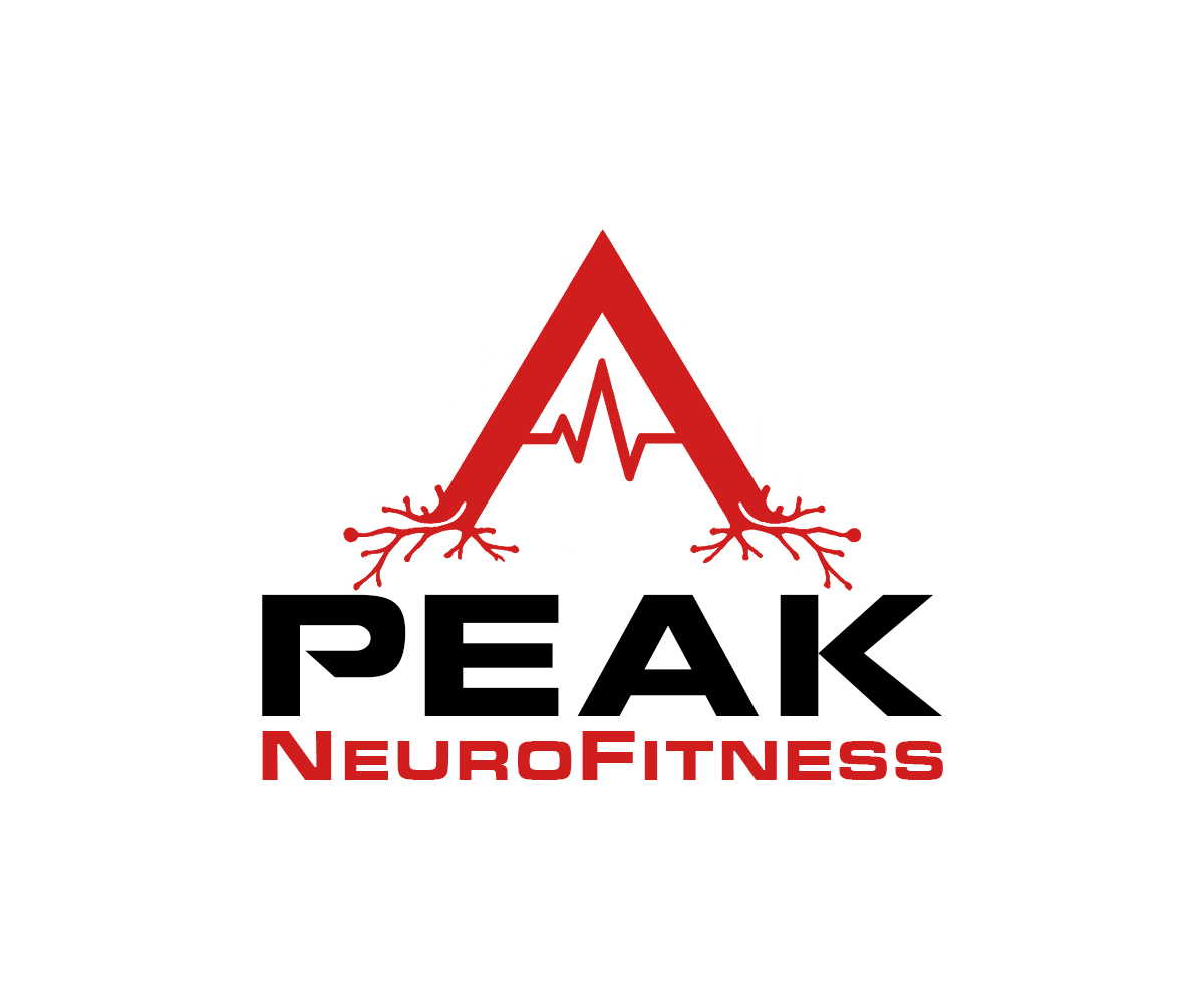
I want the design to have two axons in an *INVERTED* "V" shape ( * meaning an upside-down V with the point (PEAK) at the top *), making a mountain peak with the horizontal line across the top (UNDER THE PEAK, creating an "A" shape. making the peak to look like an EEG line). The company provides peak performance training and mental wellness services, which include neurofeedback, biofeedback, quantitative EEG (qEEG), and psychotherapy. The company is defined by the intersection of neuroscience and practice. I want the colors to be either red and white; red and back; or red, white, and black.
Zielmarkt/( -märkte)
neurofeedback, biofeedback, psychotherapy, peak performance training, and mental wellness customers
Industrie/Einheitstyp
Health and wellness, peak performance, neurofeedback, biofeedback, psychotherapy, mental health
Logo Text
Peak NeuroFitness
Logo Stile, die Sie interessieren können
Pictorial / Combination-Logo
Ein reales Objekt (Text optional)
Farben
Vom Kunden ausgewählte Farben für das Logo Design:
Sehen und fühlen
Jeder Schieber zeichnet eine der Charakteristiken der Marke des Kunden aus sowie den Stil, den euer Logo widerspiegeln sollte.
Elegant
Fett
Spielerisch
Ernst
Traditionel
Modern
Sympatisch
Professionell
Feminin
Männlich
Bunt
Konservativ
Wirtschaftlich
Gehobenes
Anforderungen
Muss haben
- the graphic with two axons forming an INVERTED (UPSIDE-DOWN) "V" shape, making a mountain peak; the horizontal line across the upper-middle section, creating an "A" frame, making the peak to look like an EEG line; the company name
Schön zu haben
- I prefer the graphic to be seperate from the "A" in the word "peak" in the company name; however, I accept submissions with the graphic as the "A" letter in the name because there have been some I like
Sollte nicht haben
- letters that are not filled in correctly (e.g., an "E" missing part of the vertical line at the top or the vertical line on the "P" not being fully connected and having a weird space)