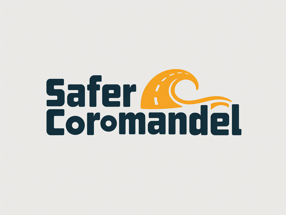
Safer Coromandel, New Zealand logo upgrade
Wollen Sie auch einen Job wie diesen gewinnen?
Dieser Kunde bekam 83 Logo-Designs von 35 Designern. Dabei wurde dieses Logo-Design Design von hadisuwarno als Gewinner ausgewählt.
Kostenlos anmelden Design Jobs finden-
 NZ$150
-
 83 Designs
-
 35 Designer
Logo-Design Kurzbeschreibung
Safer Coromandel is a public service service campaign to keep the Coromandel Peninsula safer during the summer months. It's combined project between Thames Coromandel District Council, other district councils, and safety organisations such as Fire Emergency NZ, St John, Police, Surf Life Saving NZ, ACC, and other organisations in the Coromandel.
The logo needs to be bold and capture summer and the unique Coromandel Peninsula area. Probably using orange and blue colours. It needs to capture summer, the area, and be bold and fun. The area is famous for beautiful beaches like Hot Water Beach, Cathedral Cove, winding roads and it's a place where other New Zealanders come to relax for the summer. The one we currently have we don't like as it seems outdated - the old logo is attached.
It's about staying safe at the beach, out partying over summer, on our roads and in all ways. The Coromandel Peninsula is a tourist hot spot in the summer months with the population at least tripling.
Zielmarkt/( -märkte)
18-24 year olds
Industrie/Einheitstyp
Charity, safety
Logo Text
Safer Coromandel
Logo Stile, die Sie interessieren können
Emblem-Logo
Logo eingeschlossen in einer Form
Figuren-Logo
Logo mit Abbildung oder Zeichen
Farben
Vom Kunden ausgewählte Farben für das Logo Design:
Sehen und fühlen
Jeder Schieber zeichnet eine der Charakteristiken der Marke des Kunden aus sowie den Stil, den euer Logo widerspiegeln sollte.
Elegant
Fett
Spielerisch
Ernst
Traditionel
Modern
Sympatisch
Professionell
Feminin
Männlich
Bunt
Konservativ
Wirtschaftlich
Gehobenes
Anforderungen
Muss haben
- Bold 'Safer Coromandel' words, some connection to the area, probably the beach
Schön zu haben
- Beach, road, party vibes