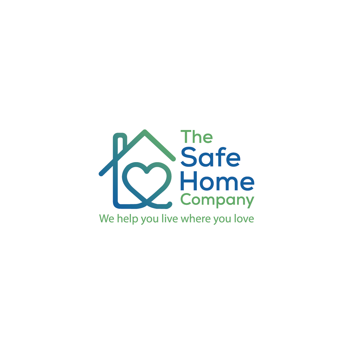
The Safe Home Company - Helping people age in place and live where they love
Wollen Sie auch einen Job wie diesen gewinnen?
Dieser Kunde bekam 277 Logo-Designs von 99 Designern. Dabei wurde dieses Logo-Design Design von MST . ANWARA KHATUN als Gewinner ausgewählt.
Kostenlos anmelden Design Jobs finden- Garantiert
-
 US$300
-
 277 Designs
-
 99 Designer
Logo-Design Kurzbeschreibung
Tagline: We help you live where you love
Industry: Home modifications for aging in place / senior safety
We provide professional home modification services that help seniors remain safely and comfortably in their homes. Our services include grab bars, stair lifts, wheelchair ramps, walk-in tubs, shower modifications, and vertical platform lifts.
PRIMARY AUDIENCE #1 (Primary decision makers and end users):
- Seniors (ages 65-85) who want to age in place in their own homes
- Characteristics: Value independence, dignity, comfort, autonomy; may be resistant to changes that make their home feel "institutional" or "medical"; want to maintain control of their lives and environment; deserve respect and empowerment, not patronization
- Emotional needs: Want solutions that preserve dignity, enhance quality of life, and celebrate living at home rather than emphasizing limitations or decline
PRIMARY AUDIENCE #2 (Co-decision makers and influencers):
- Adult children (ages 35-65) supporting aging parents
- Characteristics: Educated, concerned about safety, want professional solutions, value trust and expertise, may feel guilty or anxious about parent's safety
- Emotional needs: Peace of mind, expert guidance, solutions that parents will actually accept and use
SECONDARY AUDIENCE (Referral sources):
- Healthcare professionals (home health nurses, discharge planners, social workers, geriatric care managers)
- Characteristics: Need reliable partners, value professionalism and quality, make frequent referrals
- Business needs: Professional credibility, reliable service delivery, good patient outcomes
DESIGN CONSIDERATION:
The logo must appeal to SENIORS FIRST. This means:
- Cannot emphasize aging, decline, or limitations (disempowering)
- Must feel dignified and respectful, never condescending
- Should emphasize "home" and "living well" over "safety modifications"
- Cannot look overly medical or institutional
- Must convey empowerment and choice, not necessity or fear
EMOTIONAL TONE NEEDED:
The logo must strike a balance between "professional/trustworthy" and "caring/warm" while being empowering rather than paternalistic. We're not a medical facility (too clinical), not a handyman service (too casual), and not an assisted living facility (we help people avoid that). We're trusted experts who respect our clients' independence and genuinely care about their quality of life and dignity.
DESIRED VIBE (in order of importance):
1. Trustworthy - Must feel professional and established
2. Caring - Warm without being overly sentimental
3. Clean - Modern, uncluttered, easy to read
4. Approachable - Not intimidating or overly corporate
AVOID THESE CLICHÉS AND PROBLEMATIC SYMBOLS:
- Medical crosses or first aid symbols (wrong message - we're not healthcare)
- Walking canes, wheelchairs, or walkers (emphasizes limitations, not empowerment)
- Elderly figures or silhouettes (can feel patronizing or ageist)
- Overly literal grab bars, railings, or ramps (focuses on disability not living well)
- Protective/defensive symbols like shields (implies vulnerability/fear)
CRITICAL: The icon should make seniors think "Yes, I want to stay in MY home and live MY life" not "I need help because I'm getting old."
Avoid anything that emphasizes aging, decline, disability, or dependence. Focus on home, comfort, independence, and quality of life.
If our brand were a person, they would be:
- A trusted advisor who listens more than they talk
- Knowledgeable but explains things simply and respectfully
- Compassionate but professional, never pitying
- Reliable and detail-oriented
- Optimistic about aging in place as a positive choice
- Deeply respectful of people's independence, autonomy, and dignity
- An empowering partner, not a paternalistic authority figure
BRAND VALUES:
1. Dignity - Preserving independence, choice, and pride (our #1 value)
2. Quality - Professional craftsmanship and attention to detail
3. Trust - Earned through expertise, transparency, and care
4. Safety - Important, but presented as empowerment not fear
5. Respect - Honoring clients' homes, decisions, and way of life
IMPORTANT CONTEXT:
- This is a new business launch
- Logo will be our primary brand asset
- Will be used across: website, business cards, vehicle wraps, uniforms, yard signs, digital ads, social media
- Budget exists for a quality logo - we're investing in getting this right
- We value thoughtful design over quick execution
Zielmarkt/( -märkte)
Seniors 65-85 and Care givers
Industrie/Einheitstyp
Home Health, Home Improvement
Logo Text
The Safe Home Company or The Safe Home Co.
Logo Stile, die Sie interessieren können
Emblem-Logo
Logo eingeschlossen in einer Form
Pictorial / Combination-Logo
Ein reales Objekt (Text optional)
Abstraktes Logo
Begrifflich / symbolisch (Text optional)
Zu verwendende Schriftarten
Farben
Der Designer kann die Farben des Designs frei wählen
Sehen und fühlen
Jeder Schieber zeichnet eine der Charakteristiken der Marke des Kunden aus sowie den Stil, den euer Logo widerspiegeln sollte.
Elegant
Fett
Spielerisch
Ernst
Traditionel
Modern
Sympatisch
Professionell
Feminin
Männlich
Bunt
Konservativ
Wirtschaftlich
Gehobenes
Anforderungen
Sollte nicht haben
- AVOID THESE CLICHÉS AND PROBLEMATIC SYMBOLS: - Medical crosses or first aid symbols (wrong message - we're not healthcare) - Walking canes, wheelchairs, or walkers (emphasizes limitations, not empowerment) - Elderly figures or silhouettes (can feel patronizing or ageist) - Overly literal grab bars, railings, or ramps (focuses on disability not living well) - Protective/defensive symbols like shields (implies vulnerability/fear)