Logo Design — Modern, Elite Personal Insignia
Wollen Sie auch einen Job wie diesen gewinnen?
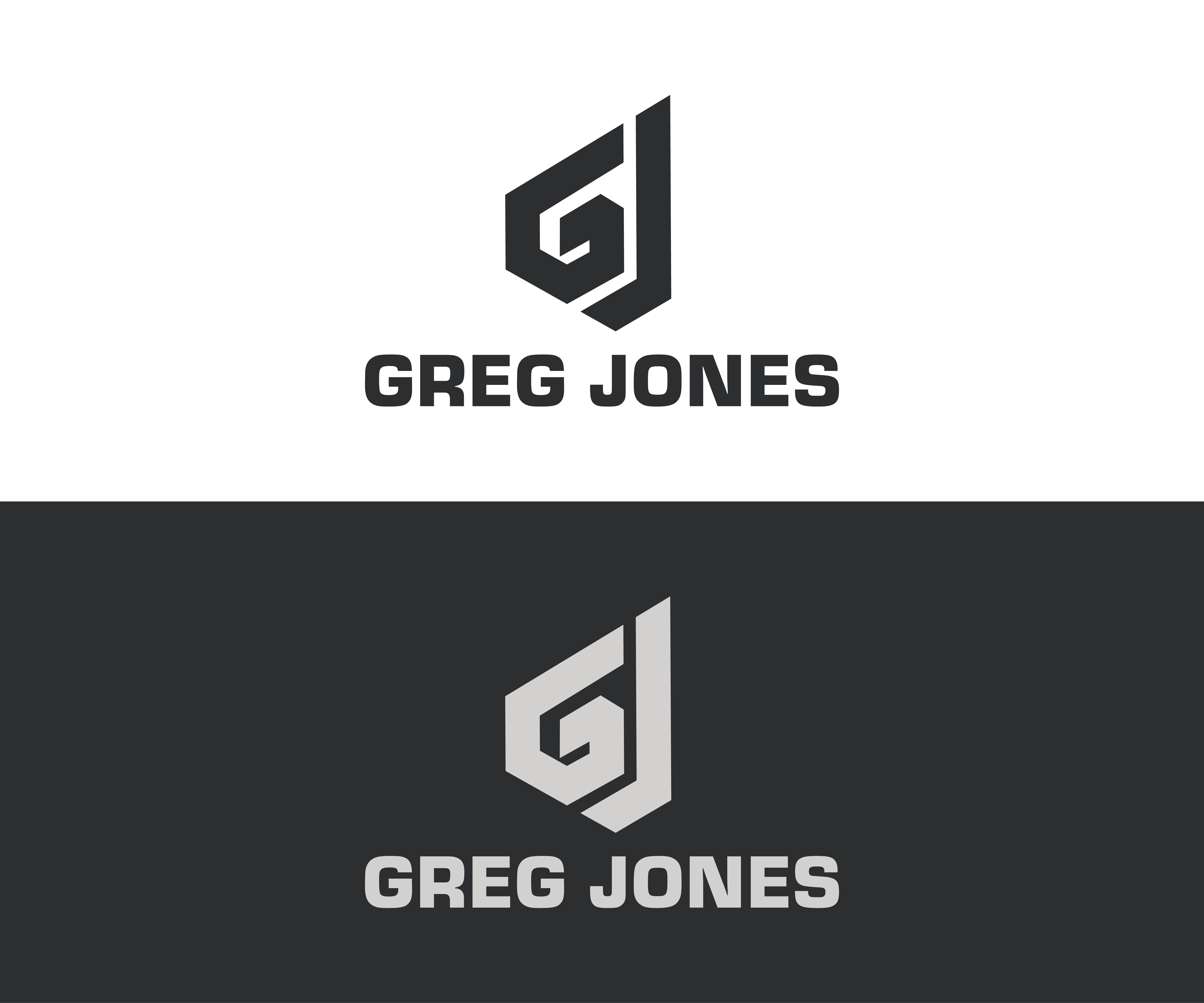
Dieser Kunde bekam 761 Logo-Designs von 185 Designern. Dabei wurde dieses Logo-Design Design von ABUBAKAR Graphics als Gewinner ausgewählt.
Kostenlos anmelden Design Jobs finden- Garantiert
-
 US$500
-
 761 Designs
-
 185 Designer
Logo-Design Kurzbeschreibung
LOGO BRIEF — GREG JONES
WHO I AM (BACKGROUND ONLY)
I am an executive advisor and strategist to founders scaling past $5M.
My background includes work in high-pressure environments such as government operations, emergency response, and long-term martial arts disciplines.
This background should influence the tone of the logo —
not the symbols used.
Please do not use military or soldier imagery.
THE ASSIGNMENT
Design a personal brand logo for Greg Jones. The primary mark should be the initials GJ. The name Greg Jones may be included as secondary text when needed, but the logo must work clearly with the initials alone. Abstracted or implied letterforms based on G and J are acceptable. The symbol should stand on its own. This is a personal insignia, not a company logo.
READ THIS FIRST:
The most important quality is WEIGHT AND PRESENCE.
Thin lines, light strokes, and delicate geometry are not what I'm looking for.
The mark must feel heavy, solid, and permanent — like it was carved or forged.
If your design feels like an app icon or a startup logo, it is wrong.
IMPORTANT: WEIGHT AND PRESENCE
The mark should feel substantial — not thin, delicate, or startup-light.
Use confident stroke weights and solid geometry. The logo should feel like it has mass and permanence.
Think: Forged or carved, not drawn. Built, not sketched.
REFERENCE FOR ENERGY & PRESENCE
I am looking for marks with the same energy as a strong personal insignia — grounded, serious, and confident.
The logo should feel heavy and settled, not light or dynamic.
It should feel like something that could be worn on the body or stamped into material.
Avoid designs that feel clever, decorative, or optimized for screens.
Prioritize gravity, stillness, and authority.
KEY FEELING & STYLE (MOST IMPORTANT)
The logo should feel:
Masculine
Premium
Professional
Elite
Bold
Modern
More specifically, the logo should communicate:
Calm authority
Confidence without being loud
Control and precision
Strength without aggression
If the logo looks flashy, decorative, or dramatic, it is not the right direction.
REACTION TEST
If someone sees this logo on a jacket, book cover, or banner, the reaction should be:
“That person knows exactly who he is.”
Not:
“Cool logo”
“That looks expensive”
“That looks aggressive”
DESIGN DIRECTION
The symbol is more important than the letters. Letters may be hidden, abstracted, or implied rather than obvious. Designers should use simple geometry, balance, and negative space. Fewer elements are better than more elements. If unsure, remove elements instead of adding them.
Good directions to explore:
Interlocked or overlapping G / J
Shared lines or negative space between letters
If unsure, remove elements instead of adding them.
WHAT TO AVOID (VERY IMPORTANT)
Do not use crests, badges, helmets, animals, crowns, or military imagery. Avoid cybersecurity, law firm, or finance-style logos. Do not use gold gradients, bevels, embossing, or 3D effects except as descripted in the COLOR DIRECTION section below. Avoid decorative, handwritten, or ornamental fonts. Do not rely on mockups, lighting, textures, or effects to make the logo feel premium.
COLOR DIRECTION
Primary colors to explore:
Start in black and white only. Preferred colors are silver, steel, gunmetal, black, and white. Gold is acceptable only as a secondary accent and only if the design is strong without gold. Do not use bright colors, heavy gradients, or glossy effects. The logo must work clearly in one color.
Silver / steel / gunmetal (preferred)
Black
White
Silver should feel:
Cool
Controlled
Precise
Professional
Think machined metal, not jewelry.
Gold Usage (Restricted)
Gold is allowed only as a secondary accent.
Guidelines for gold:
Use sparingly
Never rely on gold to make the logo feel premium
The logo must look strong without gold
If the design only looks good because it is gold, it is not the right design.
Color Rules (Very Important)
Start in black and white only
Add silver or gold after the form is finalized
No bright colors
No heavy gradients
No glossy or reflective effects
The logo must work clearly as:
Solid black on white
Solid white on black
Single-color silver or gray
Color should support the form, not replace it.
One-Line Summary for Designers (Helpful)
Silver is preferred for its precision and authority. Gold may be used only if the design is already strong without it.
TYPOGRAPHY (IF USED)
Clean and modern
Simple sans-serif or very minimal serif
No decorative fonts
Text should support the symbol, not compete with it.
FINAL INSTRUCTION
If the design is boring or generic, try again.
If the design feels simple, balanced, and confident, you are close.
Zielmarkt/( -märkte)
Founders Scaling Beyond $5M
Logo Text
See Description.
Logo Stile, die Sie interessieren können
Emblem-Logo
Logo eingeschlossen in einer Form
Abstraktes Logo
Begrifflich / symbolisch (Text optional)
Lettermark-Logo
Kurzwort oder Buchstaben-Logo (nur Text)
Farben
Der Designer kann die Farben des Designs frei wählen
Sehen und fühlen
Jeder Schieber zeichnet eine der Charakteristiken der Marke des Kunden aus sowie den Stil, den euer Logo widerspiegeln sollte.
Elegant
Fett
Spielerisch
Ernst
Traditionel
Modern
Sympatisch
Professionell
Feminin
Männlich
Bunt
Konservativ
Wirtschaftlich
Gehobenes
Anforderungen
Muss haben
- Elite, Premium, Calm Authority, Clean, Modern, Professional, Distinct
Schön zu haben
- Minimal geometry, Strong proportions, Negative space, Subtle letter integration, Timeless design, One-color friendly
Sollte nicht haben
- Shields or crests, Military or soldier imagery, Helmets or weapons, Animals or crowns, Cybersecurity or law-firm style, Gold gradients or heavy metallic effects, Bevels, embossing, or 3D effects, Decorative or script fonts, Logos that rely on mockups or textures