Logo Upgrade for Judo Business
Wollen Sie auch einen Job wie diesen gewinnen?
Dieser Kunde bekam 124 Grafik-Designs von 55 Designern. Dabei wurde dieses Grafik-Design Design von Le Yuan als Gewinner ausgewählt.
Kostenlos anmelden Design Jobs finden-
 £130
£130
-
 124 Designs
-
 55 Designer
Grafik-Design Kurzbeschreibung
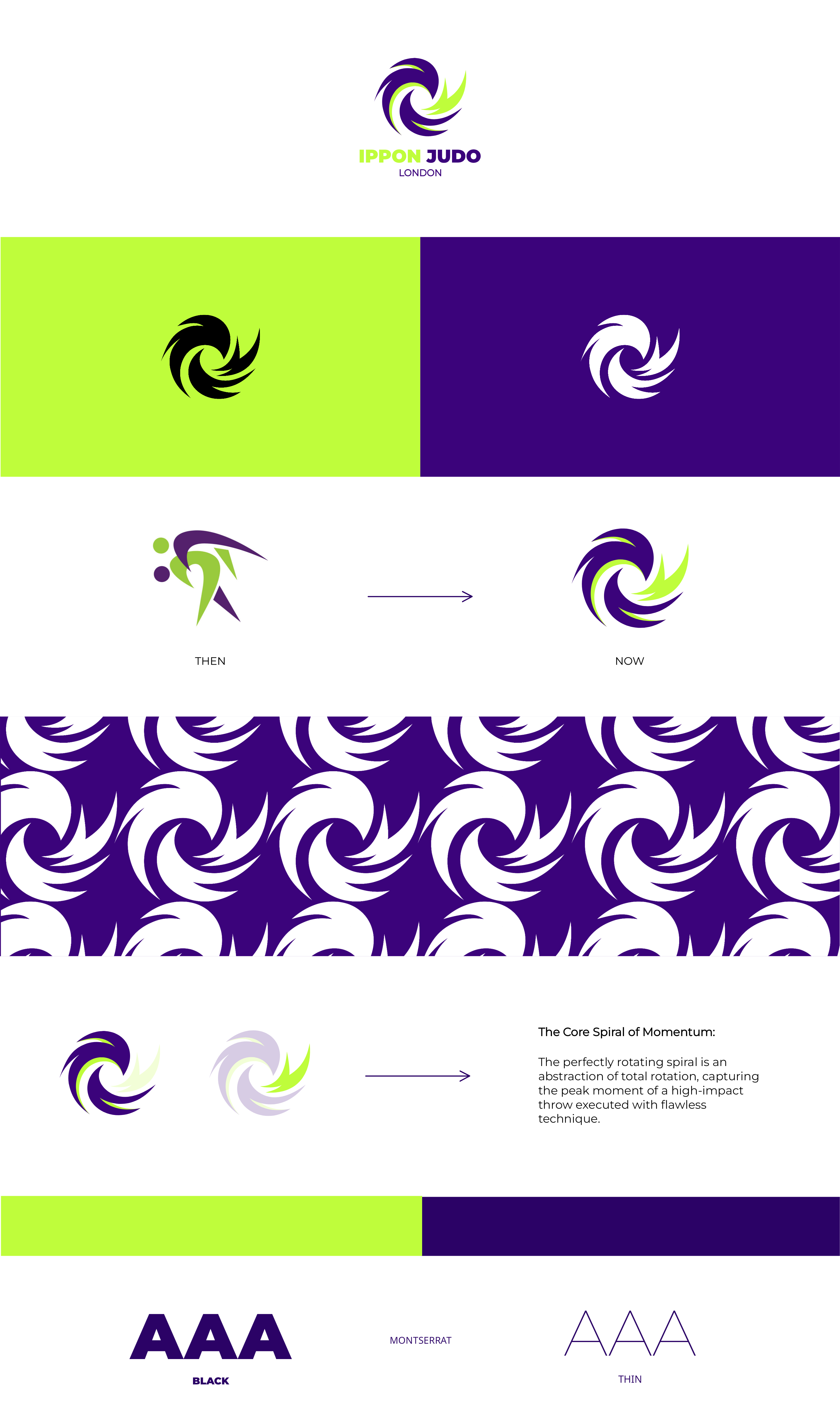
Ippon Judo London is a judo focused business rooted in performance and pathway development. Our current logo has strong foundations and brand recognition but we're looking to refine and elevate to make it more modern . This is more of an upgrade than rebrand.
Cons to logo: Our current logo has always looked like it was created on Microsoft and its never felt right.
Direction:
1. Abstract but judo figures recognisable: Keep the abstract style but logo should read immediately as a judo throw.
2. Avoid generic judo silhouettes: No stock-style throws, clip-art figures, or overly literal poses.
3. Strong sense of movement and control: The logo should feel dynamic, athletic, and powerful — capturing kuzushi, rotation, or off-balance.
4. Clean, modern, timeless: Bold shapes and confident line work.
I have attached some inspiration, our current pattern which will be useful on Merchandise and our mascot 'the panther'.
Our Brand Colours
Main colour: Bold Purple: #3B037B
Accent colour: Lime Green: #BAFF28
Accent colour: White
Accent colour: Lavender: #CAADE6 (small accent only)
Font: Gotham
Feel free to look at our website www.ipponjudolondon.com and Instagram @ipponjudolondon page if it helps.
Many thanks,
Charlotte
Head Coach of Ippon Judo London
Zu verwendende Schriftarten
Andere Schriftarten erwünscht:
- Gotham
Sehen und fühlen
Jeder Schieber zeichnet eine der Charakteristiken der Marke des Kunden aus sowie den Stil, den euer Logo widerspiegeln sollte.