Kids’ Dr – Logo Redesign (Sub-Brand of Specialist Medical Services Group)
Wollen Sie auch einen Job wie diesen gewinnen?
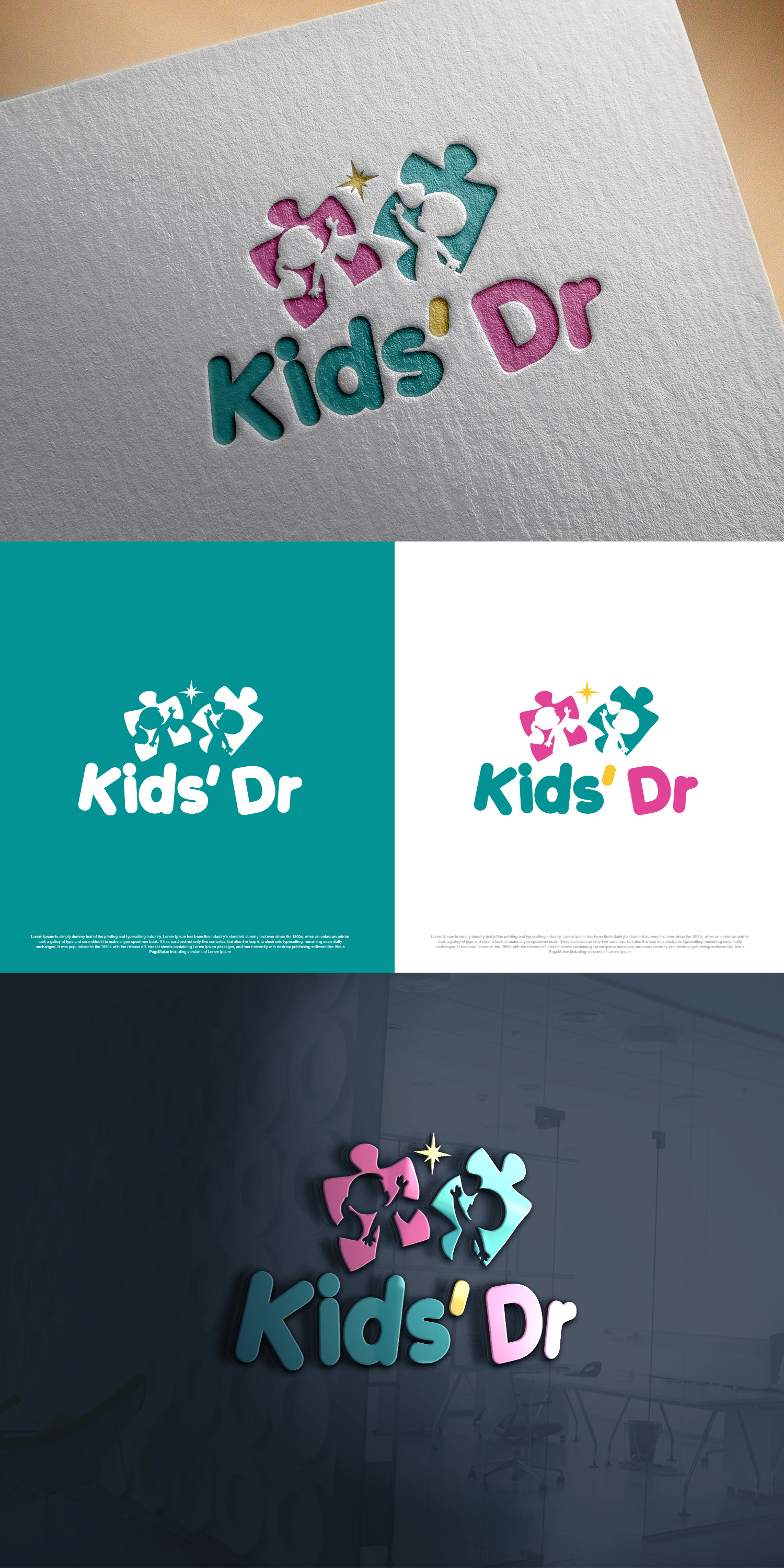
Dieser Kunde bekam 102 Logo-Designs von 46 Designern. Dabei wurde dieses Logo-Design Design von Ahsan Designs als Gewinner ausgewählt.
Kostenlos anmelden Design Jobs finden-
 A$150
A$150
-
 102 Designs
-
 46 Designer
Logo-Design Kurzbeschreibung
Kids’ Dr is a paediatric-focused sub-brand of Specialist Medical Services Group, and we are seeking a modern, refined update of our existing logo. This is an evolution, not a complete reinvention. We would like to maintain recognisability while elevating the overall look so it feels more contemporary and polished.
The refreshed logo should feel clean, bright and professional, while still warm and approachable. It must convey trust, safety and clinical excellence without appearing overly corporate or sterile. As a children’s medical brand, it should retain a friendly, child-focused feel — but in a more subtle and sophisticated way, avoiding anything overly cartoonish or busy.
We want to simplify the design. The current logo has too many elements, which makes it feel outdated and complicated. The new direction should be more streamlined and minimal, with fewer components and cleaner lines.
We like having a colourful logo, but we do not want too many colours. The palette should remain bright and uplifting, while being cohesive and controlled. A limited number of well-balanced colours is preferred over a multi-colour approach.
We would still like to incorporate puzzle pieces into the design, but in a more refined and modern way. This could be simplified, abstracted or subtly integrated into the typography or icon so it feels intentional rather than decorative.
The final design should align with the broader Specialist Medical Services Group brand identity, ensuring consistency across the group while allowing Kids’ Dr to maintain its own distinct and child-friendly presence. It must also be versatile and suitable for long-term growth, working seamlessly across digital platforms, print materials, signage and marketing.
Overall, this is a thoughtful modernisation of the brand — strengthening professionalism and clarity, while preserving the warmth and familiarity families associate with Kids’ Dr.
Original logo attached for reference.
Zielmarkt/( -märkte)
The primary audience for the Kids’ Dr logo is parents and caregivers, particularly mothers and fathers of young children, who are the decision-makers when choosing a paediatric provider. The logo needs to convey warmth, safety, trust and professionalism at first glance, reassuring parents that their child will be cared for in a competent yet nurturing environment. These parents are typically looking for a practice that feels approachable and child-friendly, but also medically credible and aligned with high clinical standards. The secondary audience is children themselves, especially toddlers through early primary school age. While children are not the decision-makers, the branding should feel friendly and non-threatening to help reduce anxiety around doctor visits. This means the logo should avoid being overly clinical or sterile, while also avoiding being too cartoonish or juvenile, as it must still resonate with parents seeking quality healthcare. Additionally, the logo should subtly appeal to referring practitioners and the broader medical community, reinforcing that Kids’ Dr operates within a professional, specialist-led medical group. In summary, the Kids’ Dr logo should primarily speak to modern, health-conscious parents seeking trusted paediatric care, while remaining warm and approachable for children and professionally aligned with Specialist Medical Services Group.
Industrie/Einheitstyp
Healthcare
Logo Text
Kids' Dr
Logo Stile, die Sie interessieren können
Pictorial / Combination-Logo
Ein reales Objekt (Text optional)
Abstraktes Logo
Begrifflich / symbolisch (Text optional)
Farben
Vom Kunden ausgewählte Farben für das Logo Design:
Sehen und fühlen
Jeder Schieber zeichnet eine der Charakteristiken der Marke des Kunden aus sowie den Stil, den euer Logo widerspiegeln sollte.
Elegant
Fett
Spielerisch
Ernst
Traditionel
Modern
Sympatisch
Professionell
Feminin
Männlich
Bunt
Konservativ
Wirtschaftlich
Gehobenes
Anforderungen
Muss haben
- The logo must feel modern, clean and professional while still being warm and approachable. It must clearly communicate trust, safety and clinical credibility, as parents are the primary decision-makers. The design should be child-friendly but in a subtle and sophisticated way, avoiding anything overly cartoonish. It must align cohesively with the broader Specialist Medical Services Group branding while still allowing Kids’ Dr to stand on its own as a distinct sub-brand. The logo must also be versatile and scalable, working effectively across digital platforms, signage, uniforms, stationery and marketing materials.
Schön zu haben
- It would be beneficial if the design subtly incorporated a symbolic element that represents paediatrics, care, growth or wellbeing in a refined way. A balanced colour palette that feels fresh and contemporary — possibly soft, calming tones — would enhance the brand’s warmth without compromising professionalism. A custom or slightly distinctive typographic treatment could help strengthen brand recognition. Flexibility in the design system, such as a primary logo, icon version and stacked variation, would also be advantageous for long-term branding consistency.
Sollte nicht haben
- The logo should not feel overly childish, overly playful or cartoon-like. It should avoid cliché paediatric imagery such as balloons, excessive rainbows, overly exaggerated characters or gimmicky graphics. The design should not appear overly clinical, cold or hospital-like, as this may create anxiety for children and parents. It should also avoid clutter, too many colours, dated fonts or complex elements that won’t scale well across different applications. Finally, it should not deviate too far from the professional standards expected within a specialist medical group environment.