

 Aktualisieren
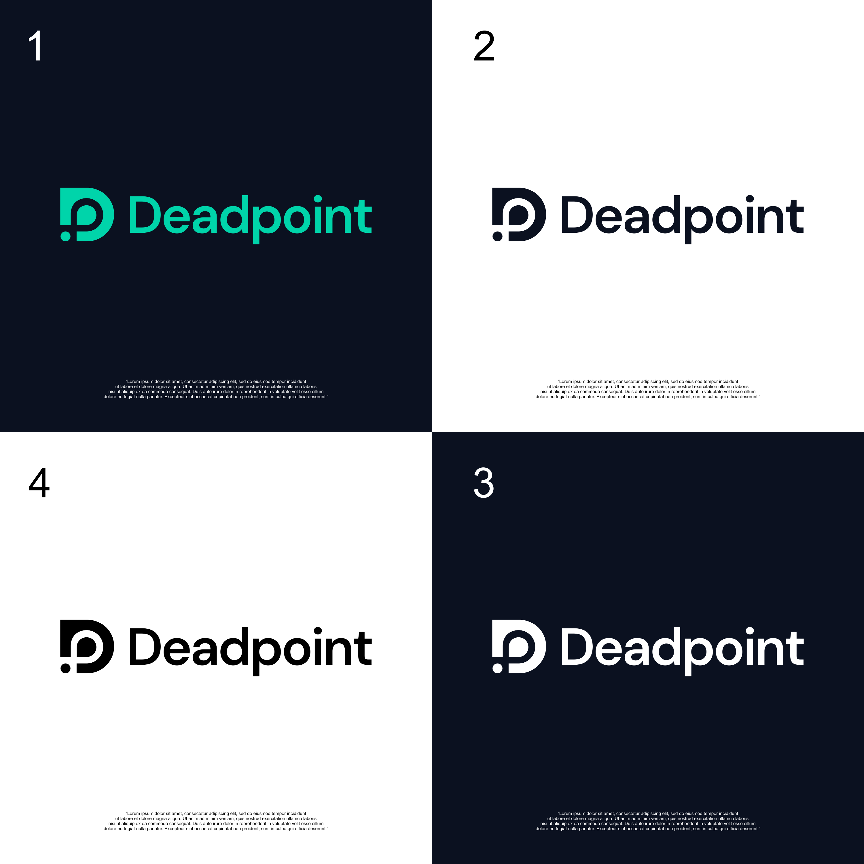
Deadpoint: logo design forAI-powered strategy intelligence platform for hedge funds
Wollen Sie auch einen Job wie diesen gewinnen?
Dieser Kunde bekam 109 Logo-Designs von 57 Designern. Dabei wurde dieses Logo-Design Design von izdihaar studio als Gewinner ausgewählt.
Kostenlos anmelden Design Jobs finden
-
 €110
€110
-
 109 Designs
-
 57 Designer
Logo-Design Kurzbeschreibung
Brand Name: Deadpoint
What we do: AI-powered strategy intelligence platform for hedge funds. We sit between a fund's trading strategies and execution — our AI tells strategies "not now" when market conditions are unfavorable, filtering out bad trades before they happen. Think of it as a quality control layer for algorithmic trading.
Where the name comes from: "Deadpoint" is a rock climbing term — it's the precise moment at the top of a dynamic move where momentum equals zero and gravity hasn't taken over yet. That split-second of stillness where you either grab the hold or fall. That's what we do for trading: we identify the exact moment where conditions are right to act vs. when to hold still.
Brand personality:
• Precise, not flashy. We're selling to hedge fund CIOs and compliance officers, not retail traders. Think Goldman Sachs research report, not Robinhood app.
• Quiet confidence. The product speaks through results — "your strategy made 300% more with our filter on." No hype language.
• Technical credibility. Our buyers are quantitative people who manage $100M–$1B. The brand needs to feel like serious infrastructure, not a startup toy.
• Controlled power. The core concept is restraint — we make money by not trading, by holding back. The brand should feel like controlled energy, not aggressive action.
Tone: Institutional, understated, authoritative. More Bloomberg than Coinbase. More Palantir than Stripe.
Visual direction:
• Dark palette — the product itself is a dark-mode dashboard (near-black backgrounds, blue accents, green/red for profit/loss)
• Clean, geometric, minimal. No gradients, no 3D effects, no playful illustrations
• Should work well on dark backgrounds (the dashboard) and light backgrounds (pitch decks, documents)
• Monospace or sharp sans-serif feel — something that wouldn't look out of place next to a terminal or data table
• The climbing origin of the name could be a subtle influence (verticality, precision, a single decisive point) but it should NOT look like an outdoor/adventure brand
What I don't want:
• Nothing that looks like crypto/Web3
• Nothing that looks like consumer fintech (no gradients, no friendly rounded shapes)
• Nothing overly complex — needs to read at 16px favicon size
• No generic "tech" marks (circuits, abstract nodes, brain icons)
References I like the feel of: Palantir, Two Sigma, Citadel, Bloomberg — institutional finance meets serious technology. The logo for Linear (the project management tool) is a good reference for the level of simplicity and sharpness I'm after.
Zielmarkt/( -märkte)
We're selling to hedge fund CIOs and compliance officers
Industrie/Einheitstyp
Finance, Fintech
Logo Text
Deadpoint
Logo Stile, die Sie interessieren können
Emblem-Logo
Logo eingeschlossen in einer Form



Figuren-Logo
Logo mit Abbildung oder Zeichen
Wortmarke-Logo
Word oder namensbasiertes Logo (nur Text)


Lettermark-Logo
Kurzwort oder Buchstaben-Logo (nur Text)



Zu verwendende Schriftarten

Farben
Vom Kunden ausgewählte Farben für das Logo Design:
Sehen und fühlen
Jeder Schieber zeichnet eine der Charakteristiken der Marke des Kunden aus sowie den Stil, den euer Logo widerspiegeln sollte.
Elegant
Fett
Spielerisch
Ernst
Traditionel
Modern
Sympatisch
Professionell
Feminin
Männlich
Bunt
Konservativ
Wirtschaftlich
Gehobenes
Anforderungen
Muss haben
- Dark palette, clean, geometric, minimal style, should work on dark and light palette. Istitutional, understated, authorative tone. Brand personality should reflect precision, quiet confidence, technical credibility, and controlled power. Monospace or sharp sans-serif feel. The climbing origin of the name could be a subtle influence (verticality, precision, a single decisive point)
Sollte nicht haben
- gradients, 3D effects, playful illustrations, should NOT look like an outdoor/adventure brand. Nothing that looks like crypto/Web3 • Nothing that looks like consumer fintech (no gradients, no friendly rounded shapes) • Nothing overly complex — needs to read at 16px favicon size • No generic "tech" marks (circuits, abstract nodes, brain icons)