

 Aktualisieren
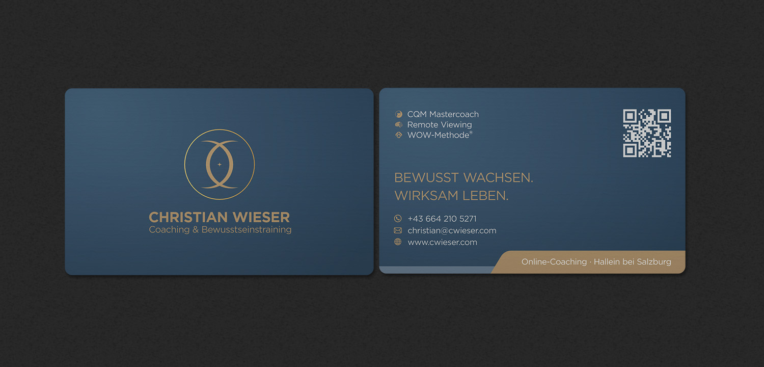
Premium business card design for coaching & personal brand
Wollen Sie auch einen Job wie diesen gewinnen?
Dieser Kunde bekam 106 Visitenkarten-Designs von 23 Designern. Dabei wurde dieses Visitenkarten-Design Design von INDIAN_Ashok als Gewinner ausgewählt.
Kostenlos anmelden Design Jobs finden
- Garantiert
-
 €60
-
 106 Designs
-
 23 Designer
Visitenkarten-Design Kurzbeschreibung
I need a premium, minimal, and highly professional business card design for my coaching practice.
The design must feel calm, structured, modern, and high-end. It should NOT look esoteric, playful, or like a generic template.
FORMAT:
- 85 x 55 mm (horizontal)
COLOR STYLE:
- blue background
- Muted gold accents (not bright yellow)
- Light grey / off-white text
FRONT SIDE (already defined – please follow exactly):
- Centered logo (provided), but please integrate the supporting lines around the circle as in the sample page
- CHRISTIAN WIESER (uppercase, gold)
- Coaching & Awareness Training (smaller below)
- Clean, centered layout with generous spacing
BACK SIDE (main task):
Top line (small):
CQM Master Coach · Remote Viewing · WOW Method®
Main focus (center, larger font):
Grow consciously.
Live effectively.
Contact block:
+43 XXX XXX XXXX
email@domain.com
www. cwieser.com
Bottom line:
Online coaching · Hallein near Salzburg
QR CODE:
- Include a QR code (placeholder)
- Position on the right side
- Clean integration, not too dominant
TYPOGRAPHY:
- Clean modern sans-serif
- Strong hierarchy and spacing
- No decorative fonts
IMPORTANT:
- Keep the design minimal and structured
- Use whitespace
- Avoid clutter
- Avoid stock-style visuals
GOAL:
A high-end, elegant business card that reflects a strong personal brand.
Zielmarkt/( -märkte)
Self-reflective individuals interested in personal development, coaching, and consciousness work. People who value clarity, depth, and practical transformation.
Industrie/Einheitstyp
Coaching / Personal Development / Consciousness Training
Kontaktinformationen für Visitenkarte
Front: Logo, Name, Title Back: CQM Mastercoach · Remote Viewing · WOW-Methode® Bewusst wachsen. Wirksam leben.
Zu verwendende Schriftarten

Farben
Vom Kunden ausgewählte Farben für das Logo Design:
Sehen und fühlen
Jeder Schieber zeichnet eine der Charakteristiken der Marke des Kunden aus sowie den Stil, den euer Logo widerspiegeln sollte.
Elegant
Fett
Spielerisch
Ernst
Traditionel
Modern
Sympatisch
Professionell
Feminin
Männlich
Bunt
Konservativ
Wirtschaftlich
Gehobenes
Anforderungen
Muss haben
- - Clean, minimal, high-end design - Strong typography and clear hierarchy - blue background with gold accents - Plenty of whitespace - Professional and calm appearance - Print-ready layout with proper margins and bleed - QR code integrated cleanly on the back
Schön zu haben
- - Subtle gradient background (very soft, not busy) - Slight premium feel (eg gold effect, but not shiny or cheap) - Perfect alignment and spacing - Elegant and modern look
Sollte nicht haben
- - No clutter or too much information - No “esoteric cliché” design (eg glowing lights, mandalas, chakras) - No stock template look - No bright or saturated colors - No decorative or playful fonts - No heavy textures or noisy backgrounds

