New Logo for security company
Wollen Sie auch einen Job wie diesen gewinnen?
Dieser Kunde bekam 376 Logo-Designs von 153 Designern. Dabei wurde dieses Logo-Design Design von MSA DESIGN als Gewinner ausgewählt.
Kostenlos anmelden Design Jobs finden- Garantiert
-
 US$300
-
 376 Designs
-
 153 Designer
Logo-Design Kurzbeschreibung
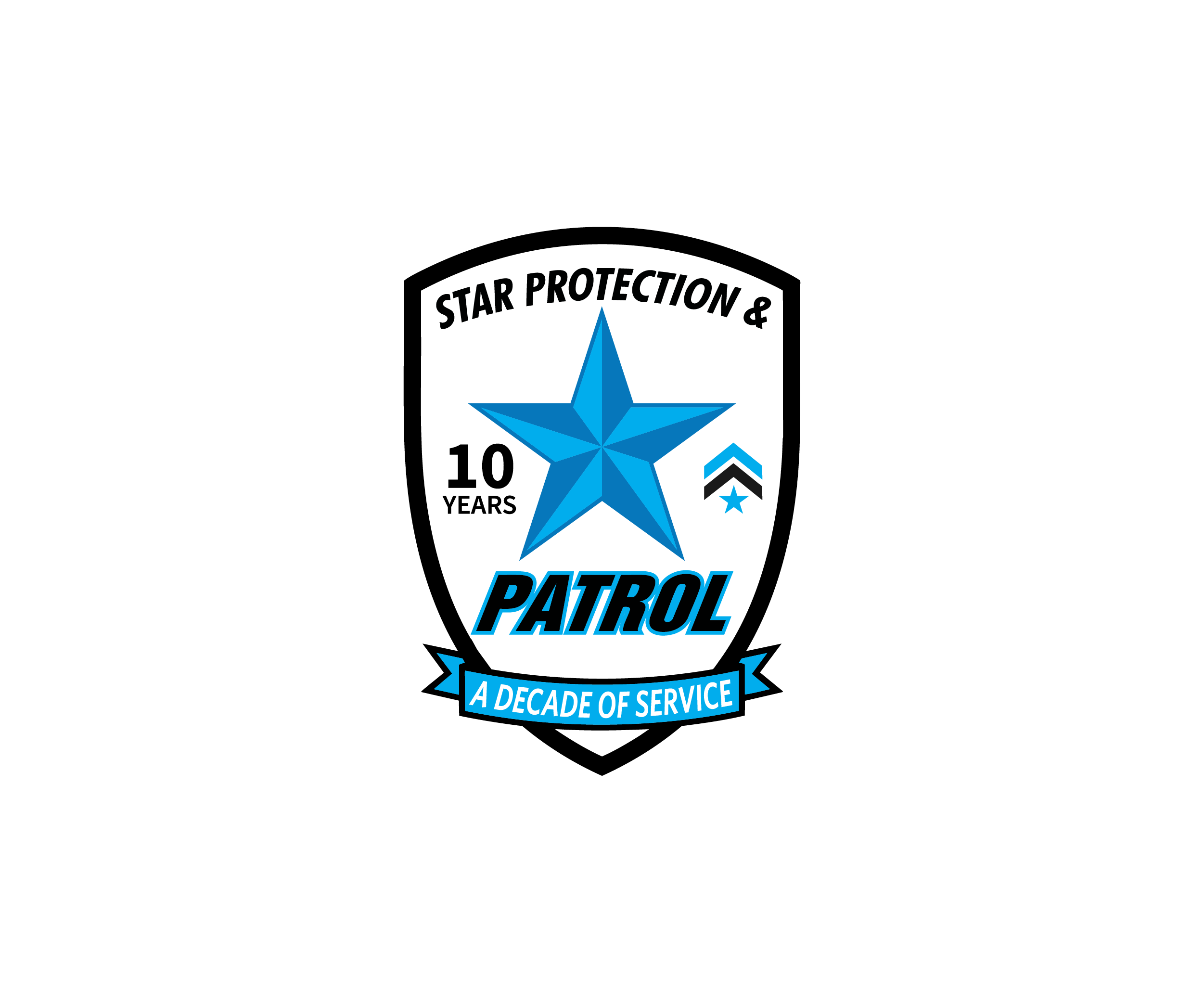
The current Star Protection & Patrol logo features a bold, modern design built around a strong visual identity: a prominent star element paired with high-contrast typography. The use of sharp lines, italicized lettering, and a black, white, and blue color scheme conveys motion, authority, and professionalism—core traits aligned with the security industry. The star icon reinforces themes of vigilance, protection, and service, while the heavy, stylized “PATROL” text emphasizes strength and presence.
As the company approaches a significant milestone—10 years of professional security service—there is an opportunity to evolve this logo to better reflect that legacy. While the existing design successfully communicates strength and brand recognition, a redesign could incorporate elements that highlight experience, trust, and longevity. This may include integrating a “10-year” mark, refining the typography for a more premium and established feel, or enhancing the star motif to symbolize a decade of reliability and proven performance.
The goal of the redesign is not to abandon the current identity, but to build upon it—retaining recognizable elements while elevating the brand to reflect a decade of growth, professionalism, and continued commitment to excellence in security services.
The black knight pic are another company examples
Started in 2016
Like shoulder patch design too
Logo Text
Star Protection & Patrol
Sehen und fühlen
Jeder Schieber zeichnet eine der Charakteristiken der Marke des Kunden aus sowie den Stil, den euer Logo widerspiegeln sollte.