Veil — Logo & Visual Identity Brief
Wollen Sie auch einen Job wie diesen gewinnen?
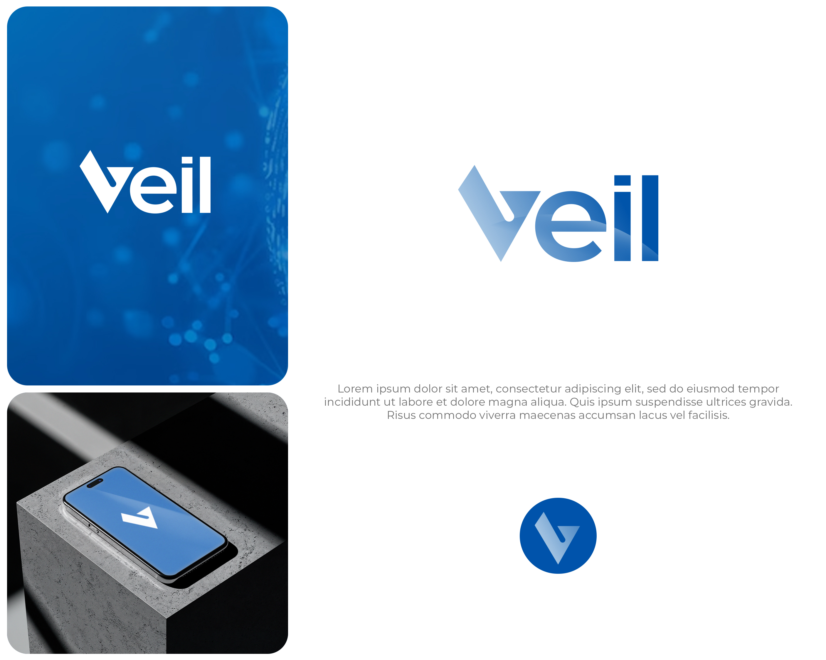
Dieser Kunde bekam 153 Logo-Designs von 59 Designern. Dabei wurde dieses Logo-Design Design von Interloop_Designs als Gewinner ausgewählt.
Kostenlos anmelden Design Jobs finden- Garantiert
-
 S$150
S$150
-
 153 Designs
-
 59 Designer
Logo-Design Kurzbeschreibung
**About Veil**
Veil is a software verification tool that helps engineers mathematically prove their systems are correct before deployment. Think of it as a spell-checker for critical infrastructure — it catches bugs that testing alone cannot find. Our customers are engineering teams building systems where failure is not an option: financial platforms, cloud infrastructure, distributed databases.
**What we need**
A wordmark logo built around the name "Veil." Optionally, the design may include a standalone icon/symbol that works independently as an avatar or favicon.
**Brand family context**
Veil is one product in a planned suite of verification tools. Sibling products include **Velvet** and **Loom**, all under a parent company brand (name TBD). The naming convention follows a fabric/textile theme. While this brief is for the Veil logo only, please design with extensibility in mind — we will likely need a cohesive visual system across the family. Choices around typeface, icon grammar, and color logic should be reusable rather than one-off.
**Design direction**
- Simple, clean, instantly recognizable — no heavy or ornate visuals
- Modern and sleek, suited to a developer tools company
- Conveys safety, solidity, and precision — we are in the business of trust and correctness
- The wordmark should do most of the work — strong, confident typographic treatment
- Monochrome should work well (the logo will appear in docs, terminals, GitHub, slide decks)
- If a standalone symbol is included, it should be abstract/geometric rather than figurative
- Feel free to experiment with the design elements and stray away from the reference image, as long as the overall logo looks modern; we are open to your best suggestions; logos without a checkmark are great and much preferred
**What we don't want**
- Literal veil, fabric, or curtain imagery (although a flowy vibe for parts of the logo might be OK)
- Shields — an overused trope in the security/verification space
- Anything heavy, ornate
- Wobbly or twisted fonts; we want to convey solidity and trust
- Try to avoid checkmarks; we've seen a few designs, and those that look closest to checkmarks are not the best ones
**Color direction**
We prefer a blue palette — deep navy to teal/cyan range. Blue communicates trust, reliability, and technical depth. A gradient from dark blue to teal-green is appealing (see attached reference), but the logo must also work in flat single-color and monochrome versions.
**Tone references**
Think Linear, Vercel, Stripe, HashiCorp — technically sophisticated companies with restrained, typographic identities. Not playful, not corporate — precise.
**Deliverables**
- Primary wordmark (with optional symbol)
- Standalone symbol variant (if applicable)
- Monochrome and color versions
- Light-on-dark variant (the logo will frequently appear in dark-mode IDEs and documentation sites)
- Formats: SVG, PNG (various sizes), favicon
A reference image is attached showing a direction we like in terms of color palette and the V-as-checkmark concept.
Another potential design option is to incorporate some kind of visualisation of the concept of a "state transition system", which can be seen as a graph (https://en.wikipedia.org/wiki/Graph_theory) with nodes (usually represented as circles) and edges (arrows, usually directed). I've attached a version like this, but I think it's too heavy to work as a logo. This motif might not work, so if you feel it's too heavy, don't try it.
I have also attached the logos of similar tools: Lean, Viper, Rocq, and CVC5.
Zielmarkt/( -märkte)
Software developers
Industrie/Einheitstyp
Technology, Software
Logo Text
Veil
Logo Stile, die Sie interessieren können
Wortmarke-Logo
Word oder namensbasiertes Logo (nur Text)
Farben
Vom Kunden ausgewählte Farben für das Logo Design:
Sehen und fühlen
Jeder Schieber zeichnet eine der Charakteristiken der Marke des Kunden aus sowie den Stil, den euer Logo widerspiegeln sollte.
Elegant
Fett
Spielerisch
Ernst
Traditionel
Modern
Sympatisch
Professionell
Feminin
Männlich
Bunt
Konservativ
Wirtschaftlich
Gehobenes
Anforderungen
Muss haben
- Simple, clean, instantly recognizable. Modern and sleek. Conveys safety, solidity, precisionh.
Schön zu haben
- A distinctive visual mark that is not a squish type of checkmark.
Sollte nicht haben
- Literal veil, fabric, or curtain imagery. Shields. Anything heavy or ornate. Wobbly or twisted fonts.