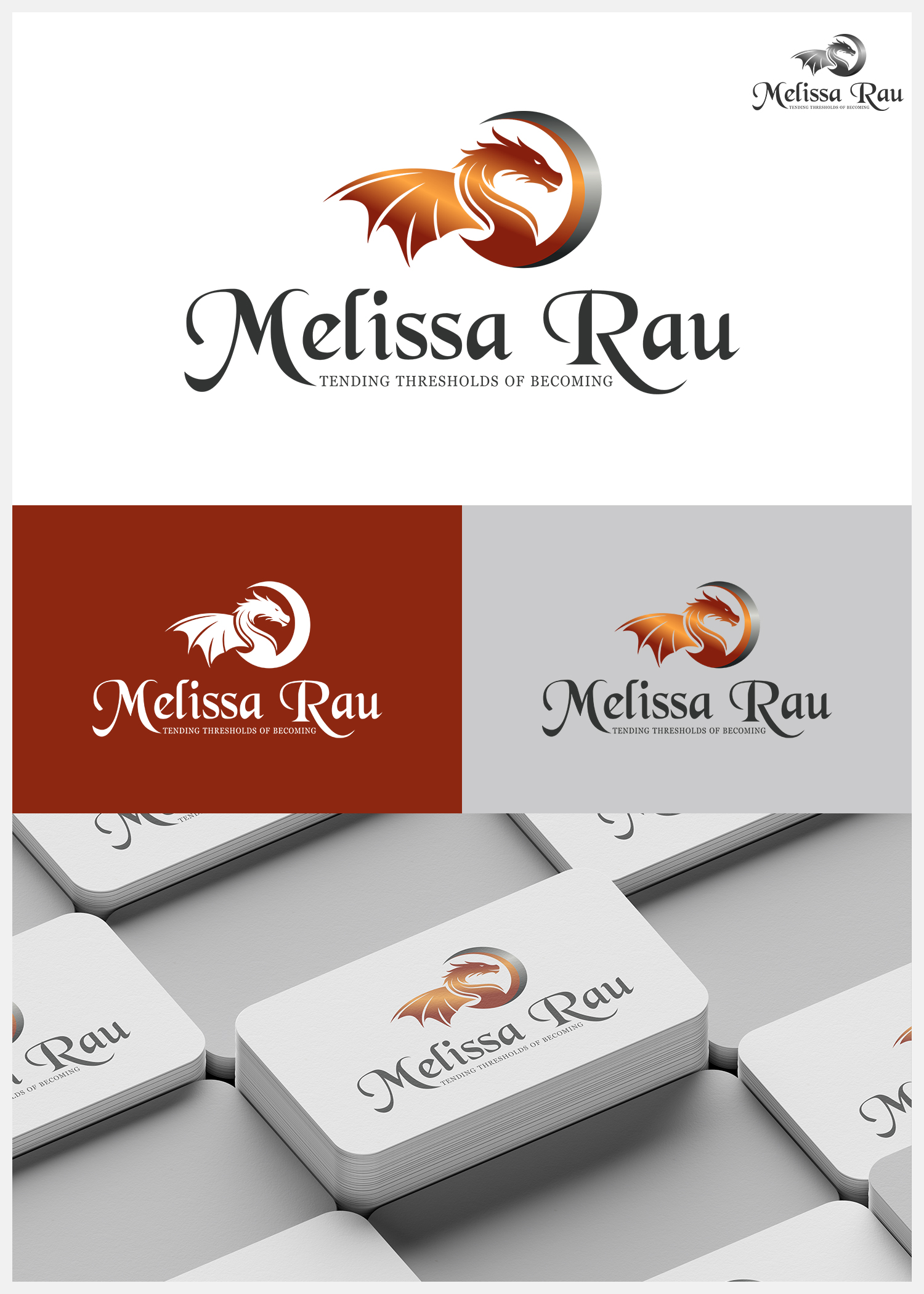
Badass Branded Dragon for website banner and print materials
Wollen Sie auch einen Job wie diesen gewinnen?
Dieser Kunde bekam 287 Logo-Designs von 51 Designern. Dabei wurde dieses Logo-Design Design von IDesign1606 als Gewinner ausgewählt.
Kostenlos anmelden Design Jobs finden- Garantiert
-
 US$150
-
 287 Designs
-
 51 Designer
Logo-Design Kurzbeschreibung
I need a logo, icon, and submark
I'd like my name, Melissa Rau to be equally balanced by a dragon ripe with symbolism. All of my fonts must be free and useable in CanvaPro ((i can upload free fonts from Dafont.com), so Melissa Rau should be represented with script font like Brittany or another flowing font, with a primary serif font that says, "Tending Thresholds of Becoming" in all caps like Cormorant Garamond. I'd like a submark and/or icon with just the dragon. I uploaded my color palette and am open to alternative suggestions if inspired. I also uploaded an image of a dragon I love and rendered on canvas, but its stance isn't right for what I'm envisioning for the banner. I've also uploaded two images of concepts/vision boards I really like (ignore the holy broken, wholly blessed language and replace with Tending Thresholds of Becoming). What I like about the The dragon isn't quite right in either of them, but I really like the concept. I also like the colors in all three images.
The logo brief I uploaded was a pdf, and I realized those aren't supported. See the mood board I uploaded. Meanwhile, here's the direction for the direction:
Melissa Rau — Dragon Brand Brief (Designer Version)
Objective
Create a refined, editorial-style dragon illustration that communicates grounded strength, quiet authority, and presence. This is a symbolic brand mark—not fantasy art, not a mascot.
Core Feeling
Calm, grounded, self-possessed
Powerful without aggression
Present, aware, and contained
“I am here. I don’t need to prove anything.”
Hard NOs (Avoid Completely)
Cartoon styling
Horse-like head shapes
Gothic / Dracula / bat wings
Spikes, excessive detail, or fantasy clichés
Fire, aggression, or action poses
Metallic/statue-like rendering
Video game / mascot aesthetics
Gold or yellow as dominant colors
If it looks like fantasy art → it’s wrong.
Pose & Structure
Seated, upright, symmetrical, grounded
Not in motion, not coiled, not crouching
Broad chest (slightly forward)
Strong, lifted shoulders
Tapered torso
Long, elegant neck
Overall: stable, contained presence
Head (Highest Priority)
Ancient, intelligent, composed
Shape: forward mass → subtle taper
Snout: faceted wedge (not long, not rounded, not blocky)
Eyes: forward-facing, calm
Brow: defined, controlled (adds intelligence)
Jaw: clear but not heavy
Mouth: optional slight opening (suggest breath, not threat)
Horns:
Only 2
Sweep backward, integrated into skull
No spikes, no ornamentation, no exaggerated curves
Wings (Second Priority)
Structured membrane (not bat/gothic/feathered)
Top edge: smooth continuous arc
Tip: single controlled hook
Bottom edge: 3–4 soft downward arcs
No upward spikes
No jagged/torn edges
Should feel like tensioned fabric, not decoration.
Tail & Limbs
Tail: natural, slight forward curve
Minimal, subtle spines only
Limbs: grounded, stable
Feet: controlled, not splayed or skeletal
No sense of movement or attack
Color & Texture
Primary: Burnt Ember
Support: Umber, Charcoal
Accent: Gold (minimal only)
Avoid:
Bright orange
Yellow-heavy palettes
Glow effects
Texture:
Subtle, controlled variation
Not overly detailed
Not metallic, stone, or sculptural
Should feel alive
Typography (If Included)
Script (Name only): Brittany Signature
Serif: Cormorant Garamond
Sans: Lato
Tagline:
ALL CAPS
Tracking +10
Line height 1.1–1.2
Centered or aligned under “R” in Rau
Style Direction
Editorial illustration, not fantasy art
Strong silhouette and shape clarity
Selective detail, not maximal detail
Intentional restraint
Should feel crafted and timeless
Final Test
If the dragon feels:
Loud → wrong
Aggressive → wrong
Decorative → wrong
If it feels:
Grounded
Quietly powerful
Timeless and intentional
→ You’re on track.
Aktualisierungen
I got distracted by a couple of compelling directions but realized the direction was leaning toward submark and less on the primary logo I'm after.
Industrie/Einheitstyp
personal wellness, discernment, spirituality
Logo Text
Melissa Rau (with sub text noted above)
Logo Stile, die Sie interessieren können
Pictorial / Combination-Logo
Ein reales Objekt (Text optional)
Wortmarke-Logo
Word oder namensbasiertes Logo (nur Text)
Zu verwendende Schriftarten
Andere Schriftarten erwünscht:
- see description
Sehen und fühlen
Jeder Schieber zeichnet eine der Charakteristiken der Marke des Kunden aus sowie den Stil, den euer Logo widerspiegeln sollte.
Elegant
Fett
Spielerisch
Ernst
Traditionel
Modern
Sympatisch
Professionell
Feminin
Männlich
Bunt
Konservativ
Wirtschaftlich
Gehobenes
Anforderungen
Muss haben
- See uploaded brand brief
Sollte nicht haben
- see brand brief