Logo Design for CROVIAX Back Office Support
Wollen Sie auch einen Job wie diesen gewinnen?
Dieser Kunde bekam 386 Logo-Designs von 157 Designern. Dabei wurde dieses Logo-Design Design von Haja_H2 als Gewinner ausgewählt.
Kostenlos anmelden Design Jobs finden- Garantiert
-
 €110
€110
-
 386 Designs
-
 157 Designer
Logo-Design Kurzbeschreibung
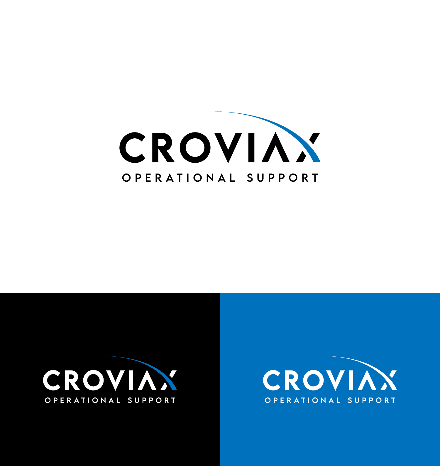
We need a premium, minimalist and typography-focused logo for our company CROVIAX.
CROVIAX offers backoffice support for businesses, and the brand should feel refined, structured, trustworthy and highly professional.
We are looking for a strong wordmark with a clean, modern and elegant aesthetic.
The style should be similar to high-end agency or editorial branding: bold typography, generous spacing, minimal composition and a confident premium feel.
We prefer a black-on-white look with a timeless and sophisticated appearance.
The logo should feel design-driven, understated and visually powerful.
Zielmarkt/( -märkte)
Businesses, SMEs, professional service companies, administrative and business clients in Switzerland and the DACH region
Industrie/Einheitstyp
Backoffice Support / Business Services / Administrative Support
Logo Text
CROVIAX Backoffice Support
Zu verwendende Schriftarten
Farben
Der Designer darf an diesem Design nur in Graustufen arbeiten
Sehen und fühlen
Jeder Schieber zeichnet eine der Charakteristiken der Marke des Kunden aus sowie den Stil, den euer Logo widerspiegeln sollte.
Elegant
Fett
Spielerisch
Ernst
Traditionel
Modern
Sympatisch
Professionell
Feminin
Männlich
Bunt
Konservativ
Wirtschaftlich
Gehobenes
Anforderungen
Muss haben
- minimal, premium and typography-focused logo. Main focus on the word CROVIAX in a bold, modern and elegant style. Secondary line BACKOFFICE SUPPORT below the main name with wide letter spacing. Logo should feel very clean, refined, high-end and professional. Black on white preferred. The design should look strong in a very minimal website layout. A simple geometric symbol is welcome, but only if it feels distinctive and premium.
Schön zu haben
- A logo style similar to high-end creative or editorial agencies: clean typography, strong spacing, modern proportions, understated confidence. Could include a minimal icon next to the wordmark, but the typography should remain the hero. Would be great if the logo feels timeless, elegant and visually balanced.
Sollte nicht haben
- No colorful concepts. No gradients. No cheap startup look. No playful logo styles. No mascots, no office icons, no headsets, no chat bubbles, no generic tech symbols. No complicated effects, shadows or busy layouts. No cliché corporate stock logo feeling.