stacko.eu – The European Software Guide
Wollen Sie auch einen Job wie diesen gewinnen?
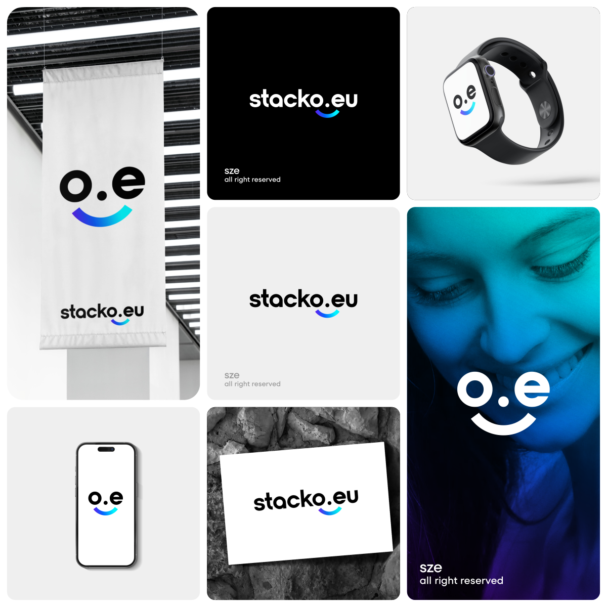
Dieser Kunde bekam 105 Logo-Designs von 63 Designern. Dabei wurde dieses Logo-Design Design von sze. als Gewinner ausgewählt.
Kostenlos anmelden Design Jobs finden- Garantiert
-
 €110
€110
-
 105 Designs
-
 63 Designer
Logo-Design Kurzbeschreibung
We are looking for a timeless, professional, and minimalist logo for stacko.eu. We are building an automated comparison portal for software (SaaS) with a focus on the European market and GDPR compliance.
The name 'stacko' is derived from 'Software Stack'. The logo is intended to convey competence, structure, and efficiency.
Our vision: We are the reputable, European alternative to large US comparison sites. We want to build trust among medium-sized businesses and startups.
Design style: * Minimalist & Clean: Less is more. No playful shadows or 3D effects.
Tech look: It should have a modern appearance (similar to stripe, miro or intercom).
Symbolism: An abstract icon suggesting stability or stacking would be great, but not essential. It should function perfectly as a favicon.
Color palette: * Primary: A deep navy blue or royal blue (for authority and trust).
Accent: A bright electric blue or mint green (for the modern tech aspect).
3. Logo text
stacko.eu
(Note for designers: Please focus on 'stacko', the '.eu' can be smaller or integrated in an accent color).
4. What the designers must deliver (deliverables)
"We need:*
Vector graphics (AI, EPS) for unlimited scalability.
Transparent PNGs for the website.
One version is suitable for light and dark backgrounds.
A square icon (favicon) without text."*
Zielmarkt/( -märkte)
CEOs, founders, IT managers and decision-makers in European SMEs (small and medium-sized enterprises) and startups.
Industrie/Einheitstyp
Technologie / Software / Datenwissenschaft (Technology / Software)
Logo Text
stacko.eu (Slogan: The European Software Guide)
Zu verwendende Schriftarten
Farben
Vom Kunden ausgewählte Farben für das Logo Design:
Sehen und fühlen
Jeder Schieber zeichnet eine der Charakteristiken der Marke des Kunden aus sowie den Stil, den euer Logo widerspiegeln sollte.
Elegant
Fett
Spielerisch
Ernst
Traditionel
Modern
Sympatisch
Professionell
Feminin
Männlich
Bunt
Konservativ
Wirtschaftlich
Gehobenes
Anforderungen
Muss haben
- Clean, professional, and minimalist aesthetic. High-quality vector files (AI, EPS). Transparent PNG versions. A standalone icon/symbol that functions as a favicon (browser icon). Modern, sans-serif typography.
Schön zu haben
- A subtle visual cue: The ".eu" part of the name in a different color or slightly smaller to emphasize the brand name "stacko". A version that looks good on both light and dark backgrounds.
Sollte nicht haben
- No 3D effects, gradients, or shadows (only flat design). No generic "growth arrows" or tacky office graphics. No playful or comic-style fonts.