NOVO Construction 25th Year anniversary
Wollen Sie auch einen Job wie diesen gewinnen?
Dieser Kunde bekam 376 Logo-Designs von 126 Designern. Dabei wurde dieses Logo-Design Design von Samsul Bachri als Gewinner ausgewählt.
Kostenlos anmelden Design Jobs finden- Garantiert
-
 US$150
-
 376 Designs
-
 126 Designer
Logo-Design Kurzbeschreibung
***Original Designs Only*** Please no vectors or other artwork from public domain
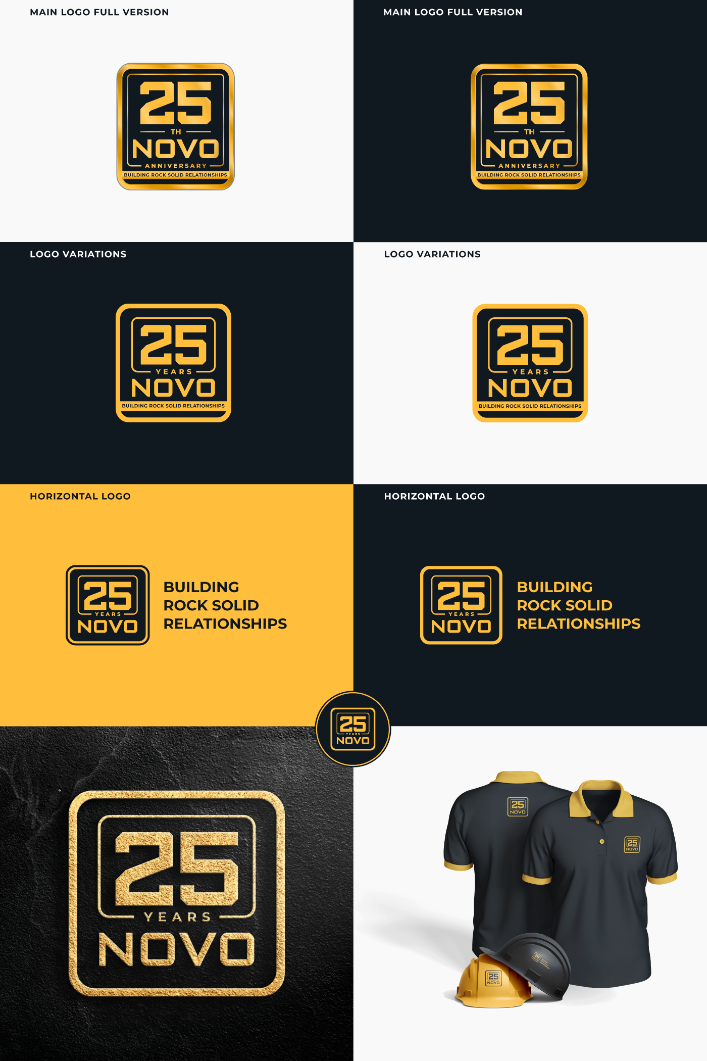
NOVO Construction — 25th Anniversary Logo Brief
Background
NOVO Construction is a minority-owned general contractor headquartered in Menlo Park, CA, specializing in tenant improvement projects across professional services, technology, and life sciences. We operate primarily in the Bay Area and Austin. After 25 years in the industry, we are marking this milestone with a commemorative logo that will live alongside our existing brand — not replace it.
Objective
Design a 25th anniversary logo lockup that celebrates this milestone with confidence and sophistication. The mark should feel earned — not celebratory in a party-hat way, but authoritative and forward-looking. We build complex, high-performance spaces for demanding clients. The anniversary mark should reflect that.
Applications
The logo must work across a wide range of uses:
Digital: website, email signatures, social media, presentations
Print: proposals, marketing collateral, stationery
Promotional: SWAG (apparel, hard hats, notebooks, etc.)
Environmental: vehicle fleet wraps (high visibility, read well at speed)
Design Direction
Clean, minimal, and scalable — must hold up at small sizes and large format
Should feel like a badge or mark that pairs with the existing NOVO wordmark, not competes with it
Avoid ribbon banners, generic star bursts, or clip-art anniversary clichés
Think more architectural / structural in feel — geometry, precision, weight
Brand Context
Primary brand colors: PANTONE 136 C (gold/amber) and Black 6 C
Fonts in use: Montserrat
The mark should feel like it belongs in the same family as the existing brand without being a copy of it
Deliverables
Primary lockup (horizontal and stacked versions)
Standalone badge/icon version for SWAG and embroidery
All files in vector (AI, EPS) plus PNG/SVG exports
Versions in full color, one-color black, one-color white, and one-color gold
What We've Seen and Didn't Love
Previous concepts felt generic — they could have been for any company's anniversary. We want something that unmistakably feels like NOVO: precise, modern, and grounded in the work we actually do.
Industrie/Einheitstyp
Construction
Logo Text
25th Year Anniversary or 25 Years
Logo Stile, die Sie interessieren können
Lettermark-Logo
Kurzwort oder Buchstaben-Logo (nur Text)
Zu verwendende Schriftarten
Sehen und fühlen
Jeder Schieber zeichnet eine der Charakteristiken der Marke des Kunden aus sowie den Stil, den euer Logo widerspiegeln sollte.
Elegant
Fett
Spielerisch
Ernst
Traditionel
Modern
Sympatisch
Professionell
Feminin
Männlich
Bunt
Konservativ
Wirtschaftlich
Gehobenes
Anforderungen
Muss haben
- the corporate novo logo included in the attachments
Schön zu haben
- Something geometric with the 25
Sollte nicht haben
- HUGE 25 year treatments