Switchday - Coparenting App, Logo/Icon and feature graphic
Wollen Sie auch einen Job wie diesen gewinnen?
Dieser Kunde bekam 210 Logo-Designs von 83 Designern. Dabei wurde dieses Logo-Design Design von Sigeto als Gewinner ausgewählt.
Kostenlos anmelden Design Jobs finden-
 US$150
-
 210 Designs
-
 83 Designer
Logo-Design Kurzbeschreibung
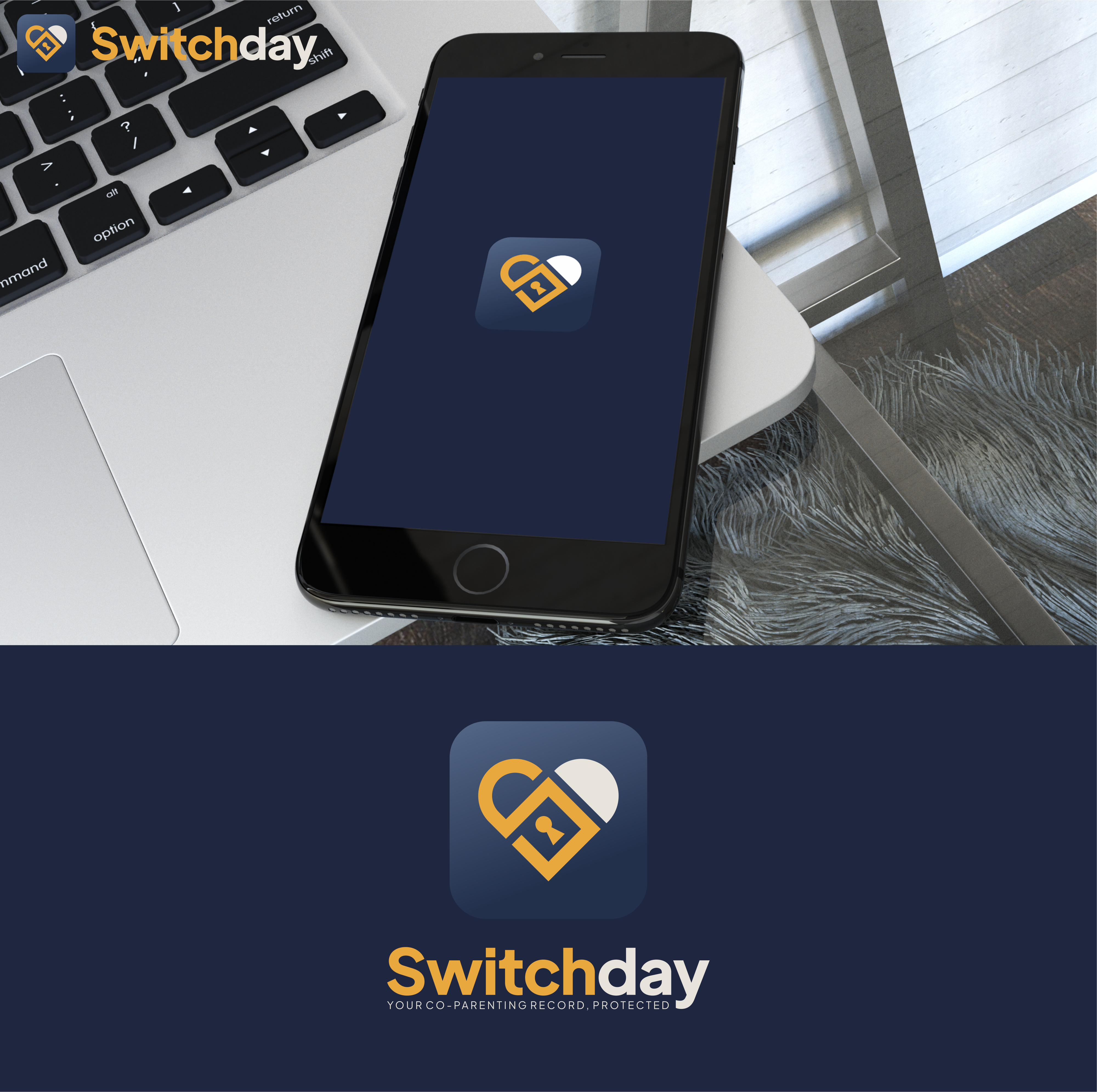
Logo design for a coparenting app/platform called Switchday. Switchday helps separated/divorced parents communicate, schedule, log expenses, etc - all communications on Switchday are tamper-proof and court-admissible. I have a rough icon design that I like the direction of, but isn't polished enough. Current icon is two arrows pointing at eachother, that look like the letter 'S" from afar. I'd like to keep the colors, but polish the design. I need the icon and feature graphics for google play and apple App Store. For the feature graphic:
Feature Graphic
- Size: 1024 × 500px (Google Play only, not used on iOS)
- Format: JPG or PNG, no transparency
- Content guidance: navy background (matching the icon's #2D3654-ish gradient), Switchday wordmark or logo, short tagline — something like "Co-parenting, documented." or "Your co-parenting record, protected."
- Keep text and logo centered/safe-zone — Play Console crops the edges on some devices
- No rounded corners (Google applies those)
- Should feel like a banner extension of the icon — same color palette, same amber/white accent
App Icon (for reference)
- iOS App Store: 1024 × 1024px PNG, no transparency, no rounded corners (Apple applies them)
- Google Play: 512 × 512px PNG, no transparency, no rounded corners
- Both stores want a flat file — Google also uses it as the adaptive icon base
Zielmarkt/( -märkte)
Separated and divorced parents
Industrie/Einheitstyp
Parenting/Legal/Productivity
Logo Text
Switchday
Logo Stile, die Sie interessieren können
Pictorial / Combination-Logo
Ein reales Objekt (Text optional)
Abstraktes Logo
Begrifflich / symbolisch (Text optional)
Zu verwendende Schriftarten
Andere Schriftarten erwünscht:
- Plus Jakarta Sans
Farben
Vom Kunden ausgewählte Farben für das Logo Design:
Sehen und fühlen
Jeder Schieber zeichnet eine der Charakteristiken der Marke des Kunden aus sowie den Stil, den euer Logo widerspiegeln sollte.
Elegant
Fett
Spielerisch
Ernst
Traditionel
Modern
Sympatisch
Professionell
Feminin
Männlich
Bunt
Konservativ
Wirtschaftlich
Gehobenes
Anforderungen
Muss haben
- Must utilize brand colors. Primary navy #2B3A5C Main brand color — backgrounds, logo Amber / gold #E8A83E Logo accent — the gold curve on the icon Amber (UI) #C4882A Slightly deeper amber used in the app Warm cream #E8E4DC App background
Schön zu haben
- Two arrows pointing at eachother, forming an S shape in the negative space between the arrows. I also like the idea of incorporating a lock/love lock?
Sollte nicht haben
- please don't submit in non-brand colors.