

 Aktualisieren
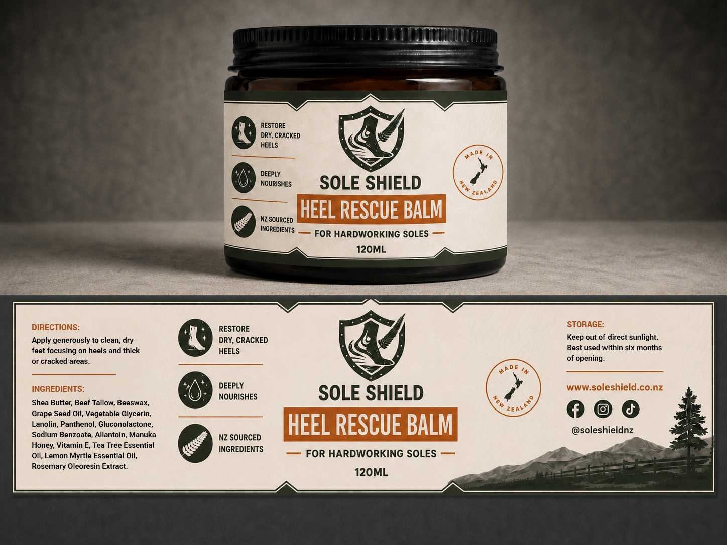
120ml Jar Label — Masculine Cosmetic Foot Balm for Cracked, Hardworking Heels
Wollen Sie auch einen Job wie diesen gewinnen?
Dieser Kunde bekam 230 Etikett-Designs von 40 Designern. Dabei wurde dieses Etikett-Design Design von Fiyaz Zaman als Gewinner ausgewählt.
Kostenlos anmelden Design Jobs finden
- Garantiert
-
 NZ$300
-
 230 Designs
-
 40 Designer
Etikett-Design Kurzbeschreibung
We need a print-ready wraparound label for a 120ml jar — a brown/amber glass jar with a black metal screw lid (file photo attached).
--DO NOT PUT A BARCODE ON THE LABEL PLEASE--
**PLEASE READ "DESIGN CROWD PROJECT BRIEF FINAL.MD" IN ATTACHED FILES IF YOU ARE SUBMITTING A DESIGN.**
The label is 190mm wide × 40mm high.
We need files to be in an .ai format with a 2mm bleed at the end.
Social media handle: @soleshieldnz (facebook, instagram and tiktok)
Sole Shield is a New Zealand foot-care brand making practical, no-nonsense products for hardworking men whose jobs wreck their feet. Our flagship product, Heel Rescue Balm, helps fix thick, cracked, hardworking skin.
Brand color scheme and overview is all in the brief file. You may add some brand aligned colors outside of the specified hex codes as you see fit to make a great design. Feel free to remove the "Sole Shield" text from the logo so Sole Shield is not doubled up on the front of the label
The tone we want: direct, rugged, and credible — like a workwear brand, not a spa brand. Most cracked-heel products on the market lean soft and feminine; we want to stand apart by looking like a serious fix for a real problem, made in New Zealand.
Full legal requirements for New Zealand cosmetic labelling (ingredients, directions, net contents, origin, etc.) are listed in the attached brief document — these are non-negotiable and must stay legible.
Please see the label attached "Label spacing guide" for this project's rough spacing guide. This label is the same size and sits well on the jar. This label doesn't need to be spaced quite as much as the Talos Label

Aktualisierungen
I want to run the design for a week - I feel 7 days is a good amount of time for designers to see the work, digest the brief and create something remarkable and memorable for Sole Shield.
Zielmarkt/( -märkte)
Working men in New Zealand whose jobs or lifestyle put heavy wear on their feet — tradies, farmers, hospital/shift workers, hunters, and outdoors people. Practical, value-driven buyers rather than luxury skincare shoppers.
Industrie/Einheitstyp
Beauty / Health & Wellness / Cosmetics
Zu verwendende Schriftarten

Andere Schriftarten erwünscht:
- Montserrat (bold, headings), Inter (regular, body)
Farben
Vom Kunden ausgewählte Farben für das Logo Design:
Sehen und fühlen
Jeder Schieber zeichnet eine der Charakteristiken der Marke des Kunden aus sowie den Stil, den euer Logo widerspiegeln sollte.
Elegant
Fett
Spielerisch
Ernst
Traditionel
Modern
Sympatisch
Professionell
Feminin
Männlich
Bunt
Konservativ
Wirtschaftlich
Gehobenes
Anforderungen
Muss haben
- All NZ cosmetic labelling requirements from the attached brief (product name, tag line, net contents, ingredients, directions, storage, made in NZ) — legible and complete, not omitted for aesthetics Fits 190mm × 40mm wraparound format for a 120ml brown jar with black lid Uses our existing brand colors: Deep Olive #3C4A34, Bone White #F4EFE6, Terracotta Clay #C1683D, and Warm Grey #4A4540 (exact palette in attached brief) Uses Montserrat (headings) and Inter (body) or close equivalents Incorporates our existing shield-and-wing logo (attached) Brand name and product name clearly readable from a normal shelf/bathroom-cabinet distance
Schön zu haben
- A style that could extend into a hero/product photo later, similar to the NZ-hills-backdrop look on our website (screenshot attached) — not required for the label itself, just good to keep in mind Original icon work (e.g. a small soak/apply/sock icon set) if it fits the rugged brand feel A design that could work as a small back-label/wraparound split if the front can't fit everything at a readable size
Sollte nicht haben
- No pastel colors, floral motifs, or delicate script fonts — this should never look like spa/luxury skincare. Don't introduce new brand colors outside the palette provided other than black.


