

 Aktualisieren
Rosemark Logo - Redesign the ROSE icon part of our logo
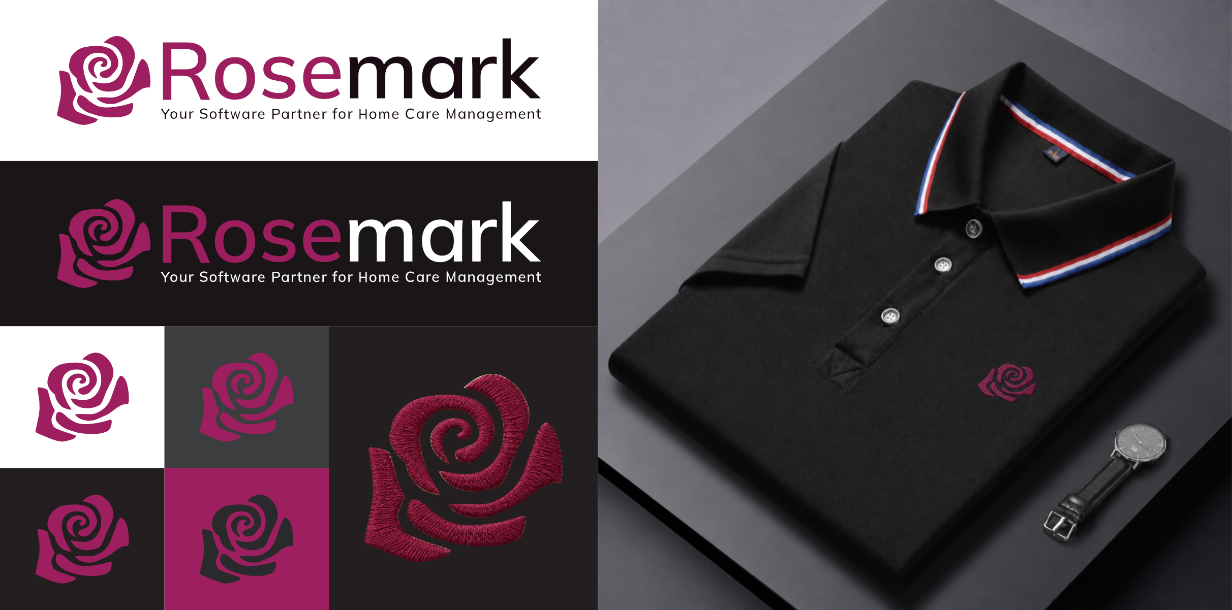
Wollen Sie auch einen Job wie diesen gewinnen?
Dieser Kunde bekam 299 Icon-Designs von 119 Designern. Dabei wurde dieses Icon-Design Design von Zarina Tama als Gewinner ausgewählt.
Kostenlos anmelden Design Jobs finden
- Garantiert
- Gebündeltes Projekt 1
-
 US$190
-
 299 Designs
-
 119 Designer
Icon-Design Kurzbeschreibung
Refresh the Rosemark logo to modernize the brand while maintaining recognition and continuity with the existing identity. The updated logo should retain the rose icon concept while improving scalability, versatility, and visual consistency across digital and print applications. I have included our current logo so you can see the geometrical rose icon we currently have and want to replace.
● Modernize the existing Rosemark logo
● Refine the rose icon for improved clarity and scalability
● Update the Rosemark wordmark with a more versatile typeface
● Improve legibility and recognition at every application size, from favicon to trade show display
● Create a flexible logo system for web, software, mobile, print, promotional products, and embroidery
Brand Attributes
The logo should feel:
● Professional
● Trustworthy
● Established
● Approachable
● Modern
● Dependable
● Simple
● Human
● Open
Avoid anything that feels:
● Trendy
● Tech startup-style
● Overly corporate
● Overly feminine
● Generic healthcare branding (clinical, sterile, or Medicare/home health imagery - Rosemark serves private duty home care, not clinical care)
Rose Icon Direction
Desired Characteristics
● Replace the existing Rosemark rose
● Simplified for modern use
● Front-facing open rose bloom (facing the viewer)
● Multiple petals clearly visible and opening outward
● Strong, recognizable silhouette
● Scalable for small sizes and embroidery
● Suitable for one-color applications
Visual Style
● Organic and natural
● Clean and modern interpretation of a rose bloom
● Balanced composition without rigidity
● Clear rose identity at small sizes
Avoid
● Top-down rose views (rosette or spiral-like forms)
● Stems or leaves
● Excessive detail
● Sharp angular petals
● Overly abstract interpretations
● Designs that lose clarity when scaled down
● Thin strokes or fine detail that won't translate to thread at small sizes

Aktualisierungen
A designer sent me a message asking me to extend the deadline. I'm not happy with the current designs, so I'd like to extend.
Hi everyone, thanks for the submissions so far! I want to give some direct feedback because I'm seeing a pattern that doesn't match the brief.
Please stop submitting: geometric or faceted rose interpretations, anything with sharp angular petals, busy or overly detailed designs, and abstract shapes that don't clearly read as a rose at a glance.
What I actually need: a simple, front-facing open rose bloom with soft, organic petal shapes. Think of a rose a child could recognize immediately, not a rose reinterpreted as a design exercise. The petals should feel rounded and natural, not faceted or angular. No stems, no leaves, no rosette or spiral top-down views.
If you're unsure whether your concept fits, ask yourself: does this look clean and clear at the size of a favicon? Would it embroider well on a polo shirt without losing detail? If the answer is no to either, it's probably too complex for this project.
I'd rather see five simple, well-executed sketches than one highly detailed illustration. Simplicity and scalability are the priority here, not visual complexity.
Thanks for understanding, and I'm looking forward to seeing concepts that hit the mark.
Added Tuesday, August 18, 2026
Apologies everyone. I had an unforeseen outage last week, so I wasn't able to respond to questions. I'll review and respond to messages today and tomorrow.
Added Tuesday, 08 September 2026
Zielmarkt/( -märkte)
Non-Medical Home Care Agencies
Industrie/Einheitstyp
SaaS for Home Care (not Home Health)
Zu verwendende Schriftarten

Farben
Vom Kunden ausgewählte Farben für das Logo Design:
Sehen und fühlen
Jeder Schieber zeichnet eine der Charakteristiken der Marke des Kunden aus sowie den Stil, den euer Logo widerspiegeln sollte.
Elegant
Fett
Spielerisch
Ernst
Traditionel
Modern
Sympatisch
Professionell
Feminin
Männlich
Bunt
Konservativ
Wirtschaftlich
Gehobenes
Anforderungen
Muss haben
- Color Direction Primary - "Rosemark pink" (#9D1F5F)
Schön zu haben
- ● Front-facing open rose bloom (facing the viewer) ● Multiple petals clearly visible and opening outward ● Strong, recognizable silhouette
Sollte nicht haben
- Avoid ● Top-down rose views (rosette or spiral-like forms) ● Stems or leaves ● Excessive detail ● Sharp angular petals ● Overly abstract interpretations ● Designs that lose clarity when scaled down ● Thin strokes or fine detail that won't translate to thread at small sizes
Dateien
Alle Dateien herunterladen - 1,0 MB
Zahlungen
Gesamt
US$190
Projekt-Deadline
01 Sep 2026 03:36:43 UTCProjekt Upgrades
Gebündelte(s) Projekt(e)
- übergebe US$69 Logo-Design an den Sieger
