

 Aktualisieren
Northwest Tennessee Human Resource Agency logos
Wollen Sie auch einen Job wie diesen gewinnen?
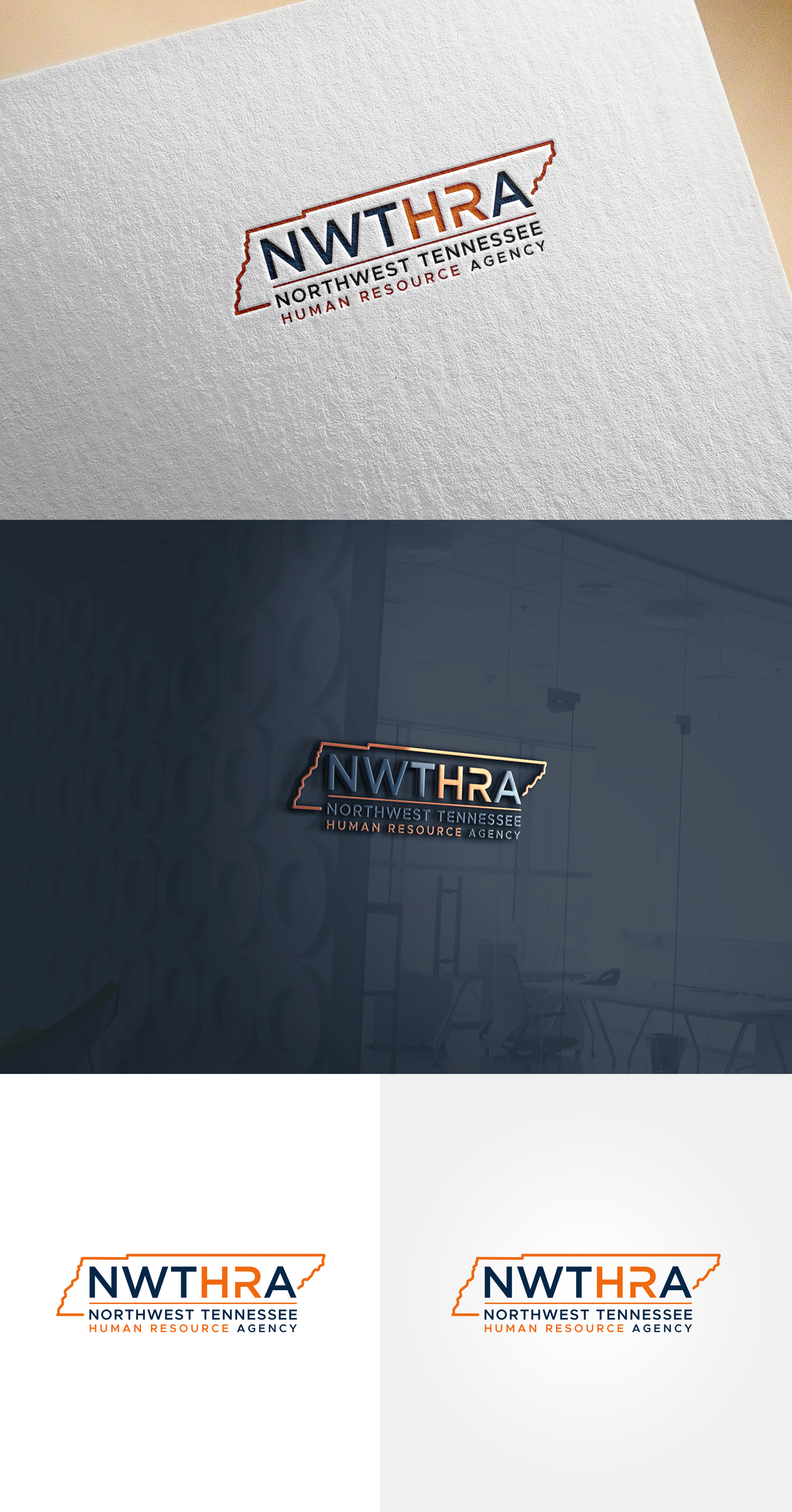
Dieser Kunde bekam 197 Logo-Designs von 62 Designern. Dabei wurde dieses Logo-Design Design von Soonia als Gewinner ausgewählt.
Kostenlos anmelden Design Jobs finden
-
 US$300
-
 197 Designs
-
 62 Designer
Logo-Design Kurzbeschreibung
Northwest Tennessee Human Resource Agency (NWTHRA)
We are looking for a modern, timeless logo for a regional public service organization that helps people live independently and strengthens communities across nine counties in Northwest Tennessee.
Our work includes Meals on Wheels, transportation, aging services, caregiver support, housing assistance, and other community-based programs. We are a trusted organization, but we want a logo that feels more approachable and connected than a traditional government agency.
The logo should communicate:
* Community
* Connection
* Trust
* Compassion
* Independence
* Hope
* Regional collaboration
We prefer a clean, simple, professional design that is memorable and will remain relevant for many years. Please avoid cliché nonprofit imagery such as hands holding hearts, medical crosses, stick figures, or generic clip art.
We're open to abstract concepts that represent connection, movement, growth, or people coming together. We do **not** want a logo that simply outlines our counties.
Preferred colors include blue and orange, similar to the Denver Broncos.
The logo should work well on vehicles, apparel, signage, business cards, social media, and printed materials, and should be easy to recognize in both color and black and white.
Uploaded pictures include our old logos - NWTHRA & NWTDD logos. The wordmark is ok, but more of a placeholder until with choose a new design. Delta HRA, MSDD & UCDD are clean logos we like.
Zielmarkt/( -märkte)
seniors, general public
Industrie/Einheitstyp
non-profit, public transportation, meals on wheels, homemaker services
Logo Text
Northwest Tennessee Human Resource Agency / NWTHRA
Logo Stile, die Sie interessieren können
Pictorial / Combination-Logo
Ein reales Objekt (Text optional)



Zu verwendende Schriftarten

Farben
Vom Kunden ausgewählte Farben für das Logo Design:
Sehen und fühlen
Jeder Schieber zeichnet eine der Charakteristiken der Marke des Kunden aus sowie den Stil, den euer Logo widerspiegeln sollte.
Elegant
Fett
Spielerisch
Ernst
Traditionel
Modern
Sympatisch
Professionell
Feminin
Männlich
Bunt
Konservativ
Wirtschaftlich
Gehobenes
Anforderungen
Muss haben
- the agency name written out
Schön zu haben
- the NWTHRA upload that shows the house and van using the negative space is something we have played with but couldn't make work. It's missing the food element
Sollte nicht haben
- no obviously generated AI designs


