

 Aktualisieren
Design a Bold Tradeshow Backdrop for a Sustainable Cleaning Technology
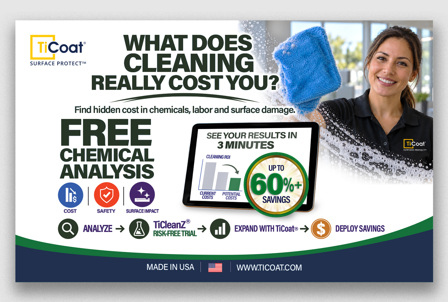
Wollen Sie auch einen Job wie diesen gewinnen?
Dieser Kunde bekam 106 Grafik-Designs von 31 Designern. Dabei wurde dieses Grafik-Design Design von raymark als Gewinner ausgewählt.
Kostenlos anmelden Design Jobs finden
- Garantiert
-
 US$110
-
 106 Designs
-
 31 Designer
Grafik-Design Kurzbeschreibung
We need a professional, high-impact 10' × 8' tradeshow backdrop for TiCoat®, a commercial cleaning technology company. 143.75" x 90" high and needs bleeds in the 143.75" direction for printing but the graphic area is 10' wide.
Our first event will have an audience that includes K–12 school administrators, facility managers, business officials, and custodial decision-makers. However, this backdrop will be used at multiple future trade shows across different commercial and institutional markets.
The design therefore needs to be universal rather than specifically education- or school-themed.
Our goal is to stop attendees as they walk past the booth and immediately communicate a simple message:
Safer and more sustainable cleaning can also cost substantially less than conventional cleaning chemicals.
We want the design to feel modern, innovative, clean, sustainable, credible, commercial, and premium. It should resonate with K–12 decision-makers while being equally appropriate at events serving commercial facilities, healthcare, hospitality, government, property management, transportation, and other institutional markets.
It should NOT look like a traditional janitorial supply advertisement and should not be overly busy.
The most important messages need to be understandable from approximately 10–20 feet away.
Required Messaging
The primary headline should be:
SUSTAINABLE CLEANING
DOES NOT HAVE TO BE EXPENSIVE.
Three major value propositions should be prominently displayed:
FREE
Cleaning Chemical Analysis
See how much you can save.
SAVE UP TO 60% or More
on Cleaning Chemical Costs
AS LITTLE AS $0.27/GALLON
We would also like a strong secondary message incorporated into the design:
SMARTER CLEANING.
High Performance. Low Cost. Safer.
Visual Direction — Important
Rather than showing a K–12 school hallway or other environment that limits the backdrop to the education market, we want a sophisticated, universal commercial or institutional environment.
This could be a bright, contemporary commercial facility, lobby, corridor, office environment, public building, or other premium architectural space that could reasonably represent many different types of facilities.
The environment should communicate:
Cleanliness • Safety • Sustainability • Professionalism • Efficiency • High Performance
We want someone from a school, hospital, hotel, office building, airport, government facility, or other commercial property to be able to look at the backdrop and relate the imagery to their own facility.
Please avoid imagery that makes the backdrop industry-specific.
We also want to avoid clichéd environmental imagery. The design does not need to be covered in leaves, trees, water droplets, recycling symbols, or other obvious "green" graphics to communicate sustainability. We prefer a sophisticated commercial interpretation of sustainability.
Color & Brand Direction
We want the overall color palette to stay primarily within:
Blues — consistent with our corporate identity
Greens — to reinforce sustainability, safety, efficiency, and environmental responsibility
White — strongly encouraged for clean space, contrast, and an open contemporary appearance
Black — should be limited primarily to text where necessary for readability
Please avoid making black a major background or dominant design color.
We want the finished display to have a bright, clean, sophisticated, sustainable look and feel rather than a dark or industrial appearance.
The design should use significant negative space and a strong visual hierarchy.
Less is more.
We prefer a few large, powerful messages that can be understood quickly rather than numerous small bullet points, paragraphs, or icons.
Creative Freedom
The attached concept image is provided to communicate our general direction and messaging only.
It does not need to be copied.
We are specifically running this contest because we want designers to improve upon our initial concept and show us different creative approaches to presenting the TiCoat value proposition.
We are open to creative interpretations of the commercial environment, composition, typography, use of negative space, and how the three major financial benefits are presented.
The finished design should feel like an innovative commercial technology brand, not simply another cleaning chemical company.
Corporate Logo — Very Important
We are attaching our official TiCoat® corporate logo for use in the design.
DO NOT redraw, recreate, modify, stylize, reinterpret, trace, or AI-generate the TiCoat logo.
The supplied corporate logo must be inserted directly into the artwork exactly as provided, maintaining its original proportions, colors, typography, trademark elements, and graphic design.
The logo should generally appear in the upper-left area of the backdrop but should not overwhelm the primary marketing message.
Printer Template & Graphic Sizing
We are also attaching the printer's official graphic template and instructions for the 8' × 8' tension-fabric display.
Designers should create their artwork using these supplied specifications so the winning design can be transferred directly into production.
The printer requires that the original document size not be changed, artwork be created on the designated design layer or a new layer, images be embedded, text be converted to outlines, and the finished production artwork be supplied as a PDF.
Please pay particular attention to the bleed area, finished size, and safe artwork area when positioning important text, graphics, and the corporate logo.
Physical Booth Context
The backdrop will sit behind an 8' tradeshow table.
The complete booth will also contain:
A blue stretch tablecloth with the TiCoat corporate logo
TiCleanZ and TiCoat product containers and samples on the table
An EcoPromix chemical mixing/dilution station displayed on an elevated stand to the left
A television/monitor to the right demonstrating our online ROI cost-savings calculator
Because these other booth elements will explain our products and technology in greater detail, the backdrop should NOT attempt to explain everything we do.
Its primary purpose is to stop traffic, establish the TiCoat brand, and communicate our core economic and sustainability value proposition.
Final Deliverables
The winning designer must provide artwork properly sized and positioned using our supplied 8' × 8' tension-fabric display template.
Final files should include:
Print-ready, high-resolution PDF
Editable source/vector artwork
All images embedded
Fonts converted to outlines
Artwork correctly positioned within the supplied printer template
Original TiCoat corporate logo incorporated without modification
The 3–5 Second Test
This is perhaps the most important requirement.
Someone walking down a tradeshow aisle should be able to look at the backdrop for 3–5 seconds and understand:
TiCoat offers safer, sustainable, high-performance commercial cleaning — at a lower cost.
The three offers we particularly want them to remember are:
FREE CHEMICAL ANALYSIS
SAVE UP TO 60%
AS LITTLE AS $0.27/GALLON
The overall takeaway should be:
Sustainable cleaning does not have to cost more.
We want the winning design to make that message immediately understandable, credible, and memorable.
Farben
Vom Kunden ausgewählte Farben für das Logo Design:
Sehen und fühlen
Jeder Schieber zeichnet eine der Charakteristiken der Marke des Kunden aus sowie den Stil, den euer Logo widerspiegeln sollte.

