

 Aktualisieren
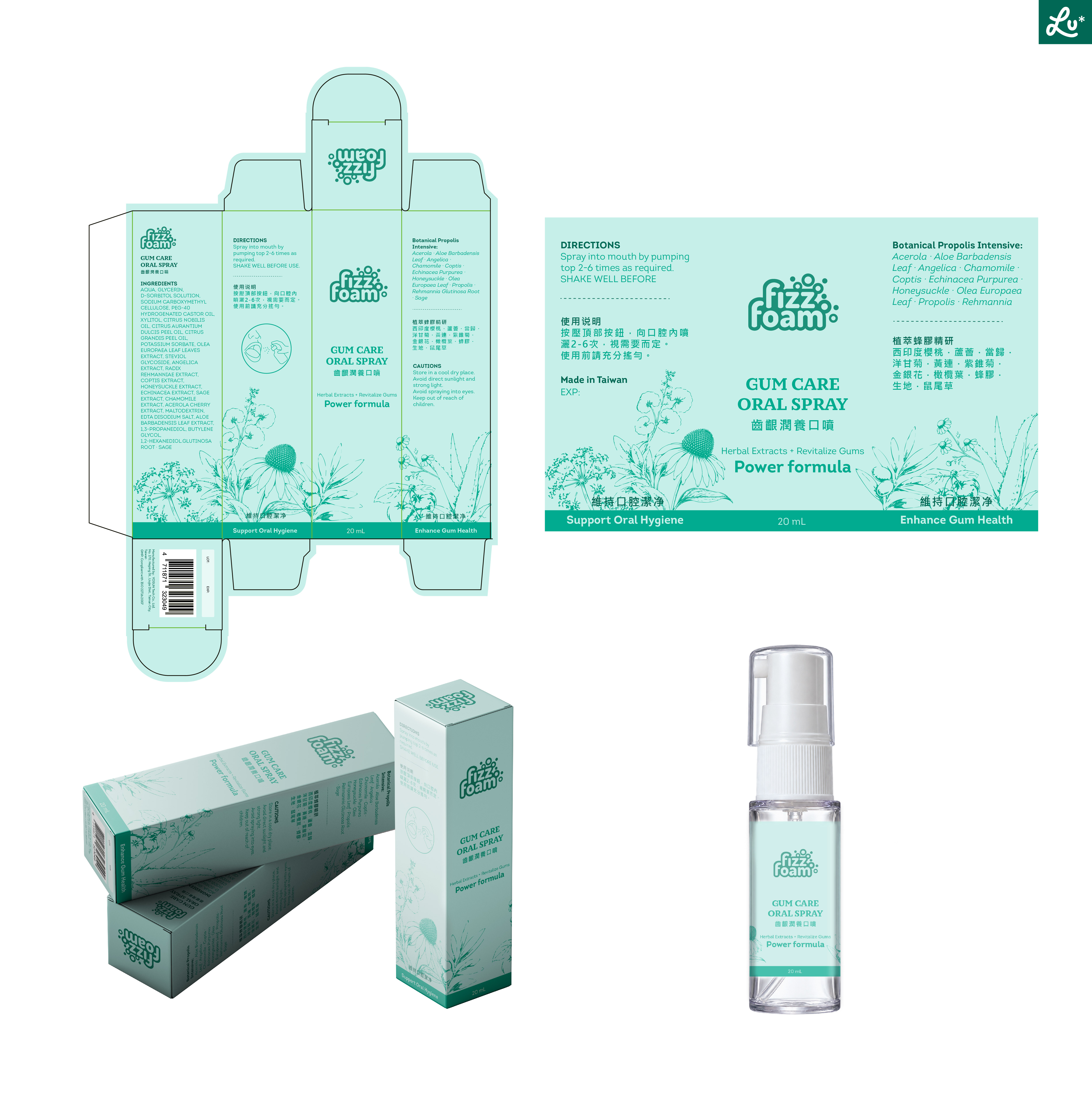
Gum Care Oral Spray — Packaging Design (Outer Carton + Bottle Label)
Wollen Sie auch einen Job wie diesen gewinnen?
Dieser Kunde bekam 66 Verpackungs-Designs von 29 Designern. Dabei wurde dieses Verpackungs-Design Design von Lulu* als Gewinner ausgewählt.
Kostenlos anmelden Design Jobs finden
- Garantiert
-
 NZ$590
-
 66 Designs
-
 29 Designer
Verpackungs-Design Kurzbeschreibung
1. Project Overview
We currently have a "Gum Care Gel" on the market, and we are very satisfied with its packaging design. We are now launching a new product in the same line, "Gum Care Oral Spray." The packaging should extend the design style and visual language of the gel, so that consumers immediately recognize both products as belonging to the same brand family — while still being clearly distinguishable to avoid confusion.
Product facts:
Gel: dark opaque bottle, thick transparent liquid
Oral spray: white transparent bottle, watery transparent liquid
2. Designer Qualifications & Geographic Requirements
Industry experience: The designer must have packaging design experience in the cosmetics or premium personal care / household care category.
Geographic requirement: This project is open only to designers based in Europe, North America, or Oceania. Designers based in Asia will not be considered, including Asian designers with Western design experience or living experience in the West. This is a clear screening criterion for this project. Thank you for your understanding.
3. Design Objectives
Extend the family identity: Extract and carry forward the core visual elements from the gel packaging.
Clear differentiation: Create noticeable differences in color, layout, and other aspects so the two products can be quickly distinguished.
Maintain premium quality: Preserve the professional, gentle, and high-quality tone established by the gel packaging.
4. Core Design Requirements
4.1 Extending the Gel's Visual DNA
Please identify and retain the following key elements from the gel packaging:
Typography: The provided font files used on the gel packaging must be used. No font substitution is allowed.
Color DNA: Maintain a green color family connection, but do not directly reuse the dark ink green as the primary color. Red, blue, and other non-green color families are excluded. The specific hue, lightness, and saturation are left to the designer's creative discretion.
Brand logo placement and presentation
Layout structure and information hierarchy
Material and finishing tendencies (if applicable)
4.2 Establish Clear Differentiation
On top of the retained DNA, create differentiation through color, layout, product name typography, or other means. The specific approach is left to the designer's discretion based on the product characteristics.
4.3 Avoid Confusion
Do not directly replicate the gel carton. Consumers should be able to distinguish the two products within seconds.
4.4 Usage Icon
An illustrated usage icon is required on the outer carton, visually communicating "press and spray toward the mouth." The style should be consistent with the overall design. The specific placement and form are left to the designer.
4.5 Typography & Layout Flexibility
All text content for the outer carton and bottle label will be provided. Specific positions and presentation forms are not prescribed. The designer is encouraged to arrange the content based on design needs and product understanding.
4.6 Key Evaluation Criterion: White Space
White space is one of the core evaluation criteria for this project. Please pay strong attention to negative space in layout and composition. Avoid crowded information. Create a sense of breathing room and premium quality, so that the outer carton — despite its limited size — feels clear, professional, and refined.
5. Delivery Process
Stage 1: Outer Carton Design Demo
Please first submit an outer carton design demo, including:
Flat unfolded carton artwork (using the provided die-cut template)
3D renderings of the carton from 2–3 angles
A brief design rationale (how the gel's visual identity is extended and where the differentiation lies)
Stage 2: Outer Carton Design Confirmation
Internal review and revision until the outer carton design is finalized.
Stage 3: Bottle Label Design
After the outer carton is confirmed, design the oral spray bottle label based on the same visual system. The label dimensions are 49 mm × 77 mm, with rounded corners on all four sides. The design must fit the actual bottle size and curvature.
6. Provided Materials
Gel packaging images
Oral spray bottle photos / dimension drawings (white transparent bottle)
Oral spray outer carton die-cut template
Brand logo and related visual elements
Font files used on the gel packaging
Complete text content for both the outer carton and bottle label
7. Notes
Maintain a professional oral care brand tone. Avoid looking too food-like or pharmaceutical.
The oral spray is a watery transparent liquid in a white transparent bottle. The primary color design should coordinate well with the bottle.
The carton is compact; all information must remain clear and legible.
For the bottle label, consider the curved surface of the bottle and how the transparent bottle body and liquid color affect visual presentation.
Farben
Vom Kunden ausgewählte Farben für das Logo Design:
Sehen und fühlen
Jeder Schieber zeichnet eine der Charakteristiken der Marke des Kunden aus sowie den Stil, den euer Logo widerspiegeln sollte.


