

 Aktualisieren
Website for global marketing and event agency
Wollen Sie auch einen Job wie diesen gewinnen?
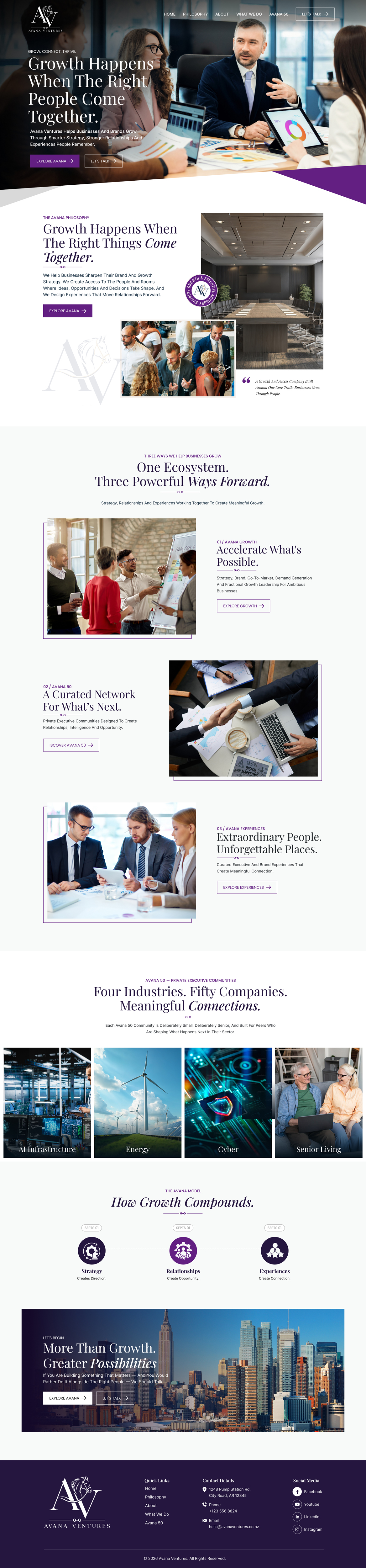
Dieser Kunde bekam 92 Web-Designs von 31 Designern. Dabei wurde dieses Web-Design Design von Sbss als Gewinner ausgewählt.
Kostenlos anmelden Design Jobs finden
- Garantiert
- Gebündeltes Projekt 1
-
 US$370
-
 92 Designs
-
 31 Designer
Web-Design Kurzbeschreibung
AVANA VENTURES — WEBSITE CREATIVE BRIEF
Project Overview
We are redesigning the homepage for Avana Ventures, a growth and access company built around one core belief:
Businesses grow through people.
Avana brings together three distinct but connected businesses:
Avana Growth — strategy, brand, marketing and growth advisory
Avana 50 — private executive communities connecting leaders, companies and opportunities
Avana Experiences — highly curated experiences designed to deepen relationships and create meaningful connection
The website should make Avana feel like a high-end, sophisticated enterprise, not a marketing agency, event company, networking group or traditional consulting firm.
The design should immediately communicate:
Growth. Access. Relationships. Intelligence. Experience.
The Feeling We Want
The site should feel like:
Ritz-Carlton × private members club × modern global advisory firm.
Think sophisticated, confident, warm and highly curated.
It should feel like you have entered a world where interesting people, important conversations and meaningful opportunities happen.
We want visitors to feel:
“I want to be in those rooms.”
The brand should feel premium and exclusive without being pretentious.
It should feel human without being casual.
It should feel luxurious without looking like a hotel website.
And it should feel powerful without looking like a financial services company.
VERY IMPORTANT: What We Do NOT Want
Please do not use:
- Beige
- Cream
- Tan
- Gold
- Camel
- Sage green
- Generic corporate blue
- Large areas of muted neutral colors
- “Boho luxury”
- Startup gradients
- Generic consulting imagery
- Stock photos of people pointing at laptops
- Overly feminine branding
- Anything that feels like a spa, wedding company or lifestyle blog
The previous design leaned too heavily into beige/cream and felt too soft.
We want substantially more contrast, sophistication and visual authority.
Color Direction
Our preferred starting palette is:
Deep Navy
#10283B
This should be the primary anchor color.
Emerald Green
Approximately:
#0F5A4E
The emerald should be deep, rich and jewel-toned — not bright green, Kelly green or teal.
White
#FFFFFF
Soft White
#F8FAF9
Charcoal
#23282C
The overall impression should be:
NAVY + EMERALD + WHITE
Use emerald thoughtfully as an accent rather than covering the entire site with green.
We would like the designer to explore how navy and emerald can work together in a sophisticated, editorial way.
Logo Treatment
The Avana Ventures logo should work primarily in:
Navy + emerald
or
all navy
On dark backgrounds, it can be white.
We do not want gold or beige incorporated into the brand.
The logo should feel clean and sophisticated rather than decorative.
Typography
Typography is extremely important.
We want a strong contrast between:
Elegant editorial serif headlines
and
clean modern sans-serif body copy/navigation.
The headline typography should feel similar to a luxury publication, private club or sophisticated hospitality brand.
Possible directions:
Canela
Editorial New
Cormorant Garamond
Playfair Display
or something similar
Paired with something like:
Neue Haas Grotesk
Inter
Avenir
Manrope
Headlines should be large, confident and beautiful.
There should be generous negative space.
Avoid small, crowded website typography.
Photography Direction
Photography should communicate:
People in consequential rooms.
We want sophisticated editorial photography showing:
private dinners
executive conversations
beautiful venues
intimate gatherings
leaders talking over drinks
boardrooms
global destinations
beautiful architecture
small groups connecting
high-end experiences
People should look natural and engaged — not posed.
Avoid generic “business meeting” photography.
We want the viewer to feel:
access
connection
possibility
The imagery should feel cinematic and editorial.
Think more:
Condé Nast / Soho House / Ritz / Monocle
than:
corporate stock photography.
Homepage Story
The homepage should tell a very clear story.
1. HERO
The hero should immediately feel impressive.
Suggested headline:
Businesses Grow Through People.
Supporting message:
Avana Ventures helps businesses and brands grow through smarter strategy, stronger relationships and experiences people remember.
Possible brand line:
Grow. Connect. Thrive.
CTA options:
Explore Avana
and/or
Let’s Talk
The hero should ideally use a beautiful full-width photograph showing sophisticated people interacting in an elevated setting.
A dark navy overlay may be used so the headline reads beautifully.
2. AVANA PHILOSOPHY
Headline:
Growth happens when the right things come together.
Supporting idea:
We help businesses sharpen their brand and growth strategy. We create access to the people and rooms where ideas, opportunities and decisions take shape. And we design experiences that move relationships forward.
This section should feel spacious and editorial.
Potential layout:
Large photography on one side.
Large serif headline on the other.
3. THREE WAYS WE HELP BUSINESSES GROW
This should visually introduce the three businesses.
AVANA GROWTH
Grow
Strategy, brand, go-to-market, demand generation and fractional growth leadership.
Possible headline:
Accelerate What’s Possible.
AVANA 50
Connect
Private executive communities designed to create relationships, intelligence and opportunity.
Possible headline:
A Curated Network for What’s Next.
AVANA EXPERIENCES
Thrive
Curated executive and brand experiences that create meaningful connection.
Possible headline:
Extraordinary People. Unforgettable Places.
These should feel like three premium editorial destinations, not three ordinary service cards.
Each should include strong imagery.
Consider a dark navy lower panel with white type and subtle emerald details.
4. AVANA 50
This section should feel particularly exclusive.
Headline:
Four industries. Fifty companies. Meaningful connections.
Avana 50 currently includes private communities focused on:
AI Infrastructure
Energy
Cyber
Senior Living
The visual treatment should make these feel like four doors into exclusive communities.
Use cinematic images.
This section could work beautifully on a full deep-navy background.
5. HOW THE MODEL WORKS
Headline:
How growth compounds.
Three elements:
01 Strategy
Creates direction.
02 Relationships
Create opportunity.
03 Experiences
Create connection.
This should be simple, elegant and highly visual.
Large numbers, generous white space and restrained typography.
Do not over-design this section.
6. FINAL CTA
The final section should feel emotional and aspirational.
Possible headline:
Let’s grow together.
or
More Than Growth. Greater Possibilities.
Use a strong lifestyle/executive image — perhaps a beautiful terrace, destination or intimate gathering.
CTA:
Let’s Talk
Overall Design Philosophy
The website should feel editorial rather than templated.
We prefer:
Large photography
Large headlines
Strong contrast
Generous negative space
Minimal copy
Elegant transitions
Sophisticated layout
Unexpected cropping
Beautiful details
We do not want everything contained inside little boxes.
Let sections breathe.
Use photography and typography as the primary visual storytelling tools.
What Avana Should Feel Like
If the design is successful, someone visiting the homepage should think:
This company has access.
This company knows interesting people.
This company operates at a high level.
This company can help me grow.
And most importantly:
I want to be part of this world.
Three Brand Words
If designers remember only three words, they should be:
Sophisticated. Human. Connected.
And if there is a fourth:
Powerful.
One final direction to designers
Please do not simply redesign the previous site. We are looking for a new visual identity and point of view. Take creative risks within the navy/emerald/white direction. The goal is to make Avana feel distinctive, modern and premium — a company built around growth, access and extraordinary people.

Aktualisierungen
Gathering more feedback
Zielmarkt/( -märkte)
C suite execs
Industrie/Einheitstyp
Marketing
Anzahl benötigter Seiten
2 page
Sehen und fühlen
Jeder Schieber zeichnet eine der Charakteristiken der Marke des Kunden aus sowie den Stil, den euer Logo widerspiegeln sollte.
Elegant
Fett
Spielerisch
Ernst
Traditionel
Modern
Sympatisch
Professionell
Feminin
Männlich
Bunt
Konservativ
Wirtschaftlich
Gehobenes
Anforderungen
Sollte nicht haben
- My project should not look like it went through an AI Designer. I do not want it to look so dark that it is not inviting every design. I have seen so far looks like AI I am looking for someone to breakthrough.
Dateien

Zahlungen
Gesamt
US$370
Projekt-Deadline
08 Okt 2026 20:09:21 UTCProjekt Upgrades
Gebündelte(s) Projekt(e)
- übergebe US$69 Logo-Design an den Sieger
