Trade show display
Wollen Sie auch einen Job wie diesen gewinnen?
Dieser Kunde bekam 40 Grafik-Designs von 10 Designern. Dabei wurde dieses Grafik-Design Design von Bins als Gewinner ausgewählt.
Kostenlos anmelden Design Jobs finden- Garantiert
-
 US$530
-
 40 Designs
-
 10 Designer
Grafik-Design Kurzbeschreibung
All-
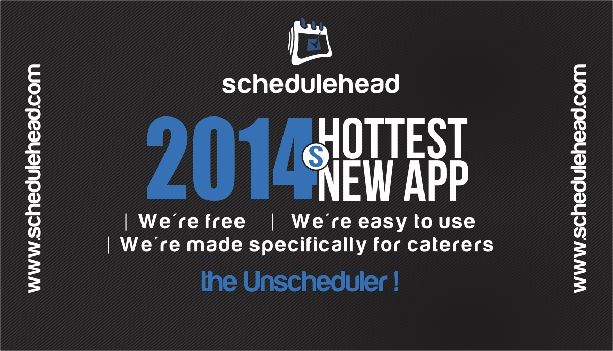
We are designing a trade show display. This is a 10' display that also includes a display stand (a mini table top wrap).
Please see the two images (example stand and example wall) of an example FINISHED product. You can also refer to the specs.pdf for the actual dimensions you'll need to design the product.
We've also attached our logo and our corporate font (harabara).
Please take a quick look at our website (schedulehead.com) and our Facebook.com/schedulehead to get a quick feel for our product. We're an app that automates the process of scheduling employees for catering companies.
Here's what we want to communicate:
1. We're free
2. We're easy to use
3. We're made specifically for caterers
Our slogan is:
the UNscheduler
Bright colors are good. We don't want any stock art or images of people or really much images at all, if any. Just nice typography with good supporting shapes. Just focus on the typography to communicate the message with colored background to separate the ideas.
PLEASE MAKE THE TYPOGRAPHY LARGE! You should be able to read this from far away! No clutter, no small text, and no text towards the bottom! THINK SIMPLICITY!
Aktualisierungen
| Hi, Can we use any images ? if you have any images please share with us. thanks Bins By Bins |
| I don''t have any images.. I''m thinking that supporting artwork will work just fine. However, we are thinking of creating some big type that says something like "2014''s hottest new app" or something like that. We''re not really particular about images themselves, so supporting graphics will work fine. We just need to communicate that we''re free, easy, and the new trend for scheduling in 2014. Does that help? Thanks for the comment, please let me know if you have more questions! By You |
| Let me clarify, by supporting artwork, I just mean the shapes and basic design to support the typography. |
Added Wednesday, February 12, 2014
Project Deadline Extended
Reason: Most of the submitted designs haven't read the brief closing and contain too many images, we don't want any images.
Since we spent a lot of extra money on this project we are extending the deadline by 3 more days.
Thank you!
Added Monday, February 17, 2014
Please make sure you read the brief carefully! We don't want any images and the text should be clear to read. Thank you!
Added Wednesday, February 19, 2014
Thanks everyone for your submissions! In about 12 hours we'll go through everything and pick out all the winners! :)
Added Friday, February 21, 2014
Zielmarkt/( -märkte)
Our target market is catering company (as in caterers of food for parties, weddings, etc) owners or managers. Design should be hip and trendy looking since we're a technology business but very clear and easy to read and understand.
Industrie/Einheitstyp
Catering
Zu verwendende Schriftarten
Farben
Vom Kunden ausgewählte Farben für das Logo Design:
Sehen und fühlen
Jeder Schieber zeichnet eine der Charakteristiken der Marke des Kunden aus sowie den Stil, den euer Logo widerspiegeln sollte.