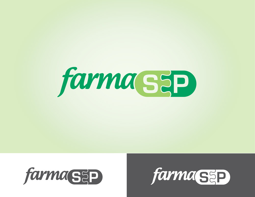
Logo design for farmaSEP
Wollen Sie auch einen Job wie diesen gewinnen?
Dieser Kunde bekam 57 Logo-Designs von 28 Designern. Dabei wurde dieses Logo-Design Design von dannyhbatista als Gewinner ausgewählt.
Kostenlos anmelden Design Jobs finden- Garantiert
-
 US$400
-
 57 Designs
-
 28 Designer
Logo-Design Kurzbeschreibung
We are looking for a logo for new company called farmaSEP. FarmaSEP helps people find the best prices locally for their meds. The logo will be a combination of the following to companies...
1. www.saberespoder.com
This is the "parent" company and you will notice their "SEP" logo. Hence the name farmaSEP. The branding for farmaSEP will be based off of SABEResPODER's branding. Please utilize the colors, look, and feel from this company. Also, please visit their site to be familiar with their mission.
2. http://saberespoder.goodrx.com
This is the online tool where the winning logo will find a new home.
Attached is SABEResPODER's logo to assist in your task. Aside from aligning the logo with SABEResPODER's brand here are some other things to keep in mind:
- we strongly encourage SEP to stay capitalized to keep with the brand
- farma (Is derived from the spanish word farmacia meaning Pharmacy)
- You have liberty in how both parts "farma" and "SEP" come together... meaning all caps, cap the f, leave farma lowercase, make it a different font, color, or not.
- using the puzzle pieces would be great... not required
- not a huge fan of completely getting away from the initial "SEP" logo in the farmaSEP logo... but also open to creative ways to combine the two or almost leaving the "SEP" logo intact.
- Not to restrict creativity... but initial thoughts are to keep the "SEP" logo intact as much as possible and find a creative way to include "farma" whether by adding the text next to the "SEP" logo or by incorporating the puzzle strategy someway. Again, please feel free to get creative as well.
Aktualisierungen
Hello everyone and thank you for the submissions so far. We will be providing feedback individually but want to state that the SEP portion of the logo cannot change. The attached logo must remain intact. But is provided for the ability to match colors and to use or add the farma element.
Added Friday, February 21, 2014
Project Deadline Extended
Reason: still looking for something the client is happy with.
Added Tuesday, March 04, 2014
Zielmarkt/( -märkte)
Spanish speaking consumers looking for the best pricing on medications
Industrie/Einheitstyp
It Company
Logo Text
farmaSEP
Logo Stile, die Sie interessieren können
Emblem-Logo
Logo eingeschlossen in einer Form
Pictorial / Combination-Logo
Ein reales Objekt (Text optional)
Abstraktes Logo
Begrifflich / symbolisch (Text optional)
Wortmarke-Logo
Word oder namensbasiertes Logo (nur Text)
Zu verwendende Schriftarten
Sehen und fühlen
Jeder Schieber zeichnet eine der Charakteristiken der Marke des Kunden aus sowie den Stil, den euer Logo widerspiegeln sollte.
Elegant
Fett
Spielerisch
Ernst
Traditionel
Modern
Sympatisch
Professionell
Feminin
Männlich
Bunt
Konservativ
Wirtschaftlich
Gehobenes
Anforderungen
Muss haben
- must align with SABEResPODER's branding (colors, look, and feel, etc)
Schön zu haben
- Utilize the SEP puzzle strategy... not mandatory
Sollte nicht haben
- Should not feel too corporate.