Logo for organic simple food/ drink related start-up
Wollen Sie auch einen Job wie diesen gewinnen?
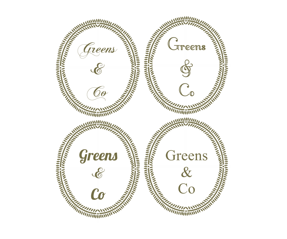
Dieser Kunde bekam 115 Logo-Designs von 25 Designern. Dabei wurde dieses Logo-Design Design von Mandarina als Gewinner ausgewählt.
Kostenlos anmelden Design Jobs finden-
 £150
£150
-
 115 Designs
-
 25 Designer
Logo-Design Kurzbeschreibung
Logo and brand marking for a newly established organic drinks/food and product related business. Inspiration of product placement is Dean & DeLuca: http://www.deandeluca.com
The premise is classic, stylish and upmarket clear branding.
I like fonts such as Didot ( h & fj ) and Arnhem
Please us a mix of the following in a line and also with the 'and co' etc underneath
GREENS AND CO
GREENS & CO
GREENS AND COMPANY
GREENS & COMPANY
I THINK NOW IVE DECIDED ITS JUST THE TEXT ABOVE AND ITS CHOOSING A FONT AND TYPEFACE FOR IT
Aktualisierungen
Please look read my brief and take time to look at the images ive attached. Id like just
Greens & Co no other text.
I think ive decided I want dark green text, please dont mix lots of colours or use light greens as they just wont be chosen.
Please also dont be so obvious to add or include some sort of leaf or food image, the brand eventually could expand to other items, I want it to look simple and luxurious not 'country'
I like fonts such as Didot , arnhem, itc didi, granby , bembo mantinia,torino , stempel garamond please look at those AND similar fonts . Or the perhaps the other way and burgues ,buffet or edwardian script.
Thankyou in advance for your efforts
Added Monday, March 03, 2014
Zielmarkt/( -märkte)
The target audience is the affluent and health conscious ethical market.
Packaging is going to be solid and recyclable, perhaps paper or hessian in some parts and so needs to be workable and not lost on that.
Industrie/Einheitstyp
Business
Logo Text
Greens & Co.
Logo Stile, die Sie interessieren können
Wortmarke-Logo
Word oder namensbasiertes Logo (nur Text)
Lettermark-Logo
Kurzwort oder Buchstaben-Logo (nur Text)
Zu verwendende Schriftarten
Andere Schriftarten erwünscht:
- Didot, arnhem etc
Sehen und fühlen
Jeder Schieber zeichnet eine der Charakteristiken der Marke des Kunden aus sowie den Stil, den euer Logo widerspiegeln sollte.
Elegant
Fett
Spielerisch
Ernst
Traditionel
Modern
Sympatisch
Professionell
Feminin
Männlich
Bunt
Konservativ
Wirtschaftlich
Gehobenes
Anforderungen
Muss haben
- Clear text however a slightly more organic feel with the logo.
Simple bold colours. Use of dark green white dark grey or black ( not them all) I like the idea of the & co to be under the Green's but not essential.
No use of multiple colours or heavy ad hoc images such as a large leaves please , if there is to be a design it needs to be more thought out and organic and gentler than that, however im unsure if I want that or just simple text. Please look at the images of some of the branding I like and use your own judgement.