

 Aktualisieren
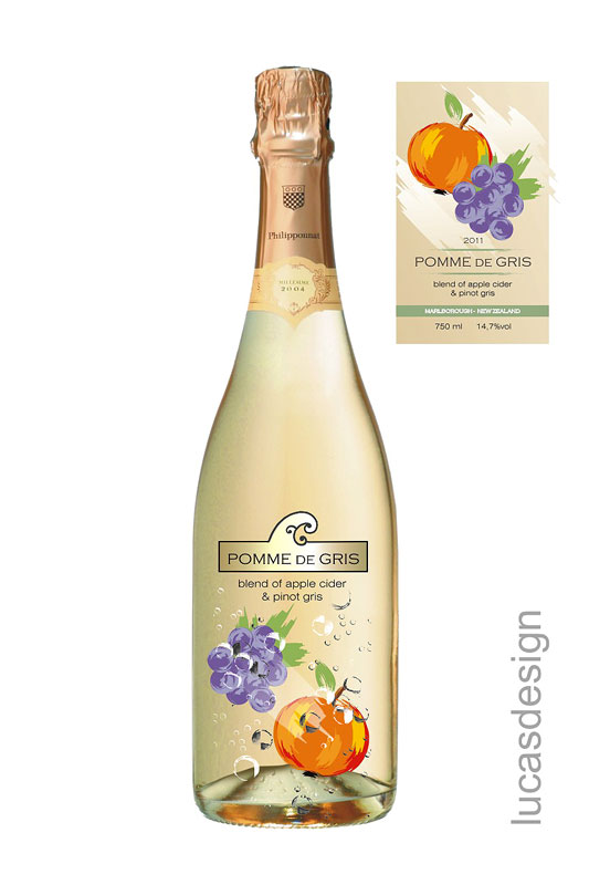
Label and packaging - Pomme de Gris
Wollen Sie auch einen Job wie diesen gewinnen?
Dieser Kunde bekam 62 Verpackungs-Designs von 18 Designern. Dabei wurde dieses Verpackungs-Design Design von lucasdesign als Gewinner ausgewählt.
Kostenlos anmelden Design Jobs finden
- Garantiert
-
 NZ$560
-
 62 Designs
-
 18 Designer
Verpackungs-Design Kurzbeschreibung
We are after label and pack design for a product called Pomme de Gris. This product is a blend of Pinot Gris and Apple Cider.
Pomme de Gris:
The packaging needs to accomplish the following: quickly explain what the product is, establish as a premium price product and grab the eye. The package should also reflect the product innovation.
Quickly Explain What the Product Is:
Pomme de Gris is a nice name that could lift the image – but no one will have any idea what the product is by the name. Consider that a consumer will be staring at a shelf, then the bottle for maybe two to three seconds before moving on to another bottle. In those three seconds we need to make certain that they understand that the product is a blend of wine and cider. Pomme de Gris will not support this on its own.
Suggestion is to use words like Wine, Cider, Orchard, Vine, Apple, Heirloom, Exotic and make it simple. Perhaps a sticker that says “50% Wine/50% Apple Cider” that sits on the neck of every bottle. They need to quickly ‘get it”. Imagery will assist as well. Consider a hybrid 50/50 image of wine grapes and apples to tell the story.
Establish a Premium Price Point:
The label needs to say high quality in the package and the font. Have fun with the shipper – this is where you can have a field day with imagery and fun buzz words – we love the idea of a busy shipper that tells the story with a clean and smart looking bottle.

Aktualisierungen
Project Deadline Extended
Added Sunday, March 16, 2014
Project Deadline Extended
Added Thursday, March 27, 2014
Project Deadline Extended
Added Wednesday, April 02, 2014
Zielmarkt/( -märkte)
This is a premium product targeted at females of age 25-45.
Industrie/Einheitstyp
Consumer
Farben
Vom Kunden ausgewählte Farben für das Logo Design:
Sehen und fühlen
Jeder Schieber zeichnet eine der Charakteristiken der Marke des Kunden aus sowie den Stil, den euer Logo widerspiegeln sollte.
Elegant
Fett
Spielerisch
Ernst
Traditionel
Modern
Sympatisch
Professionell
Feminin
Männlich
Bunt
Konservativ
Wirtschaftlich
Gehobenes
Anforderungen
Muss haben
- Label design on a burgundy bottle with a screw cap, see here for bottle shape: http://www.o-icatalogue.co.nz/wine/#/?view=thumbs&segments=41&colors=&capacityMin=187&capacityMax=750&heightMin=171&heightMax=334&labelMin=44&labelMax=168&neckMin=0&neckMax=1000
Packaging design on a 12 x 750ml carton. This sort of thing: https://www.cellarit.com.au/images/photo06.jpg
Schön zu haben
- We have attached some examples of a concept we quite like but it's not bright enough.

