

 Aktualisieren
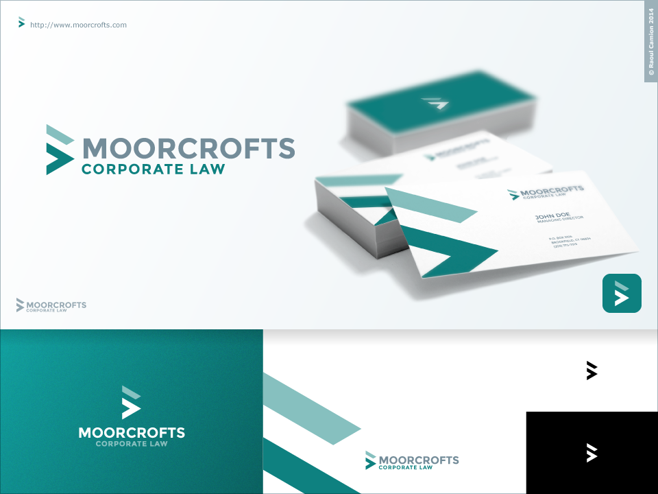
Improved logo for Moorcrofts
Wollen Sie auch einen Job wie diesen gewinnen?
Dieser Kunde bekam 87 Logo-Designs von 43 Designern. Dabei wurde dieses Logo-Design Design von Raoul Camion als Gewinner ausgewählt.
Kostenlos anmelden Design Jobs finden
-
 £300
£300
-
 87 Designs
-
 43 Designer
Logo-Design Kurzbeschreibung
We have had our current logo (see www.moorcrofts.com) for 14 years, and although it looks good on paper, it renders badly on digital devices.
We are keen to retain the turquoise triangle motif, but not necessarily two triangles. We are also not committed to the current font (Palatino). We are in the process of a redesign of our website: see test.moorcrofts.com, so we are looking for something that matches the font families on there. MOORCROFTS is the main text (not necessarily all caps) and CORPORATE LAW the secondary text (again, not necessarily all caps, and not necessarily the same font).
We are a tech law firm: we are looking for something modern, flat and clean. We do not regard ourselves as a traditional law firm.
Deliverable to be in .psd and .png, and for the logo to be scalable. It may be helpful to have a design specifically for small screens, and another one for a conventionally rendered web page.
Ultimately, we would want to be able to adopt the logo as our new corporate logo throughout.
Thanks!
Andrew
Logo Text
MOORCROFTS corporate law