Logo Design for Marketing Research Company
Wollen Sie auch einen Job wie diesen gewinnen?
Dieser Kunde bekam 626 Logo-Designs von 204 Designern. Dabei wurde dieses Logo-Design Design von Bluemedia als Gewinner ausgewählt.
Kostenlos anmelden Design Jobs finden- Garantiert
-
 US$600
-
 626 Designs
-
 204 Designer
Logo-Design Kurzbeschreibung
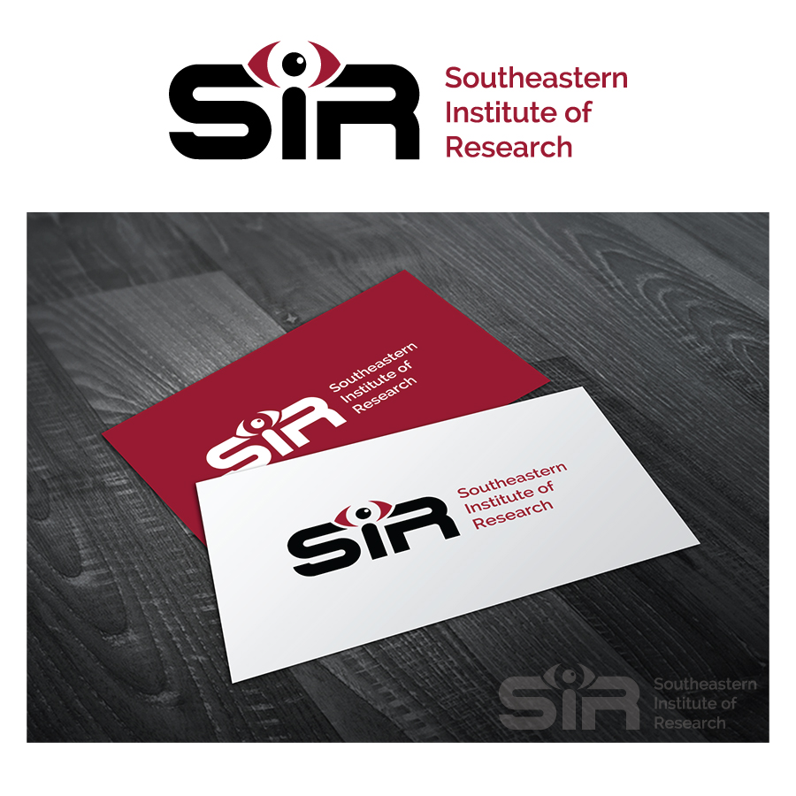
The Southeastern Institute of Research (SIR) is a 50-year-old Marketing Research company based in Richmond Va. We are currently seeking a new logo to use in traditional and digital outreach materials, internal documents (letterhead, business cards, etc), and client-facing presentations/reports. You can learn more about us at www.sirresearch.com.
Our current logo - which is dated - tries to communicate that we are in the business of figuring out people - the puzzle pieces forming the "person".
While that has served us well, it's time to update it and to use some other visual to help represent what we do.
Now, what is it that we do? In short, we help companies and organizations figure out things and solve business problems. We conduct research and from the findings deliver insights that solves/addresses the business problems. Our clients tell us we are especially good at uncovering things, figuring out connections, putting together different facts into a complete picture.
Also, we are known as forward-thinking marketing consultants, driven by curiosity and an undying attention to detail. We are really good at figuring out "what's next" - that is, the future.
We are interested in at least two different concepts for the new logo:
1. A new version or new metaphor that communicates our skill at figuring things out - putting together the puzzle or connecting the dots. IT DOES NOT HAVE TO BE A PUZZLE VISUAL.
2. A version that communicates our curiosity and ability to see what's coming - our future focus.
Mandatories:
-Must use our RED color (Hex-# 9d1b32)
-Emphasize INITIALS over full-name (full name should be below/to the side, allowing us to TAKE IT OUT in certain applications). We almost-exclusively refer to ourselves by our initials.
-Somewhat corporate but with some hint of fun, approachable. We're a small company with friendly folks. We don't need to look like a huge corporation.
Aktualisierungen
A new REVISED brief has now been attached to this project. Please consult it as you move forward. Thanks - SIR
Added Tuesday, April 01, 2014
Project Deadline Extended
Reason: We have decided to change the project type to a "committed payment" AND have updated the creative brief.
Added Tuesday, April 01, 2014
Hello All,
Unfortunately, we are eliminating a ton of designs today. Perhaps we weren't clear, but we'd REALLY like to see designs that do not integrate the puzzle-piece into the lettering. In fact, moving AWAY from the puzzle-piece idea is something we want! Please check the creative-brief, which we we updated last week, before proceeding.
Keep in mind this logo will go on EVERYTHING. Business cards, websites, letterheads, presentations, etc. It can't be too busy.
Added Monday, April 07, 2014
Added Tuesday, April 22, 2014
Project Deadline Extended
Added Monday, April 28, 2014
Project Deadline Extended
Added Monday, May 12, 2014
Project Deadline Extended
Added Friday, May 30, 2014
Hello All,
We appreciate all the work you have put into your submissions. As good as some of them have been, SIR hasn't been blown away by any particular design.
This will be our last update before we pick a logo. Please take in mind the following revision before you proceed.
"One thing that we would like to see is making the "i" in the logo represent a light -- like the Pixar logo, or like a lighthouse. Something literal or figurative that communicates that we use research to shed light on things others don't see."
Thanks so much for all your work.
-SIR
Added Friday, July 11, 2014
Industrie/Einheitstyp
Marketing
Logo Text
SIR - Southeastern Institute of Research
Logo Stile, die Sie interessieren können
Pictorial / Combination-Logo
Ein reales Objekt (Text optional)
Lettermark-Logo
Kurzwort oder Buchstaben-Logo (nur Text)
_brief253924.png?AWSAccessKeyId=ASIARQT47ZIUZVXANBRC&Expires=1759265744&response-content-disposition=attachment%3Bfilename%3D%22SIR%20Logo%20%282%29%20Tuesday%2C%2025%20March%202014%2014_39_24.png%22&x-amz-security-token=IQoJb3JpZ2luX2VjEFIaCXVzLWVhc3QtMSJIMEYCIQCOyj%2Fx0RnjqkMzOhKP%2FNkRdVIHtF9QI7ygXU0tpoo%2BdwIhAKmXDKk3V2NVFtFJPffpnp%2BTN4YWd9fY1B6vBXoJiy49KvQDCNv%2F%2F%2F%2F%2F%2F%2F%2F%2F%2FwEQABoMMTA0NDE1MDg3MTQ1IgxvLja2NR1tTOWfXN8qyAPf7YIY2DXaFzGHDWbOC37cAEMh1OGvAofOi4itG19mCjnRv5jrmRTmhKiV%2BcVjO46Whgs%2BN6ddOM1waqVHp20dPZKV9uWiGOeBk3p43Td4a7Gg9M8sbyW3oFA1SwazqhbYl%2FTQQioP6trqzt5yJFygh%2F5S1S6f4cSPayNGPu0CFybaMXAmh2fwWEI6cx%2F%2BqtHgy5NcLgSeQpHnE%2BqUUnImAHR1qSeWqPoSVMsZjHLLji7h5qFUVoZyGq7l12B35jIazW916HshGre82cSNhz1nk1rA89ond0d4ROmUDRjmkJpwGRLAvh5AL07kfFkp%2BekrtCaLiN%2BMws8yqKUAfNazHCw7bizQujYg%2F1qOmWyipLRV98T68MtFwlDgImUuKJXByxqUM3XI1r7cr5x0kazwRuYnBkvVMqVBcmplp6DBC8lRGSpdr36DyRjFRDg9in7wttSkY9DlhKDZWeaXFmgSC%2B1b3V%2FEziCbdxj5JRoswlLu%2FiKV0bVbzDF0XBT0m0bU%2By5cWBNLf%2FfQeZzxDGl%2Bx3dgF82qJkkPAH5XqXpomah9bUgIZbhBgft0jho7UreONwT1a8scFwaWUtzNPcnPJ%2BUuSj3GyIYw3Y7rxgY6pAGpWbOQld4%2BKMhqwTtxCPtT5ZZuxJ4hjKaF70Fy4adk2jJihHNmL6mTS27e75Kwhi01cEUQoWflA7eXQrqjWIHCovWS82eDnDv9YmK%2FZNHW5rtxv%2FcVdu2md%2BJAkuCms3bNh%2Ffp0iVtOL5BgSVWkf4AMo2iD07GduvBKga4teLqaKmKSZwR32NLLE98xw%2F1Co8T5Vd4ZxxSImFzEceF8QUUJVeCLA%3D%3D&Signature=yhShVgK2TdUVH%2BZs1MzqYhW2OnA%3D)