Marketing Agency Needs Fresh New Look
Wollen Sie auch einen Job wie diesen gewinnen?
Dieser Kunde bekam 40 Wordpress-Designs von 11 Designern. Dabei wurde dieses Wordpress-Design Design von pb als Gewinner ausgewählt.
Kostenlos anmelden Design Jobs finden- Garantiert
-
 US$725
-
 40 Designs
-
 11 Designer
WordPress-Design Kurzbeschreibung
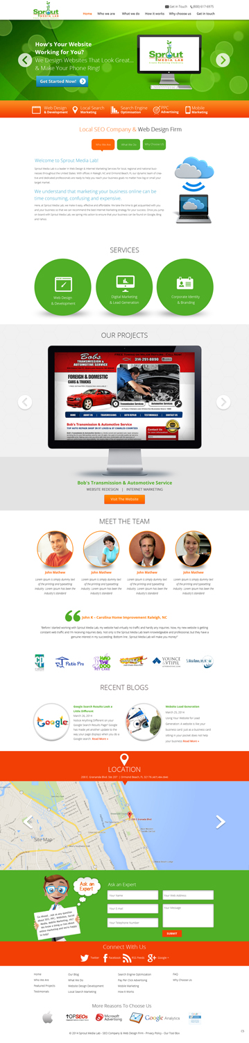
SproutMediaLab.com is a Digital Marketing agency with locations in North Carolina and Florida. And, yes, we do custom Websites too. When we're designing for ourselves, we prefer to outsource because we typically get fresher perspectives from designers involved in the project. Which is why we're here today posting this Redesign project for our very own website.
Overall, we like our website look/feel....but don't LOVE it. We need our new site to be a bit fresher and more current using some of today's web design/development trends.
Some of the details: We want to use more current font styles and sizes (ideally, we use 3 different fonts including one "handwritten" or script font). We use the little nerdy scientist way too much throughout our website. We want to project a positive, friendly image to our customers....but we also want to be considered serious professionals in our industry(s). So, we would like to see a better mix of fun & friendly with professional & completely capable.
Here are two examples of our local competitors and websites that we think are very well done and include some of elements we're looking to see on our new site:
1) www.designzillas.com = these guys do a great job at mixing their cartoony dinosaur with realism imagery. Very clean & professional website, but also cool and interesting how they carry through some of their branding and toony graphic elements. We like the use of big circles to highlight certain elements. We feel that this would play well for us too because we already use some of these big circles/bubbles in our bokeh background.
2) www.trimarkdigital.com = these guys have the same kind of top to bottom layout with big chunks for each section. They come across as a little more "buttoned up" then designzillas, but still friendly enough to make a small business owner feel comfortable.
There are a few elements that we consider part of our brand and that we want to continue to use in our new design. They are as follows:
1) The nerdy scientist dude....we have 50+ variations of this little guy in every file format you need. I'll try to upload the whole set....at the least, you'll have one or two examples.
2) The electric green bokeh background you see at the top of each page of our website.
3) And our logo of course which is included in uploads.
Please feel free to ask me any questions. We're really open to new and fresh ideas and creativity. So...let 'r rip!
Aktualisierungen
Only 1 more day left! There are a few concepts that I really like, but I have not yet made any decisions. I'm still looking for "the winner" to be submitted. I also decided to award a 2nd and 3rd place prize. Keep 'em coming ladies and gentleman. Thanks for taking your time to respond and submit your ideas and concepts.
Added Sunday, April 06, 2014
Hello everyone...thank you for submitting your concept(s). We are narrowing down the choices and will be submitting some tweaks/changes to those designs that make the cut. So, please be on the lookout for some additional notes.
Added Friday, April 11, 2014
Industrie/Einheitstyp
Digital