Logo Design Project - Institutional Investment Management
Wollen Sie auch einen Job wie diesen gewinnen?
Dieser Kunde bekam 226 Logo-Designs von 80 Designern. Dabei wurde dieses Logo-Design Design von beeyo als Gewinner ausgewählt.
Kostenlos anmelden Design Jobs finden- Garantiert
-
 US$400
-
 226 Designs
-
 80 Designer
Logo-Design Kurzbeschreibung
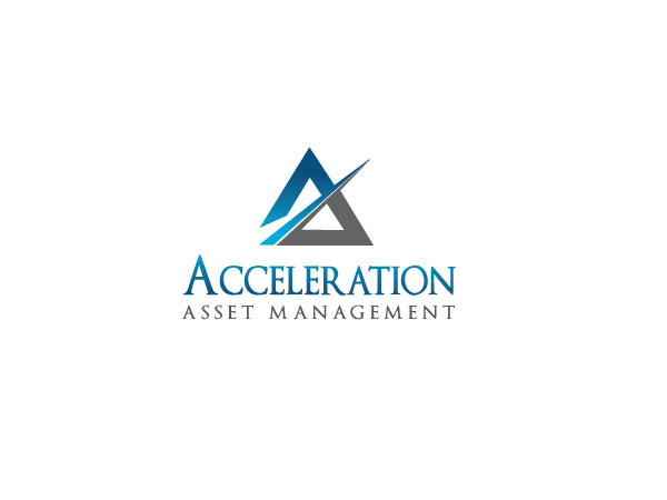
We need a logo design for a new investment company called Acceleration Asset Management. We manage stock portfolios for clients. Our job is to take prudent risks with their money and generate superior returns.
We want to project an image of discipline and confidence and success.
The logo and name will be used in marketing materials, letterhead, business cards, and web pages. The graphic element will sometimes be used without the company name.
Aktualisierungen
Project Deadline Extended
Reason: We have been traveling and out of town for the past week and have not had the opportunity to carefully review all the designs recently submitted. Thanks to all of you for the tremendous response, we have been a bit overwhelmed. Over the weekend we will post another document clarifying the image we are trying to present. We will also try to provide feedback as much as we can on specific submissions.
Added Friday, July 06, 2012
Zielmarkt/( -märkte)
This is a not consumer/retail; our main audience is upper income, well educated, financially savvy, male, 40-60, and financial fiduciaries.
Industrie/Einheitstyp
Investment
Logo Text
Acceleration Asset Management
Logo Stile, die Sie interessieren können
Abstraktes Logo
Begrifflich / symbolisch (Text optional)
Sehen und fühlen
Jeder Schieber zeichnet eine der Charakteristiken der Marke des Kunden aus sowie den Stil, den euer Logo widerspiegeln sollte.
Elegant
Fett
Spielerisch
Ernst
Traditionel
Modern
Sympatisch
Professionell
Feminin
Männlich
Bunt
Konservativ
Wirtschaftlich
Gehobenes
Anforderungen
Muss haben
- Financial services firms (other than consumer banks) tend to use a fairly conservative and traditional serif typeface. The company name should not be "animated" into the design. See for example: Ameriprise, Deutsch Bank, BNY Mellon. Go for clean and simple and straightforward, not fancy and elaborate and busy.
Schön zu haben
- The key design element should be some form of curving arrow, rising and pointing up and to the right. Think the Nike "swoosh" or a sine curve, maybe/probably in a box.
The arrow idea derives from a stock price chart, or a chart of a company's growth rate. You'd want that trend to be rising, getting better and stronger over time. The message we want to implicitly convey is that we own businesses with rising earnings and rising stock prices.
The typeface should be bold, suggesting energy, momentum, strength, confidence. The word "Acceleration" could be slightly more prominent (larger) than "Asset Management" which is a somewhat generic descriptor.
We'd prefer designs using blues or greens, not red/yellow, perhaps with a second neutral color (gray/tan/taupe).
Sollte nicht haben
- Don't create something from the initials AAM.
Don't use script or artsy/cartoonish typefaces.
Don't use red/orange/yellow.