Calcoola.com web app & logo design
Wollen Sie auch einen Job wie diesen gewinnen?
Dieser Kunde bekam 23 Web-Designs von 6 Designern. Dabei wurde dieses Web-Design Design von maxartkiller als Gewinner ausgewählt.
Kostenlos anmelden Design Jobs finden- Garantiert
-
 C$300
C$300
-
 23 Designs
-
 6 Designer
Web-Design Kurzbeschreibung
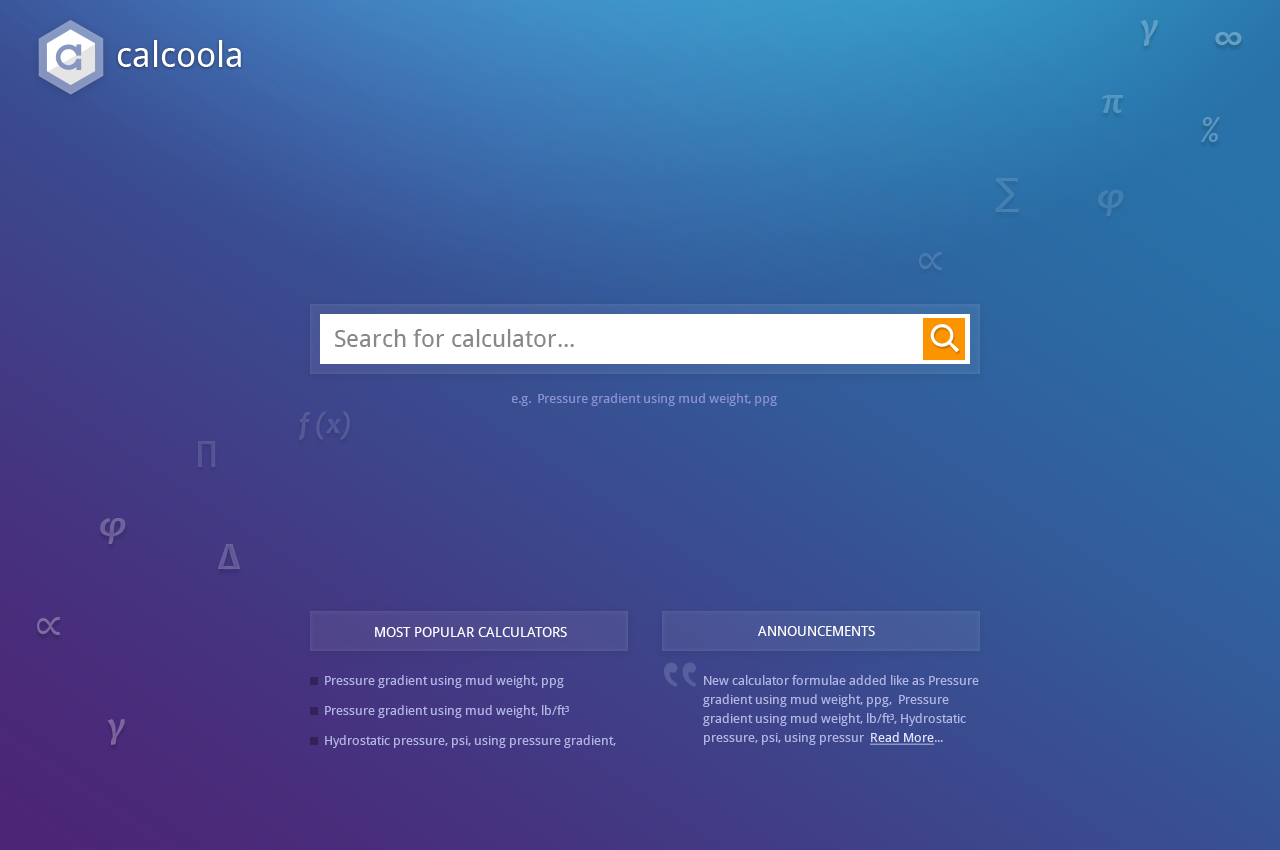
Background: I have a web application (http://www.calcoola.com/) which serves like an online catalog of various formulas and calculators that are grouped into categories. For starters these would be Oil & Gas related formulas. Since I can apply the same logic to any industry I'm planning to extend this to other fields in the future. The main goal of the application is to make it easy for users to find calculators they're looking for and be able to use them.
What I have so far: This is work in progress Ajax web application written in Dojo (JavaScript framework) using custom widgets and templates. Currently the web app uses standard CSS styles that come with Dojo framework out of the box. I have many use cases yet to be implemented and I'm sure I will need more screens/dialogs/workflows down the road as I already have a feature set planned for future releases. The initial workflow that I've implemented so far is pretty straight forward: 1) user searches for a calculator(s); 2) user inputs the parameter(s); 3) user captures the result of calculation.
What I need: I need a logo to represent the web application. And mainly a UI/UX designer touch to the web app like simple, intuitive layout, colors and fonts. Currently I have 2 pages (more like states than pages since it's an application there is no clear transition between the pages): 1) The front page of the web app needs to have a big search box in the center middle something similar to the one on home page of mashape.com. It will also have informative boxes/sections like "Most popular calculators", "news/announcements" and others I can't think of right now. 2) The search results page listing found calculators.
I'm expecting that the designer would tweak the layout of pages and composition of widgets (in various states e.g. open/close) or even simplify some widgets to improve usability as he/she sees suitable given that this will keep everything intuitive for users. I'm also expecting that they will produce colors (palette) and pick suitable fonts for consistent overall professional style. I'm not expecting them to code any of it since I'm doing the actual coding/programming.
Aktualisierungen
Project Deadline Extended
Reason: Some design revisions require more time.
Added Sunday, May 11, 2014
Project Deadline Extended
Added Wednesday, May 21, 2014
Industrie/Einheitstyp
Industry
Sehen und fühlen
Jeder Schieber zeichnet eine der Charakteristiken der Marke des Kunden aus sowie den Stil, den euer Logo widerspiegeln sollte.
Elegant
Fett
Spielerisch
Ernst
Traditionel
Modern
Sympatisch
Professionell
Feminin
Männlich
Bunt
Konservativ
Wirtschaftlich
Gehobenes
Anforderungen
Schön zu haben
- Example web apps that could be used as a guideline:
https://www.mashape.com/
https://www.heroku.com/