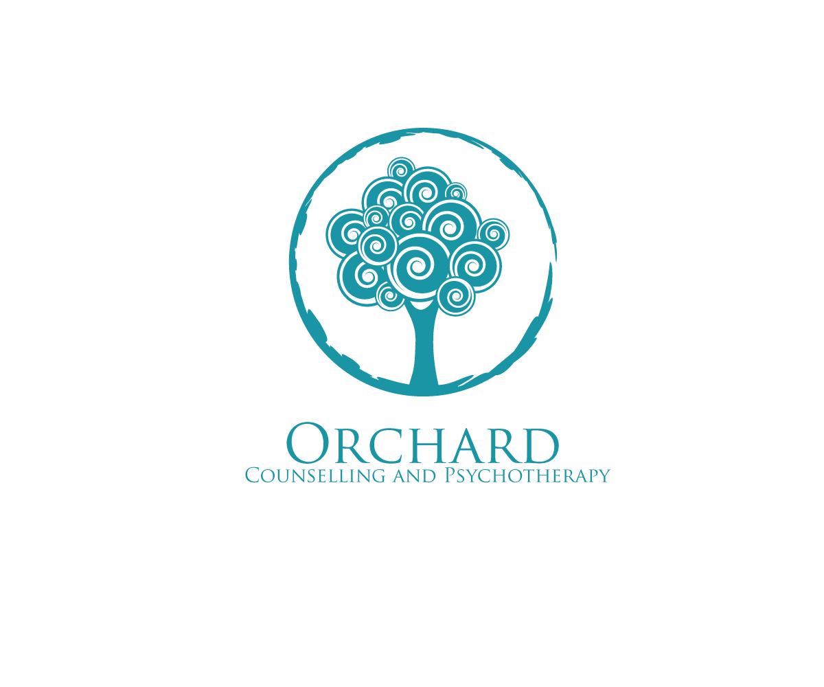
Orchard Road Counselling and Psychotherapy OR The Orchard Counselling and Psychotherapy
Wollen Sie auch einen Job wie diesen gewinnen?
Dieser Kunde bekam 33 Web-Designs von 9 Designern. Dabei wurde dieses Web-Design Design von anshtoyj als Gewinner ausgewählt.
Kostenlos anmelden Design Jobs finden- Garantiert
-
 S$360
S$360
-
 33 Designs
-
 9 Designer
Web-Design Kurzbeschreibung
I'm setting up a new practice as a Psychotherapist in Singapore - potentially on Orchard Road. I'm looking for something simple yet sophisticated and I'd like to reference the 'Orchard' in the name. The Orchard is also right in the heart of the very busy city of Singapore, so while I'd like to avoid anything 'touchy feely', it would be nice to think of the practice as something of a haven in the city.
Type is an important part of this as I'll use my name in or under the practice name and it needs to look serious but contemporary. I'd like also to be able to use the type on its own.
I'd like to also consider using a different name for the practice : The Orchard Counselling and Psychotherapy, which might change the look and feel somewhat.
Aktualisierungen
In terms of a logo/image design inspiration, I've just come across this: http://supermamastore.com/products/singapore-icons-tembusu. It's a lovely design, feels like it speaks to trees/orchard, something classically Singapore and a really simple but beautiful colour scheme as well. The Tembusu tree is a heritage tree in the Singapore Botanic Gardens.
Added Friday, May 02, 2014
In terms of navigation pages, you can follow this as a generic example:
Added Friday, May 02, 2014
Zielmarkt/( -märkte)
My clients will be drawn from a wide range of expats here in Singapore. English speaking - mostly U.S. and British - and from an international professional group (hence it has to look as serious/professional) but also needs to appeal to both men and women.
Zu verwendende Schriftarten
Sehen und fühlen
Jeder Schieber zeichnet eine der Charakteristiken der Marke des Kunden aus sowie den Stil, den euer Logo widerspiegeln sollte.
Elegant
Fett
Spielerisch
Ernst
Traditionel
Modern
Sympatisch
Professionell
Feminin
Männlich
Bunt
Konservativ
Wirtschaftlich
Gehobenes
Anforderungen
Muss haben
- Clean, simple, sophisticated feel in logo and font and layout. I find this really inspirational: http://supermamastore.com/products/singapore-icons-tembusu