Innovation Presentation Template
Wollen Sie auch einen Job wie diesen gewinnen?
Dieser Kunde bekam 105 PowerPoint-Designs von 8 Designern. Dabei wurde dieses PowerPoint-Design Design von Ayzeek als Gewinner ausgewählt.
Kostenlos anmelden Design Jobs finden- Garantiert
-
 US$400
-
 105 Designs
-
 8 Designer
PowerPoint-Design Kurzbeschreibung
I need a unique template design for a presentation on Innovation used exclusively inside of our company. I'd prefer to work in Apple Keynote but can take a .ppt and convert it. The template should appeal to a broad audience of diverse job descriptions. This is a one-time presentation that will last between 30 and 45 minutes. The design should provide a strong visual appeal with multiple chart layouts to support highlighted test points (no bullets, I hate bullets), graphics, line art, and video/photos. My presentations are sparse, never more that 2 concepts per chart (usually one). Our company is a high tech manufacturer selling products in many markets ranging from Government to consumer. The final design should include style a style guide including suggested fonts, colors, graph formats, suggested word art, etc.
Zielmarkt/( -märkte)
The audience is internal employees only. Strong corporate branding is not required in this presentation.
Industrie/Einheitstyp
Government
Farben
Vom Kunden ausgewählte Farben für das Logo Design:
Sehen und fühlen
Jeder Schieber zeichnet eine der Charakteristiken der Marke des Kunden aus sowie den Stil, den euer Logo widerspiegeln sollte.
Elegant
Fett
Spielerisch
Ernst
Traditionel
Modern
Sympatisch
Professionell
Feminin
Männlich
Bunt
Konservativ
Wirtschaftlich
Gehobenes
Anforderungen
Muss haben
- Strong visual appeal helping to support the communication of simple concepts (that have been broken down from complex subject matter).
Multiple chart template forms to support different forms of communication including text points, data charts, graphics, photos, and videos.
Visuals will be memorable, but not overpower the content. Visuals will help convey the content.
Well conceived and coordinated color pallets. Fonts guides (that I can access).
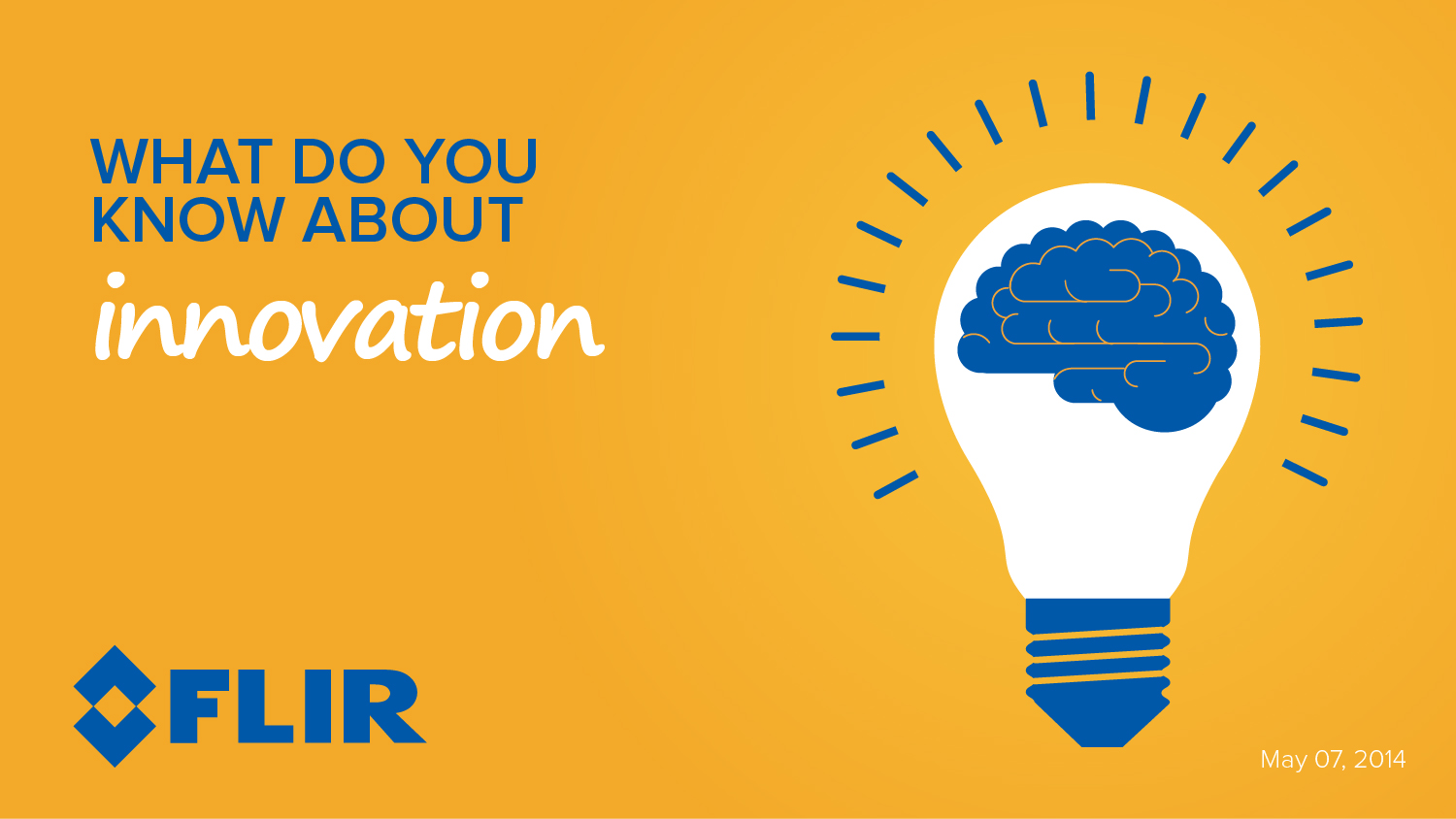
You can visit our company web site at www.FLIR.com to see logo and corporate look/feel. It would be good to build logo into a few of the chart templates, but not all.
Schön zu haben
- Keynote (please). I can live with .ppt if I have to.
Many charts will make a point with simple single sentences. Find a way to make the sentences graphically interesting by varying font and/or color of specific words to help drive points.
Note that colors that I've identified below are based upon the blue used in our logo and the orange that complements it. I'm not married to these but use them as guidelines.
Sollte nicht haben
- Noise. Corporate nauseia.