Design 3 banner stands for trade show graphics
Wollen Sie auch einen Job wie diesen gewinnen?
Dieser Kunde bekam 31 Beschilderungs-Designs von 5 Designern. Dabei wurde dieses Beschilderungs-Design Design von Sbss als Gewinner ausgewählt.
Kostenlos anmelden Design Jobs finden- Garantiert
-
 US$200
-
 31 Designs
-
 5 Designer
Schilder-Design Kurzbeschreibung
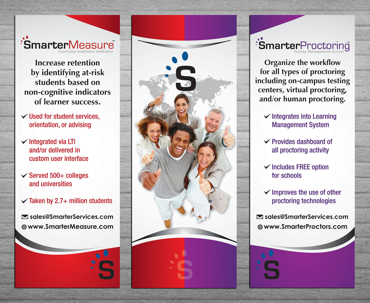
31'W x 81'H - design should be clean and pop. We work with higher ed and k12 (high school) industry so our audience is students, administrators, and such. One of the attached graphics has the concept of our 3 banner stands. 1 - SmarterMeasure 2 - Graphic (what we like - multiracial, neatly dressed, differ. ages, world behind, swoosh at the bottom which mimics our look on flyers - see attachment). what we don't like - green color which doesn't go w/ our look, words on the image. Our 2 products are used to help schools proctor exams and measure student learner readiness. I'd like to see 2 variations. One colorful with red and purple popping somehow coordinating with our literature w/o being matchy matchy and the other option a bit more muted or subdued in color. We want to look professional and not like a preschool using bright colors but visually appealing nonetheless.
Updates
Thank you for everyone who sent in designs. We have selected a design and are working with the designer to finalize the graphic. We do not need any new submissions.
Added Thursday, May 15, 2014
Zielmarkt/( -märkte)
Educators, faculty, administrators, college students, all 50 states
Industrie/Einheitstyp
Preschool
Zu verwendende Schriftarten
Farben
Vom Kunden ausgewählte Farben für das Logo Design:
Sehen und fühlen
Jeder Schieber zeichnet eine der Charakteristiken der Marke des Kunden aus sowie den Stil, den euer Logo widerspiegeln sollte.
Elegant
Fett
Spielerisch
Ernst
Traditionel
Modern
Sympatisch
Professionell
Feminin
Männlich
Bunt
Konservativ
Wirtschaftlich
Gehobenes
Anforderungen
Muss haben
- 3 individual banner stands 2 with logos and info and the other one with image
image should be multiracial
Schön zu haben
- some kind of world/globe image with the ticks marks around our "S" in our logos kind of like ovals exemplifying smarter or better
Sollte nicht haben
- No outdated clothing on people; no curly cutesy fonts,
_brief055148.jpg?AWSAccessKeyId=ASIARQT47ZIUZAMD2JN4&Expires=1757797593&response-content-disposition=attachment%3Bfilename%3D%22SmarterProctoring_Front%20%284%29%20Monday%2C%2005%20May%202014%2017_51_48.jpg%22&x-amz-security-token=IQoJb3JpZ2luX2VjELj%2F%2F%2F%2F%2F%2F%2F%2F%2F%2FwEaCXVzLWVhc3QtMSJHMEUCIAUxBpotVLlbL0miyueoXidmqN7mHj7HJw0xKUROkU9aAiEAtb%2ByYera6H2mMTUCVNUa3LN%2FJxQyzBoIcmSmDdqXLC0q6wMIMRAAGgwxMDQ0MTUwODcxNDUiDA8ouwAKxr3oOkZ5kCrIA31NdA8UAwKUFHs8nn6D20Kt0%2BkQdo%2FmaTSwzNSP%2FMjOv7lY6q%2FFKLoMqtGXx%2B22RG7h%2BnBSedBJLNQYR5UDZQDQaWiYGqa%2FBuxZN916doKsHiBKmku2pmrvMfsStlsBr9TIr4jFErmJZT16he8s%2FhvdNR5klFfVwofHBE0xA%2BmDdcmzIwib1eDYK3gnIdci2xOyL9EnQVjwlDkz1WOo%2BPngE%2B1tmwRl0spd1D6HtmW0doJWR0Kp3gZYseq2m28NfHmK8jeWZB6ImSA86R7D5pZh7jWrlODzH4D094S3CCpQIUSImOsPpivV3ZiHBsiyks8na500LaJkRz0Ia3V%2BltPNce4UsYESgP2uadJbpUFCzS9121VUOXOqmOpMyvdVMEqiGDohEVpRzpgrUyw22OBtgN%2F5K4ZHgOWkRgZkR2wAHJ3fbJZomC0Zvgn4oqKXJksrd6cWFZ3o%2FLlKPLFSVWZsjs9tdOH6nMK4zmBme0pkBDKBxpRLbTlpqD32bQOMzvTYZakPG2iZ0%2F%2F4jVw%2Bneab9xyBtGHVL3zdZ1DAmWSVLCa2P00LAdJD1axt1b3K9htvIqZCqemBVSS8ucCzM7fNxqX%2FJ6BejTDmgpHGBjqlAZumezu%2Bmu%2BU3AOg2NzrXvRyBkzOYcnTS9XAVm5U8izC9QaevmkVr8t9AVQLNd4shDQu8n0LPm%2BlphKNYNj44cpARn32Ef2GAJbnGeL2zPD5UwsbCUMBn1T8ef%2F%2BAnr6ysslu6OGOvqUYtLGoyf6SxsKhlE0EJQakgTYvS1XYxSc%2Bz%2FGVOE3U6riGL6dl4IlOnWs9ohVvH3L0QKNMxWL%2FYCEHTbWEg%3D%3D&Signature=NV7eH8maS4H0WAD6LRZQWZdG2Is%3D)