

 Aktualisieren
NEW App Icon & Splash Screen!! CheckApp! (Coupons app)
Wollen Sie auch einen Job wie diesen gewinnen?
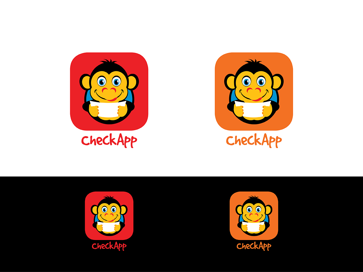
Dieser Kunde bekam 48 Icon-Designs von 11 Designern. Dabei wurde dieses Icon-Design Design von RoundYellow als Gewinner ausgewählt.
Kostenlos anmelden Design Jobs finden
- Garantiert
-
 €190
-
 48 Designs
-
 11 Designer
Icon-Design Kurzbeschreibung
We need an APP ICON and SPLASH SCREEN for a new StartUp company based in Silicon Valley called "CheckApp". It's a coupon app focused on big fast food companies like McDonald's, KFC, Subway... cinema, and football!!. It's social too. We want to communicate the wish of having a nice hamburger or sandwich and have fun with our offers. It's a marketing app.
We thought about an accomplice face funny monkey with a coupon/ticket, so that when you look at him, he looks at you with accomplice faces, and activate mirror neurones (neuromarketing). Funny and professional icon. That's the best choice we think, also using two colours, we were thinking about orange and something else, something related with food and activity. (Colours can be changed if there is a better combination)
We want the logo not to be overloaded, something clean, atractive, eye catching and easy to merchandise.
The screenshots are a bit boring because of inspiring on some templates, we want to apply gammification, so we need that on the design.
Good luck and thank you!!
AT THE MOMENT OUR BUDGET IS BEING FULLY INVESTED ON THE DEVELOPPMENT OF THE SOFTWARE, LATER ON, IF THE DESIGN GOES MERCHANDISED BY OUR BRAND, WE'LL OFFER THE DESIGNER A PERCENTAJE OF THE MERCHANDISING EARNINGS AS REWARD.
THANK YOU FOR YOUR COMPREHENSION.
LIKE IN THE STOCK MARKET, THIS IS A LONG TERM OPERATION

Aktualisierungen
Colors and some specifications updated. Also the percentage reward commitment.
Thank you!
Added Tuesday, June 10, 2014
Added iOS grid image for app icon ( http://ivomynttinen.com/blog/the-ios-7-design-cheat-sheet/ ).
Thank you!
Added Wednesday, June 11, 2014
Hey!
Just added "app cheff" image, we foundit on google andwe liked the gradients and style. If you need inspiration, changing the cheff hut for a coupon and a CheckApp "C" could look good.
Thank you all!!
Best regards,
Francisco
Added Thursday, June 12, 2014
Zielmarkt/( -märkte)
Between 15-30 years old (the age when most people go to mcdonalds & cinema).
Industrie/Einheitstyp
Marketing
Farben
Vom Kunden ausgewählte Farben für das Logo Design:
Sehen und fühlen
Jeder Schieber zeichnet eine der Charakteristiken der Marke des Kunden aus sowie den Stil, den euer Logo widerspiegeln sollte.
Elegant
Fett
Spielerisch
Ernst
Traditionel
Modern
Sympatisch
Professionell
Feminin
Männlich
Bunt
Konservativ
Wirtschaftlich
Gehobenes
Anforderungen
Muss haben
- Funny (not boring), colorfull, atractive.
-App icon size 1024x1024 mínimum
Colours to be chosen by the designer, something related with the screenshot or the four example colours combination we've made for some orientation.
Schön zu haben
- Using the proportions grid uploaded.


