Brand Identity
Wollen Sie auch einen Job wie diesen gewinnen?
Dieser Kunde bekam 61 Logo-Designs von 22 Designern. Dabei wurde dieses Logo-Design Design von k-ant als Gewinner ausgewählt.
Kostenlos anmelden Design Jobs finden-
 US$200
-
 61 Designs
-
 22 Designer
Logo-Design Kurzbeschreibung
I am an architect/interior designer looking to brand my business consistently across my website and printed material (business cards, plans, letter head, etc.). I started a logo, but need some help punching it up (see the uploaded logo). And I need help printing consistently (ie, making the logo apear the same size and resolution in different formats).
You can see samples of the work that I do here: http://www.houzz.com/pro/jeremyirvine
I'm based in Southern California, and the lifestyle here is cool and casual, but still very trendy. I see my design aesthetic as being clean and modern with some vintage references. I want my logo to be very clean. I like tall thin type faces. Usually sans serif, but I could be talked in to sarifs if they are the right kind. And I'm really liking the flat retro looking graphics that are used in apps and info graphics a lot.
Here are some websites of others in my field that I really like:
mlkstudio.com
suzanfellman.com
castedesign.com
bernd-gruber.eu
http://communedesign.com/
http://kyleschuneman.com/
I also uploaded a picture of the graphics that I'm using now. The letter is a typical letter for me, created in Google Docs. The business cards are what I'm using now, I like the image on the back, but hate the die cut corners and the fonts and the satin finish of the card stock. The brown folder is what I typically put my presentations in, I like the organic contrast to a white piece of paper.
A few people have suggested that I incorporate a color or pattern as a theme. I'm not sold on that idea. But I included some colors and fabrics that I use often for inspiration. I think a dark shade of blue with a hint of green would be the way to go if I were to have a signature color.
Thanks so much for reviewing at my job. I'm looking forward to working with you.
-Jeremy
Aktualisierungen
Hi Designers,
Added Saturday, May 10, 2014
Zielmarkt/( -märkte)
middle class to wealthy people. My clients are usually middle aged career driven with new money. They are usually have a young modern look and feel. Usually politically liberal. Always looking for creativity and new ideas. And I would say that they are not conspicuous consumers, more discrete about money.
Industrie/Einheitstyp
Printing
Logo Text
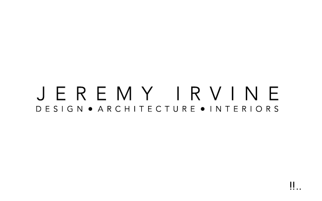
JEREMY IRVINE DESIGN ARCHITECTURE INTERIORS
Logo Stile, die Sie interessieren können
Wortmarke-Logo
Word oder namensbasiertes Logo (nur Text)
Lettermark-Logo
Kurzwort oder Buchstaben-Logo (nur Text)
Zu verwendende Schriftarten
Farben
Vom Kunden ausgewählte Farben für das Logo Design:
Sehen und fühlen
Jeder Schieber zeichnet eine der Charakteristiken der Marke des Kunden aus sowie den Stil, den euer Logo widerspiegeln sollte.
Elegant
Fett
Spielerisch
Ernst
Traditionel
Modern
Sympatisch
Professionell
Feminin
Männlich
Bunt
Konservativ
Wirtschaftlich
Gehobenes
Anforderungen
Muss haben
- Must say Jeremy Irvine and in some way incorporate the words design, architecture, and interiors.
Schön zu haben
- The color blue if it can be incorporated in a way that feels sophisticated. See the uploaded pics for specific shades of blue. At the same time it should read in b/w because I plan to have a stamp made to stamp some paper materials.
I'm not opposed to incorporating a picture or image, but it has to look sophisticated and clearly relate to architecture or interiors.
Sollte nicht haben
- No serif fonts. And the J and I should always be capitalized (I know, I'm a nerd).