Blind dating / hook up web
Wollen Sie auch einen Job wie diesen gewinnen?
Dieser Kunde bekam 72 Web-Designs von 10 Designern. Dabei wurde dieses Web-Design Design von OM als Gewinner ausgewählt.
Kostenlos anmelden Design Jobs finden- Garantiert
-
 €375
€375
-
 72 Designs
-
 10 Designer
Web-Design Kurzbeschreibung
We're creating a new web application based on blind dates to hook up with others who like you (occasional dating, not long-term relationships): www.blindhookingup.com
The background idea is the same as other dating websites (there're many differences but probably don't matter for the design): to browse potential matching profiles based on several criteria (age, gender, zone, etc.) and vote for the ones you like (a yes/no answer just seeing the pictures and basic info, option to see the detailed profile including other users feedback about that profile). The other users do the same, and then, you can see the real matches and contact them.
The one who start the contact to matched profiles, should pay for it, discounting the cost from a previously funded credit balance.
There's also a section to browse for meeting places/plans suggestions.
After you had any date, you could leave feedback about the other, so, everyone had a reputation (similar to the ebay's feedback system).
Of course, the other typical options: register/mail verification, profile edit, "loading..." stuff, etc.
We'll start with a typical website application, but we'll move to mobile app soon, so, a responsive design will be a plus.
We expect to get a design to use as a pattern to develop (our job) the application, so, we'll need to work with the winning designer to get the graphical pieces/elements (backgrounds, icons, sprites, etc.) not only the whole screen captures. We'll contact the finalists to discuss details about how much of this are included or not and possible future work if we need it.
We've got no previous work done on logos or color schemes, so, feel free to work on whatever you want.
Please, feel free to ask for details if you need more: virtualservicesltd@outlook.com
Aktualisierungen
One preference on our web development will be to use Bootstrap (or similar frameworks), so, if you know about it and you'd like to take in care, this will be a plus, not a must. If you think there will be something to gain on other design patterns, please, forget Bootstrap and put preference on the design itself.
Added Monday, May 12, 2014
After received the first drafts, I think there's something general to clarify:
Added Wednesday, May 14, 2014
Let’sfocus a little more what we have in mind to be a different dating site andwhat we expect to obtain with this design project:
The mainfunctionalities and, so, the most important parts to design are:
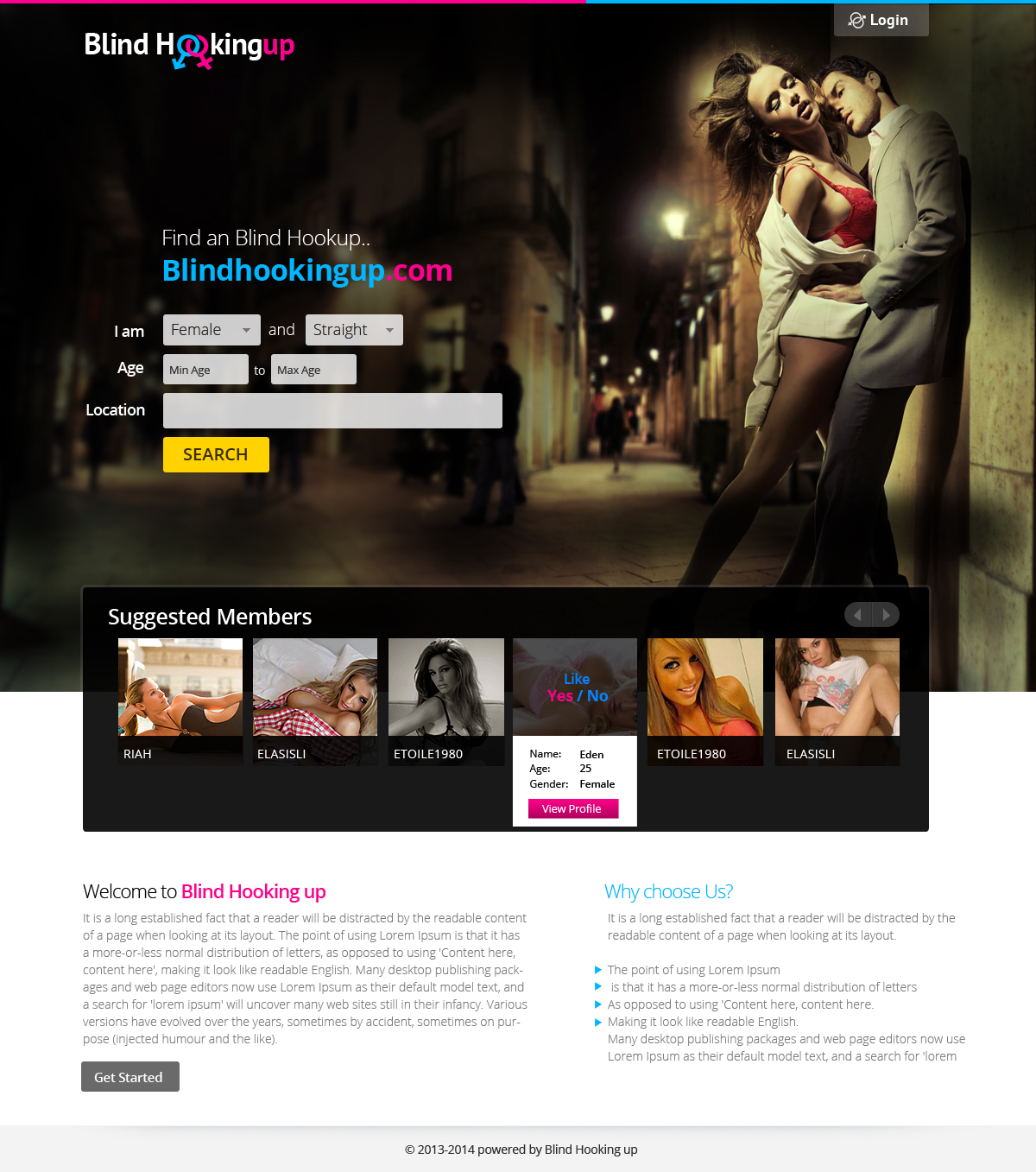
1. Viewinga sequence of potential matching profiles, answer a question similar to “do youwant to hook up he/she/them?” Clearly more “hot” than “sweet”… more erotic (notX) than love/tender… more prohibited/hidden/secret thanstandard/traditional/public/familiar…
This simplysystem can be the principal idea so, could take a good place in the home,before register showing the best rated profiles, and after register to show thepotential matches.
The sitewon’t be restricted to men/women, it will allow to register as couple too andthe mix of sexual orientations hetero/bi/homo... Of course you should registerand choose your filter parameters, but you’ll do it sometimes, not in everyvisit to the site.
The usershould see a big picture of each profile (this is the first attraction, we’rehooking up not searching for our whole-life partner) and just a few otherdetails like age and feedback rating from other users that already met thatprofile.
Thereshould be a way to review what profiles did you answer Yes and what No.
2. Anotherimportant part of the site is the one to create and propose meet plans. You canpost here your fantasies, your plans, your suggestions about what do you wantto do or what you propose for the meeting. This is where the search engine willtake place, to propose you places, ideas or services based on what you’refinding. This will be some kind of wizard or assistant, to “configure” yourideal meeting. It should suggest you activities to include in your plan and thesearch engine will suggest related places related to that activities. I.e.: ifI’d like to take a dinner, grab some beers and finish the night on a 5 starhotel suite, I’ll add “Dinner ideas”, “going out ideas” and “night stay ideas”(or something similar) and the engine will suggest me some near restaurants,pubs and hotels. Of course, you can enter your personalized plan manually inplain text or just select activities without taking any suggestion. (reserve aplace to suggest new activities to the system!)
Afterconfiguring your plan, you can post it to be realized some days and expose itto your matches to find anyone that like your plan.
This wizardwill allow you to browse the past plans to edit/reuse them and also receiveanswers from the matching profiles who like your plant to initiate the finalcontact and meet them.
3. Inanother section you should see plans posted by others and have the way toaccept or discard them.
4. Ofcourse, the homepage must not be as simple as the Yes/No answering section, it’simportant to explain what the service are and how it works, but, for us, it’smore important to see how the “daily” operative will show up than the home,because the home must be a reflect, a summary, of the operative surrounded bycatching slogans.
There’realso several related or secondary screens and resources to be designed, but,first, we’ll to focus on these four things. Drafts should reflect these ideasor will be very difficult to fit.
Added Thursday, May 15, 2014
After revising a lot of designs sent, there's something we're doing wrong... maybe I'm not explaining myself well, so, let me try again to expose some important ideas and add some others that had appeared after a few designs that I thing they're on the right way:
Added Saturday, May 17, 2014
Many of your are using some kind of form to enter the search parameters... We want to try to avoid this and we're thinking on integrate the form on the homepage itself... something like to use icons to select "what I'm" (Man/Woman/Couple... in a similar way as many of you are showing the total profiles of each...); then, a second, bigger, selector to choose "what I'm looking for" (Men/Women/Couples, could select one or many)... maybe playing with big pictures or the background itself; finally (perhaps integrated with the results) some kind of slider to select the age range, leaving only the dropdowns to select the geographic location (if no one has a better idea with no typical "fields").
Added Monday, May 19, 2014
Project Deadline Extended
Reason: Some of you are in a very good way, but probably you need some more time to make your ideas shine ;)
Added Monday, May 19, 2014
Industrie/Einheitstyp
Dating
Sehen und fühlen
Jeder Schieber zeichnet eine der Charakteristiken der Marke des Kunden aus sowie den Stil, den euer Logo widerspiegeln sollte.