footytips.com.au Logo Refresh
Wollen Sie auch einen Job wie diesen gewinnen?
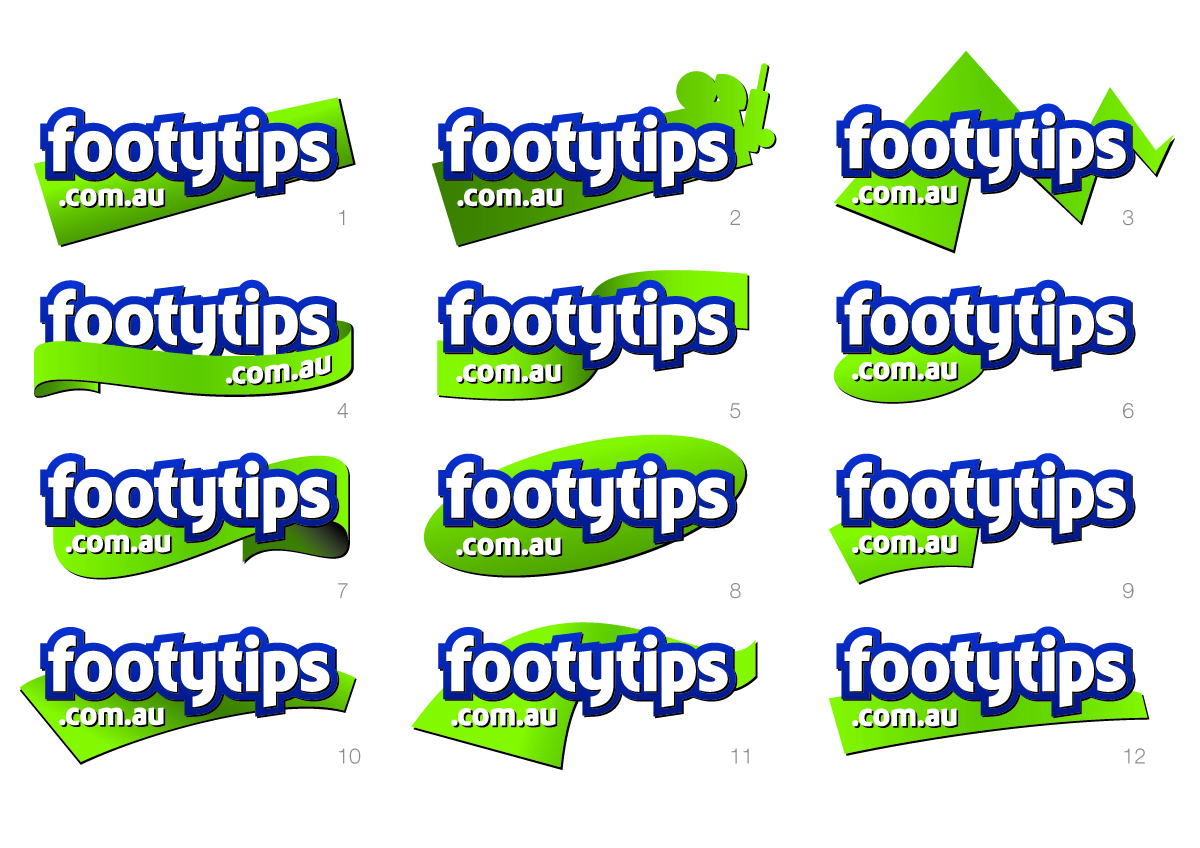
Dieser Kunde bekam 169 Logo-Designs von 46 Designern. Dabei wurde dieses Logo-Design Design von JSD als Gewinner ausgewählt.
Kostenlos anmelden Design Jobs finden- Garantiert
-
 A$985
A$985
-
 169 Designs
-
 46 Designer
Logo-Design Kurzbeschreibung
We have had the same logo for 12 years, its time for a refresh. We want to make our logo refresh an evolution - we are not looking for a revolution.
**************************************
REPEAT: WE WANT AN EVOLUTION - NOT A REVOLUTION IN OUR LOGO.
Our site will get an update (see attached) for 2011. Our logo should reflect the moderness or "web 2.0" feel of our new site. We suspect that some people won't even notice the logo change, but they will feel different about the site as the look and feel of the site/brand has changed.
**************************************
PROJECT BACKGROUND:
Footytips.com.au is Australia's largest footy tipping site. For non Australians, "Footy Tipping" is the same as the "Pick EM" games for NFL & EPL ,etc. Its a big cultural thing in Australia. Its basically a soft version of fantasy football, but all the fantasy football "feelings" and "emotions" apply.
BRAND ESSENCE:
Our brand essense is: Bragging rights through the pulse of sport. The "pulse of sport" refers to the fact that sport changes all the time and as a result your "bragging rights" can change from game to game, minute-by-minute.
BRAND BACKGROUND:
At the very the heart of our essence is the desire
to create communities where individuals have the
opportunity to win, to claim bragging rights. Winners
can grin and losers can please themselves, we
unashamedly wish to make hero’s of the winners
of the competitions that we configure. It means as
a brand we need to build powerful rituals around
celebrating the individuals who are the winners. We
need to create forums and experiences where they
get to strut their bragging rights. We need to feed
our tipping communities with ideas and opportunities
for celebrating their winners. If we are being passive
as a brand in celebrating winners and elevating their
bragging rights status, we are simply not living our
essence.
BRAND VALUES:
Rock Solid (reliable)
Addictive
Tribal
Innovative
The Source
Sports Mad
BRAND PERSONALITY:
Imaginative
Leader
Spirited
Reliable
PRODUCT VALUE TO MEMBERS:
Target Market: Members and competition administrators seeking an informative, easy and effective sports tipping
competition.
Benefits: Hassle free administration, Great way to create a sense of community with a shared interest
and feeling of belonging, Access to the right information for informed tipping, Entertaining and fun, Easy and convenient mobile access.
COLORS
The blue has to stay, it is the core color of our brand. The secondary color of green we are happy with, but a blue only logo would be OK. It would be unlikely that we would want to introduce another color than blue and green.
THE ORIGINAL LOGO
The rectangles behind the letters t-i-p-s in our old logo were to represent physical pieces of paper that "footy tipping" was traditionally done on in offices. I think this was lost in translation, we don't think many people actually got that.
Aktualisierungen
Thanks for those designers that have submitted designs so far. One thing that no-one has picked up is the brand essense "Bragging rights through the pulse of sport". I did suspect that we might get some "pulse" in the logo (like the heart rate monitors). Id be interested to explore this. Please, any use of a "pulse" has to be VERY subtle, but its one creative angle that has not been explored that is consistent with our brand.
Zielmarkt/( -märkte)
Typically people that run a tipping comp in their office. They start the comp and invite friends. They are not always internet savvy, but they do want to use a site that gives them comfort it is reliable and professional and won't let them down.
Industrie/Einheitstyp
Games
Logo Text
footytips.com.au
Logo Stile, die Sie interessieren können
Emblem-Logo
Logo eingeschlossen in einer Form
Wortmarke-Logo
Word oder namensbasiertes Logo (nur Text)
Sehen und fühlen
Jeder Schieber zeichnet eine der Charakteristiken der Marke des Kunden aus sowie den Stil, den euer Logo widerspiegeln sollte.
Elegant
Fett
Spielerisch
Ernst
Traditionel
Modern
Sympatisch
Professionell
Feminin
Männlich
Bunt
Konservativ
Wirtschaftlich
Gehobenes
Anforderungen
Muss haben
- Must contain the letters "footytips.com.au".