Homepage Banner for Financial Exchange
Wollen Sie auch einen Job wie diesen gewinnen?
Dieser Kunde bekam 28 Grafik-Designs von 11 Designern. Dabei wurde dieses Grafik-Design Design von JR designs als Gewinner ausgewählt.
Kostenlos anmelden Design Jobs finden- Garantiert
-
 US$240
-
 28 Designs
-
 11 Designer
Grafik-Design Kurzbeschreibung
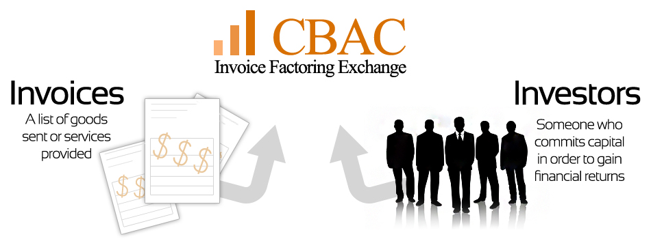
Our business is an invoice factoring exchange located in the United States.
Our business provides a marketplace for businesses with outstanding invoices and investors looking to purchase the invoices from these businesses. The investors provide the businesses with immediate capital instead of the businesses waiting 30-90 days for the invoices to be paid by their customers.
Our business plan is very similar to the DesignCrowd business plan. The difference is instead of designers there are investors and instead of people needing designs created there are businesses with invoices that need to be purchased.
I would like the size to be approximately 950px x 350px. The site is located at cbacfunding.com.
Here is an example from a similar company in the UK: http://marketinvoice.com/wp-content/uploads/2011/02/Hon-HowItWorks.png.
Here is a very good representation of how our company works: http://cbacfunding.com/about/how_it_works
Aktualisierungen
I believe a white background would look best. The inner pictures should show invoices on the left, buyers on the right and our company represented in the middle as the center marketplace.
I'm not opposed to something different but if a visitor comes to the site I went them to grasp exactly what we do withing a few seconds.
Added Friday, September 07, 2012
After seeing a few designs, I believe it's important to reiterate to the business selling their invoices that they will receive many offers. A good way to do that would be to show many arrows going from the buyer to the marketplace. The arrows I've noticed have been very bold, it might look better in shades of gray or a lighter color and maybe more abstract.
Added Friday, September 07, 2012
Project Deadline Extended
Reason: Some good designs are starting to come in and I asked some designers to make a few changes.
Added Tuesday, September 11, 2012
Zielmarkt/( -märkte)
Businesses
Industrie/Einheitstyp
Business
Sehen und fühlen
Jeder Schieber zeichnet eine der Charakteristiken der Marke des Kunden aus sowie den Stil, den euer Logo widerspiegeln sollte.
Elegant
Fett
Spielerisch
Ernst
Traditionel
Modern
Sympatisch
Professionell
Feminin
Männlich
Bunt
Konservativ
Wirtschaftlich
Gehobenes
Anforderungen
Schön zu haben
- I believe a white background would look best. The inner pictures should show invoices on the left, buyers on the right and our company represented in the middle as the center marketplace.
I'm not opposed to something different but if a visitor comes to the site I went them to grasp exactly what we do withing a few seconds.
Sollte nicht haben
- I'm not looking for a banner with orange background. I prefer to have a white background with some colorful pictures that may jump when a user enters the page.