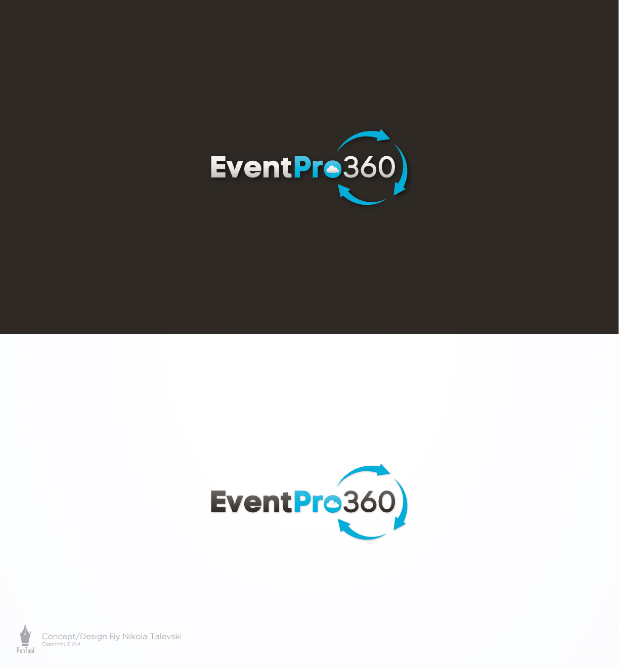
Logo for EventPro360 web based event management software

Wollen Sie auch einen Job wie diesen gewinnen?
Dieser Kunde bekam 221 Logo-Designs von 35 Designern. Dabei wurde dieses Logo-Design Design von PenTool als Gewinner ausgewählt.
Kostenlos anmelden Design Jobs finden- Garantiert
Logo-Design Kurzbeschreibung
PLEASE SEE THE PDF FILE THAT WE UPLOADED - IT IS A SCAN SHOWING A ROUGH SKETCH OF WHAT WE ARE AFTER.
EventPro360 is in need of a logo. We provide web based event management software for professionals in the golf, banquet and catering industries.
Here are a few parameters for our logo design:
1. The logo should be focused on the text EventPro360. We would like to see the word Pro in bolder text than the other text.
2. We would like to see a circle made up of 3 arrows going around the 360 part of the text - but not all the way around it. We want to make sure the text has continuity so we don't want the arrows to come between the Pro and the 360. So the first arrow can start above the "o" of Pro and the last arrow can finish up just below the "o". Our preference is for arrows with a little bit of style to them - for example, arrows that start out thin and then get wider towards the end of the arrow.
3. We would also like to see a subtle cloud shape or part of a cloud shape somewhere in the logo. Specifically, the cloud shape could start just left of the E and wrap around the top of it, and end somewhere above the first few letters of Event. It does not need to be a full cloud - even just a single line in the right shape would do, or something that can show a cloud in negative space if you are looking for it.
4. We would prefer for the logo to be longer (left to right) as opposed to taller. We want to be able to fit the logo into title bars on top of web pages, like the DesignCrowd logo does on their web site.
5. We are passionate about providing cutting edge software that is intuitive, easy to use, and efficient. Our logo should be clean, modern, and not overly complex.
6. We are open to other color variations, but our preference is to have two color scheme versions of the logo: a white/blue version to go on dark backgrounds, and a dark gray/blue version to go on light backgrounds.
Aktualisierungen
Project Deadline Extended
Reason: We did plan our original deadline date very well. One of our key company decision-makers is away on vacation this week, so we have decided to extend the deadline to next week. This way, we should be able to have a final design selected shortly after the deadline. Thank you for your patience,
EventPro360
Added Tuesday, July 08, 2014
Zielmarkt/( -märkte)
Our customers are General Managers and other management-level staff at Golf Courses, Country Clubs, Resorts, Banquet Halls, and Catering Companies.
Industrie/Einheitstyp
Software
Logo Text
EventPro360
Zu verwendende Schriftarten
Farben
Vom Kunden ausgewählte Farben für das Logo Design:
Sehen und fühlen
Jeder Schieber zeichnet eine der Charakteristiken der Marke des Kunden aus sowie den Stil, den euer Logo widerspiegeln sollte.
Elegant
Fett
Spielerisch
Ernst
Traditionel
Modern
Sympatisch
Professionell
Feminin
Männlich
Bunt
Konservativ
Wirtschaftlich
Gehobenes
Anforderungen
Muss haben
- Must have the text EventPro360 along with some other graphic element to give the logo some character.
Schön zu haben
- We would like to see some logos with one or both of the following graphic elements:
1. A series of 3-5 arrows that form a circle shape, which is representative of an event life cycle or sales cycle. This circle could be around the 360 portion of the text, or anywhere else you think looks good.
2. A subtle cloud shape, outline, or partial cloud shape. This could be located next to the text, or in amongst the text somehow. One idea would be to have the top line of a cloud shape above the text.