Revolutionary Video Platform (uncoded) - updated 05.11.
Wollen Sie auch einen Job wie diesen gewinnen?
Dieser Kunde bekam 72 Web-Designs von 9 Designern. Dabei wurde dieses Web-Design Design von Veleriq als Gewinner ausgewählt.
Kostenlos anmelden Design Jobs finden- Garantiert
-
 €480
€480
-
 72 Designs
-
 9 Designer
Web-Design Kurzbeschreibung
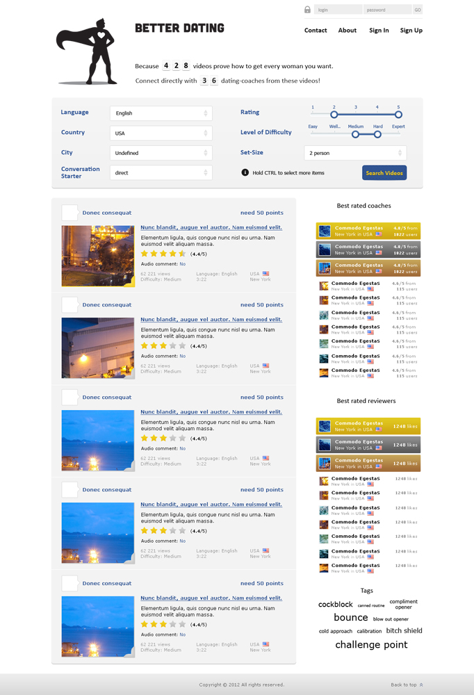
We want you to design the frontpage (uncoded) of BETTERDATING.com (we ev. hire the winner to create the subpages).
The concept of BETTERDATING.com is to show (ONLY!) infield videos of dating coaches (when they get in contact with women on the street) so that the users will have a solid base for deciding which coach they want to contact. I highlight that because some designs contained other ideas like "dating tips". No, we are specialized on infield videos. People should see if these coaches are really worth their money.
Therefore, the frontpage must include the following:
Header: Logo (attached), writing "BETTERDATING" or "BETTER DATING", links "Contact", "About", "Sign In", "Sign Up"
No design yet tried to change the logo in its size. You're welcome to do creative stuff.
What else is necessary on the front page:
1. 2 statements:
"Because 34 videos prove how to get every woman you want."
"Connect directly with 26 dating-coaches from these videos!"
The numbers should be showed in a way that the users know that they count up automatically; important: use the style badoo has on it's front page by showing their amount of users.
2. Top rated Dating Coaches:
As the videos on the site can be rated, we want the coaches with the best rated videos on the front page with their faces (people can jump from there directly to their profiles).
To the pictures of the coaches you should also add the country flag and the city (where they come from). Plus, users should see who's on the first place, who's on the second place.. max. 10 coaches on the front page..
Set the title "TOP 10 DATING COACHES listed by best rated videos"
3. Search System
In order to find the videos the user is searching for, it needs a simple search form, where they can search after:
- Language
- Country
- City
- Rating
- Level of Difficulty
- Set-Size
- Conversation Starter
You can use simple white bars with a drop-down button.
4. Tags
Implement tags like "bitch shield, blow out opener, bounce, calibration, canned routine, challenge point, cockblock, cold approach, cold reading, compliment opener" etc.
Alphabetically listed..
5. Create previews of the (searched) videos which contains:
- Thumbnail of the video (only thumbnails on front page, no bigger video playback window, pls use pictures in order to make the site look more real)
- Some infos about the video (name of the coach with user-picture, duration, language, country (name and flag), city, audio comment (yes/no), difficulty level (super easy-expert), views, points needed to view (1-3), 5 star rating)
- Title and the beginning of the text about the video (written by the coach), i.e. about 30 words
- There are 2 sorts of videos.. (it's not necessary to explain why, it's just important that you implement two different versions of the video preview area (different only in terms of color!).. for example, some video preview areas could be edged in gold, others in silver.. or you could fill the whole video preview area with a color.. show me your taste... even though I prefer the more elegant way like gold and silver, you can probably surprise me with other color combinations..
- In order to simplify the process of comparing your designs, pls create 4 such preview video are areas..
6. Best voted video reviewer:
Users AND coaches will be able to write reviews about the videos. These reviews can be liked/voted. Therefore, we will know which user or coach writes the best reviews.
So we want you to implement also the charts of the 10 best voted video reviewers. Make sure there is a ranking list with the name of the user/coach and how many likes he got.
Here as well: add country flag, country and city (to see where they come from)..plus a little thumbnail of the profile picture.. Make sure the best 3 are being highlighted somehow..
Aktualisierungen
Added Tuesday, November 06, 2012
Zielmarkt/( -märkte)
male, 16-40 years old, worldwide audience
Industrie/Einheitstyp
Dating
Sehen und fühlen
Jeder Schieber zeichnet eine der Charakteristiken der Marke des Kunden aus sowie den Stil, den euer Logo widerspiegeln sollte.
Elegant
Fett
Spielerisch
Ernst
Traditionel
Modern
Sympatisch
Professionell
Feminin
Männlich
Bunt
Konservativ
Wirtschaftlich
Gehobenes
Anforderungen
Muss haben
- Not all submitted designs considered all requirements.
Therefore, please read the requirements carefully and consider all of them. If you want to add some new ideas or if you decide not to implement some requirements, I suggest to submit a second design.
Schön zu haben
- - if you have other ideas, feel free to add some of them to the front page, probably in form of a second design
- sometimes the same page will look totally different in other colors. Therefore, it would be great to add a 2nd version of your design, in terms of color
- the front page needs to be an eye-catcher
- different BETTERDATING font styles (come up with your own taste), a few different styles would be great!
Sollte nicht haben
- - a search field like there is one in the first submitted design (the intelligent search is already being available with the filter system and the tags)
- female colors like pink/purple (it's a site only for men)
- a 08/15 look.. this will be the first website worldwide which contains videos from the best dating gurus on this planet in action.. they deserve a cool place to show their videos in order to gain new customers..