

 Aktualisieren
Software Review & Lead Gen Website Needs a Design
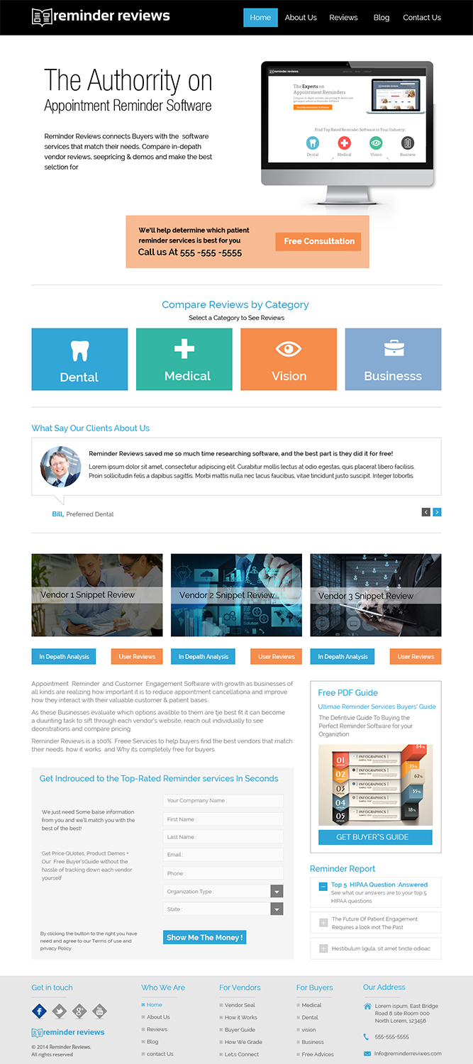
Wollen Sie auch einen Job wie diesen gewinnen?
Dieser Kunde bekam 7 Web-Designs von 4 Designern. Dabei wurde dieses Web-Design Design von Creative Usha als Gewinner ausgewählt.
Kostenlos anmelden Design Jobs finden
- Garantiert
-
 US$190
-
 7 Designs
-
 4 Designer
Web-Design Kurzbeschreibung
We are starting a software lead generation company in the Appointment Reminder space. Our business model is very similar to softwareadvice.com. We get paid when we introduce a qualified buyer to a software vendor by vetting out each buyer with a phone call with one of our experts.
The site needs to entice the buyer to call us or submit a form on our site for a quick interview where we will then narrow down the field of vendors to 3 that best suit their needs. Everything is 100% free for the buyer. We also provide reviews of each software vendor so that they can compare.
The website can currently be found at reminderreviews.com (this is a mockup we have just been playing around with - we do not prefer this specific design look, although we do like the font style, icons and color styles)
We're looking for a design of the home page and of the review page (for the reviews, we are going to have a medical reviews page, a dental reviews page, vision reviews page and business reviews page - reminder software will vary depending on the category of the organization) about us, for vendors page, and how it works page.
We've attached some really basic mockups we created of each page in a PDF. Each page is labeled (some have a "2" and that just means as you scroll down) You definitely don't have to copy what we have - we've been told that its too "busy" looking. We feel that a professional web designer could do a much better job of simplifying the UI and creating a better flow as well as just making it more pleasing on the eyes.
For inspiration, see softwareadvice.com (they have the exact same business model, but they work in multiple industries whereas we just work with reminder software) and thumbtack.com (also a slightly similar model).
Feel free to use the text from our mockups, create your own, or just use latin and we can fill in the rest with what fits best in your design.
We have a logo that we can send you, but no photos, so please use your best judgement and we'll make changes as needed.
Most important to us:
- Strong, simple calls to action - we want the buyers to call us directly, download our buyer's guide (in exchange for their email) or fill out a form for us to call them - when we get them on the phone, we conduct a quick interview to assess their needs and then narrow down the vendors to just 3. The vendors then pay us for the introduction to the buyer.
- Conveys to the visitor how we can help them (narrow down their search, allow them to compare vendors, save time and avoid mistakes)
- Narrow down each visitor by the type of company they are (Medical, Dental, Vision or Business)
We like white space, and simple / modern looks.

Aktualisierungen
Project Deadline Extended
Added Wednesday, July 30, 2014
Zielmarkt/( -märkte)
Doctors offices, office managers and business people
Industrie/Einheitstyp
Software
Zu verwendende Schriftarten

Farben
Vom Kunden ausgewählte Farben für das Logo Design:
Sehen und fühlen
Jeder Schieber zeichnet eine der Charakteristiken der Marke des Kunden aus sowie den Stil, den euer Logo widerspiegeln sollte.
Elegant
Fett
Spielerisch
Ernst
Traditionel
Modern
Sympatisch
Professionell
Feminin
Männlich
Bunt
Konservativ
Wirtschaftlich
Gehobenes
Anforderungen
Muss haben
- See description above
Schön zu haben
- We like the font ff-tisa-web-pro and can provide if necessary