

 Aktualisieren
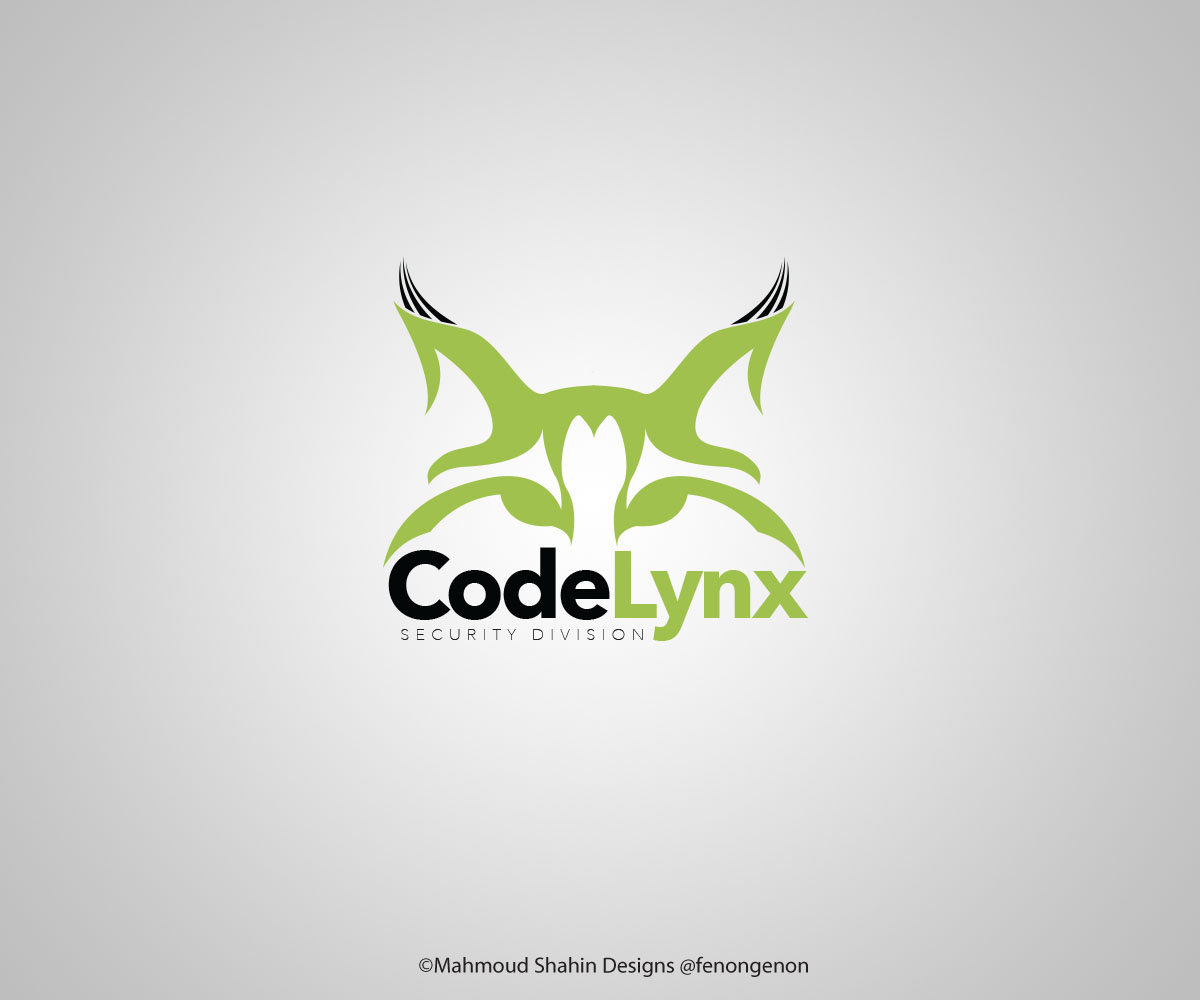
Need New 'CodeLynx' Corporate Logo (Software and Security Company)
Wollen Sie auch einen Job wie diesen gewinnen?
Dieser Kunde bekam 70 Grafik-Designs von 16 Designern. Dabei wurde dieses Grafik-Design Design von Mahmoud Shahin als Gewinner ausgewählt.
Kostenlos anmelden Design Jobs finden
- Garantiert
-
 US$315
-
 70 Designs
-
 16 Designer
Grafik-Design Kurzbeschreibung
www.codelynx.com - We are trying to better incorporate the two sides of our business (software development and physical security such as camera/alarm/motion detectors) by collaborating on more projects and giving our teams more opportunity to interact. Up until now the software side has been using the current logo and the security side has been using the old logo with the cat. We want a new logo that reflects both sides and our new merge/collaboration. Here is what they want to keep from each of the old logos:
Current (wordmark) - Like the clean, modern font and the shade of green used. Think design is too simple and want some kind of lynx (wild cat) included in the logo (so not just a wordmark). Like the separation in color between 'Code' and 'Lynx' but having it in all caps makes it difficult to read for some people (would prefer small caps or an uppercase 'C' and 'L' to better show the break between words).
Old (cat) - Like having a lynx (wild cat) in the logo, really want a more geometric/simpler/more modern looking cat though. Open to a cat eye, the full body, or a cat head/profile, just want some kind of inclusion of the cat. One owner suggested the cat leaping or showing some kind of motion through graphics. Don't like the shade of green on this one (too dark/dated looking). Think the font is dated but like the capital 'C' and 'L' because it's easier to read the company name and see it is two words (CodeLynx).
Final design should be modern, adaptable to many formats (we use it online, in print, embroidered on shirts, etc.), and preferably include a Lynx (cat)--even if it's more of a suggestion of one than the literal interpretation on the old logo.
Also attached are several samples that the owners of the company (a husband/wife team) said they liked, just as a frame of reference. Thanks!!!
Zielmarkt/( -märkte)
Mostly male decision makers at the companies we work with
Industrie/Einheitstyp
Security
Zu verwendende Schriftarten


Farben
Vom Kunden ausgewählte Farben für das Logo Design:
Sehen und fühlen
Jeder Schieber zeichnet eine der Charakteristiken der Marke des Kunden aus sowie den Stil, den euer Logo widerspiegeln sollte.
Elegant
Fett
Spielerisch
Ernst
Traditionel
Modern
Sympatisch
Professionell
Feminin
Männlich
Bunt
Konservativ
Wirtschaftlich
Gehobenes
Anforderungen
Muss haben
- Please see brief


