Geospatial Software Suite - Product Logo Design
Wollen Sie auch einen Job wie diesen gewinnen?
Dieser Kunde bekam 255 Logo-Designs von 53 Designern. Dabei wurde dieses Logo-Design Design von designgreen als Gewinner ausgewählt.
Kostenlos anmelden Design Jobs finden- Garantiert
-
 A$900
A$900
-
 255 Designs
-
 53 Designer
Logo-Design Kurzbeschreibung
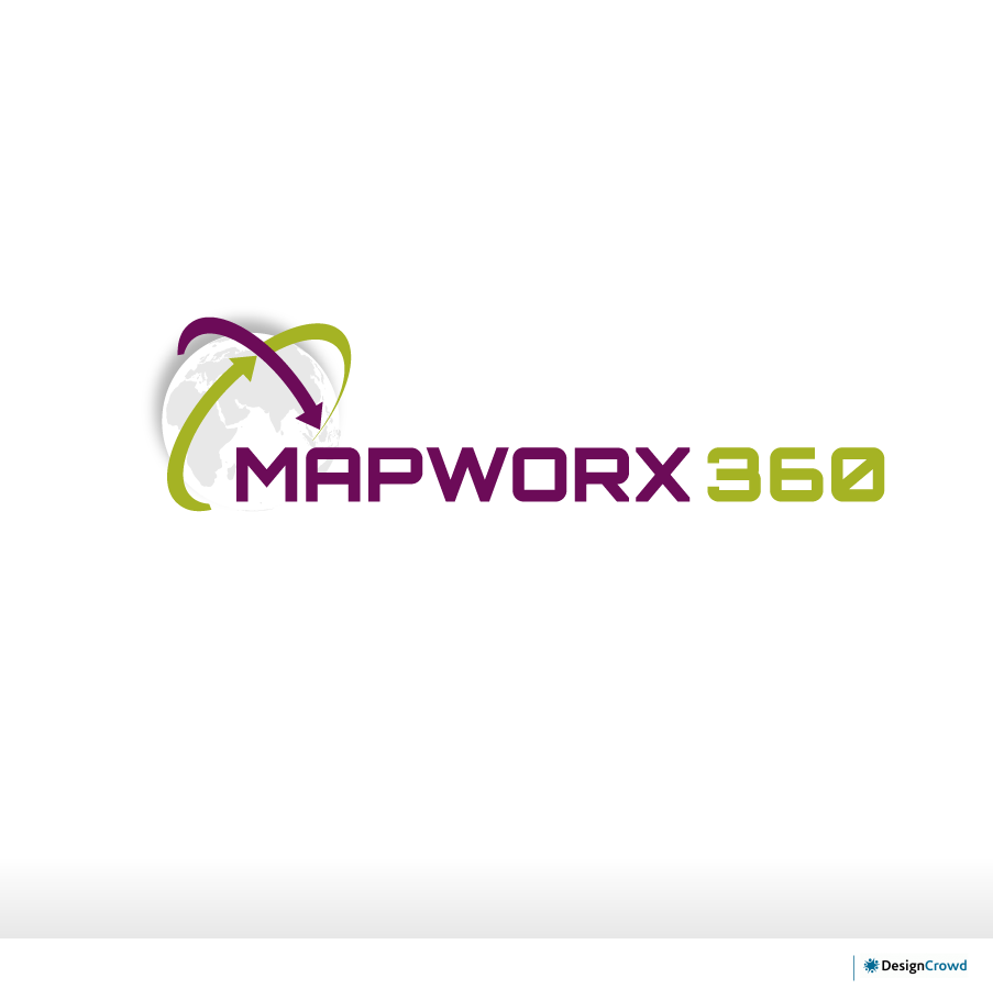
We are about to launch a product suite called "Mapworx 360", which encompasses a number of our geospatial (geographic / mapping) software products. The suite is intended as a "one-stop shop" that will meet all the needs of people who want a cloud-based web portal for distribution and visualisation of spatial data. One of the main features of the software suite is iDelve, an interactive web-mapping application, that allows users to view and interact with vector based spatial data layers in their desktop and mobile browsers.
Our company (Amristar) provides technically innovative and advanced solutions for organisations who require software solutions to deal with spatial data (think roads, cadastre, aerial photography, etc.) Typically our clientele consists of spatial data custodians, government departments, utility companies, mining companies and other large enterprises.
The "360" part of Amristar's "Mapworx 360" product expresses the "all encompassing" nature of our solution. In the future we will be launching instances of our product that will be named "Mapworx XXX", where the "XXX" could be a client name, or something that represents a specific target audience. The logo must therefore be designed in such a way that the "360" part is easily interchangeable. However, "Mapworx" will never be used by itself without a suffix.
We already have established company colours, typefaces and logos that we have used in our "Amristar" and "iDelve" logos, and it would be nice to see some entries that incorporate or blend well with these, however we are also open to suggestions of complementary colours/fonts that could tie in well with our brand. However, because our company is currently evolving, we are more than happy to consider designs 'outside the box' of our existing branding also.
Aktualisierungen
Hi All,
- I want to reduce the emphasis on 'the cloud'. Some of you have used clouds in your designs, but this is not really what our software suite is all about. Yes, it does utilise cloud computing for data management purposes, however, I want the emphasis to be more on the fact that our product is a web-based mapping software suite.
- Having seen some designs using the 'Amristar' pink/red colour, I have decided that I really don't like it all that much for this particular logo (but please keep the Amristar colour in mind, because whatever colours you choose needs to look aesthetically pleasing when lined up next to our other existing logos).
- I have also come to the decision that the text part needs to be a single colour. Our existing logos use text that has no gradients, borders or 3D effects, so please try to keep your design of the text simple and in keeping with this.
Added Thursday, November 22, 2012
Firstly, thank you very much to everyone who has submitted designs so far, and particularly those of you who have submitted several new versions based on my feedback. It is very much appreciated.
Added Tuesday, December 04, 2012
Thanks to all that participated in our design contest. A short list of submissions is currently being reviewed by our leadership team, and we hope to reach a decision soon. We thank you for your patience. Please wait for us to contact you if we have any further feedback or requests.
Added Wednesday, December 19, 2012
Hi everyone,
Added Thursday, January 03, 2013
Zielmarkt/( -märkte)
Spatial Data Re-sellers and Custodians, Large Enterprises, Government Departments, Utilities Companies, Resources Industry
Industrie/Einheitstyp
Government
Logo Text
Mapworx 360
Logo Stile, die Sie interessieren können
Emblem-Logo
Logo eingeschlossen in einer Form
Pictorial / Combination-Logo
Ein reales Objekt (Text optional)
Abstraktes Logo
Begrifflich / symbolisch (Text optional)
Sehen und fühlen
Jeder Schieber zeichnet eine der Charakteristiken der Marke des Kunden aus sowie den Stil, den euer Logo widerspiegeln sollte.
Elegant
Fett
Spielerisch
Ernst
Traditionel
Modern
Sympatisch
Professionell
Feminin
Männlich
Bunt
Konservativ
Wirtschaftlich
Gehobenes
Anforderungen
Schön zu haben
- Incorporation of our company colours and/or typefaces or colours/fonts that complement them (designs that do not have this will still be considered and we are keen to see alternatives).
'Amristar' font: Sackers Square Gothic (or similar)
'for a world gone spatial' font: Orbitron
Sollte nicht haben
- Compasses, North Arrows (too many logos have this, but other geographic symbology is allowed)