

 Aktualisieren
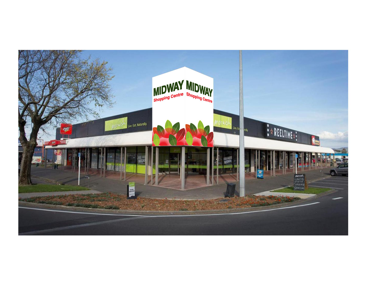
Midway Shopping Centre main sign re-design project
Wollen Sie auch einen Job wie diesen gewinnen?
Dieser Kunde bekam 75 Beschilderungs-Designs von 26 Designern. Dabei wurde dieses Beschilderungs-Design Design von Dbmay als Gewinner ausgewählt.
Kostenlos anmelden Design Jobs finden
- Garantiert
-
 A$440
A$440
-
 75 Designs
-
 26 Designer
Schilder-Design Kurzbeschreibung
We would like to refresh the look of the main sign we have on the corner of a block of shops to make it more contemproary and vibrant.
A picture of the existing sign which reads Midway Shopping Centre can be found in attached PDF and at the following URL.
http://www.bayleys.co.nz/~/media/Listings/Manawatu%20Wanganui/Palmerston%20North%20City/Palmerston%20North%20CBD/750532/Images/750532_1.ashx?bc=Gainsboro&as=1&h=550&w=980&ma=1
Midway Shopping Centre is also know locally as Midway Plaza, but the key word is Midway.
The existing signage has a flower/clover pattern on it which I think was just added to create a bit of interest. The building is located in a town surrounded by farm land.
I do quite like the organic feel of plant leaves or certain flowers - preferably New Zealand native plants for instance - the Kowhai flower or leaf block, pohutukawa, or kaka beak - reference images can be found with google image search
Geometric patterns could also be an option.
Once again the imagery is only to soften the sign and add some interest.

Aktualisierungen
Additional images of existing signage added
Added Friday, December 07, 2012
Project Deadline Extended
Reason: Closing date extended to allow for fact that lead up to Christmas is a busy time of year for many people.
Added Wednesday, December 12, 2012
Zielmarkt/( -märkte)
The target audience is premium shopper
Industrie/Einheitstyp
Building
Sehen und fühlen
Jeder Schieber zeichnet eine der Charakteristiken der Marke des Kunden aus sowie den Stil, den euer Logo widerspiegeln sollte.
Elegant
Fett
Spielerisch
Ernst
Traditionel
Modern
Sympatisch
Professionell
Feminin
Männlich
Bunt
Konservativ
Wirtschaftlich
Gehobenes
Anforderungen
Muss haben
- Must have the words: Midway Shopping Centre.
The big M is not essential, and I would rather the emphasis was on the word Midway.
Sollte nicht haben
- Should not be brown. We want the sign to feel more contemporary, but not too hard. The current pale brown feels too soft in comparison with the look of the building.