Facilitation App MyTurn needs Icon
Wollen Sie auch einen Job wie diesen gewinnen?
Dieser Kunde bekam 40 Icon-Designs von 7 Designern. Dabei wurde dieses Icon-Design Design von Vzentale als Gewinner ausgewählt.
Kostenlos anmelden Design Jobs finden-
 €185
€185
-
 40 Designs
-
 7 Designer
Icon-Design Kurzbeschreibung
MyTurn App pre-release information
(MyTurn is free, open source software)
Many procedures for allocation of turns to speakers have been advocated.
MyTurn resolves conflicting requests to speak in favor of the person who has spoken the least.
Our motto: Protect, Promote, Perform
Protect the speaker:
Inappropriate requests to speak are never revealed.
(There are several other protective functions).
Promote participation:
Participation is balanced through application of an Equal-time Resolution Rule.
(This is a key feature.)
Perform:
Performance of groups using the Equal-time Resolution Rule is superior.
(This is a published experimental result.)
The MyTurn application is available for testing at:
http://myturn.mobi/
The instructions and other documentation can be found at:
http://doc.myturn.mobi
The MyTurn App will run on Android (Google, HTC, etc.) and iOS (Apple) operating system devices. It can also be run in a computer's web browser.
There has been discussion on the MyTurn List about graphics. Access requires subscribing to the List. The most relevant message is:
https://groups.google.com/d/topic/mturn/_78tdKa-duc/discussion
A review of the Messages is not required for submitting a design, but it may be helpful.
Aktualisierungen
Several designers have used the name of the App as the basis for a design. That was an initial strategy and the following was posted to the List in regard to this image:
The bottom of the "Y" is the bottom jaw of the dog. The red field breaks the continuity of the letter, however, allowing the top of the "Y" to be placed in a different perspective - this would work better if the cut just left the "V" part of the "Y" above the cut. The light area under the "Y" helps create an "empty space" that pushes the "V" back allowing it to be seen in perspective. The left part of the remaining "V" is the back of the dog - this would be better, if it joined with the "M". The right part of the "V" is the tail of the dog. So, the dog is almost directly facing us, but the body can be seen in perspective on the right side of the mouth.
There are a lot of things that could be done to make the illusion easier to see. Of course, dogs don’t have rectangular mouths, so rounding of the red field or maybe reducing it just to a red "tongue" would help. Bones stereotypically have rounded bulges on their ends. The "T" of "Turn" could be the end of a bone, maybe hanging out of the side of the mouth with the other "bulge" obscured by the side of the dog's head. Using heavily serifed text for "Turn" would make it more bone like, since the letters would more easily be seen as a single unit. The "MY" color needs to be adjusted to be more dog like. If the left side of the "V", making up the back of the dog, was tiger striped, it would appear bigger, giving the appearance of a more husky dog. This is a result of another type of visual illusion.
Added Tuesday, December 18, 2012
This image is one that illustrates the point of the App. A variation on this could be successful.
Added Tuesday, December 18, 2012
Project Deadline Extended
Reason: We were unable to provide timely feedback, due to problems related to payment. This meant that we were booked solid for the first few days after posting the project.
A later deadline will also compensate for holiday off-times.
Added Tuesday, December 18, 2012
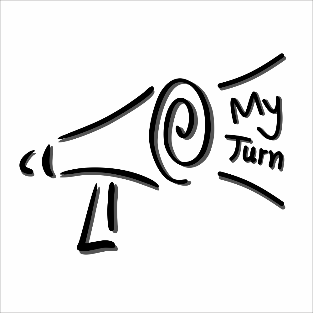
We prefer additional designs based upon this minimalist megaphone image. Try to maintain the same style, while adding the App name "My Turn". For example, the name could be coming out of the Megaphone, on its side, or underneath it.
Added Friday, December 21, 2012
The link in the previous Post doesn't seem to work. Here it is:
Added Friday, December 21, 2012
Zielmarkt/( -märkte)
Initial users may be professional facilitators, however, any smartphone user will find it helpful in a group discussion context.
Industrie/Einheitstyp
Computer
Sehen und fühlen
Jeder Schieber zeichnet eine der Charakteristiken der Marke des Kunden aus sowie den Stil, den euer Logo widerspiegeln sollte.