Coaching business needs a logo design
Wollen Sie auch einen Job wie diesen gewinnen?
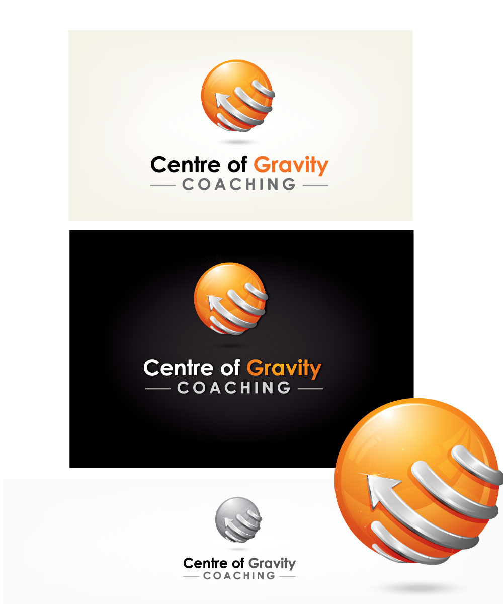
Dieser Kunde bekam 33 Logo-Designs von 13 Designern. Dabei wurde dieses Logo-Design Design von mouallem zoheir als Gewinner ausgewählt.
Kostenlos anmelden Design Jobs finden-
 A$160
A$160
-
 33 Designs
-
 13 Designer
Logo-Design Kurzbeschreibung
A coaching business called 'Centre of Gravity Coaching' needs a logo design. They like the idea of using a combination of light and grey colours, including shadows to signify a rising state of being - from uncertainty [e.g. grey] to enlightened and empowered [e.g, yellow/orange etc]. Please note that colour preferences are not set. The concept of 'centre of gravity' refers to gaining congruence or alignment between values and actions, filtering out the noise and unhelpful distractions/thoughts/beliefs to uncover what truly gives a person hope, power and purpose - their centre of gravity - This concept should be reflected in the design. The logo should include the name of the business, although this can sit under an appropriate logo image. There is no preference for font style. The logo and text should be positioned in such a way as to allow for use on future business card designs.
As a general comment, I''d have to say I really like the use of grey and orange (two colours) in the text. It helps create a distinction and makes the name ''pop''. There was originally some thought of placing the logo and text on a grey background for use on business cards, although the designs thus far (i.e. shadows, grey text combo) are suggesting a white background would do the designs more justice.
Please don''t feel you are limited to just using a sphere to represent the concept of achieving equilibrium, balance and focus. If you have another idea - be brave and go for it
Zielmarkt/( -märkte)
Very broad appeal - Executives, business owners, students, all genders and demographics.
Industrie/Einheitstyp
Business
Logo Text
Centre of Gravity Coaching
Logo Stile, die Sie interessieren können
Abstraktes Logo
Begrifflich / symbolisch (Text optional)
Figuren-Logo
Logo mit Abbildung oder Zeichen
Farben
Vom Kunden ausgewählte Farben für das Logo Design:
Sehen und fühlen
Jeder Schieber zeichnet eine der Charakteristiken der Marke des Kunden aus sowie den Stil, den euer Logo widerspiegeln sollte.
Elegant
Fett
Spielerisch
Ernst
Traditionel
Modern
Sympatisch
Professionell
Feminin
Männlich
Bunt
Konservativ
Wirtschaftlich
Gehobenes
Anforderungen
Schön zu haben
- Shadows and 3D style imagery