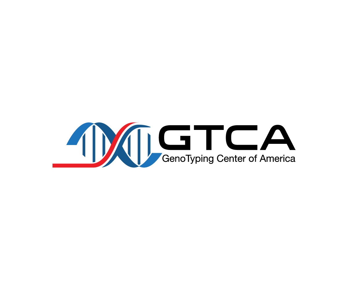
Logo Update for GenoTyping Center of America
Wollen Sie auch einen Job wie diesen gewinnen?
Dieser Kunde bekam 55 Logo-Designs von 25 Designern. Dabei wurde dieses Logo-Design Design von sourgraping als Gewinner ausgewählt.
Kostenlos anmelden Design Jobs finden-
 US$320
-
 55 Designs
-
 25 Designer
Logo-Design Kurzbeschreibung
We need to modernize our current, home-grown logo (see GTCA logo.png file). We would like the logo to include the acronym GTCA, but be designed such that we could use it in conjunction with the full company name (GenoTyping Center of America) either below or next to the logo. For example, The Jackson Laboratory uses "JAX" as their logo, but often places "The Jackson Laboratory next to it (see attached JAX logo.gif image).
We request that the logo have red, white and blue incorporated into the design, but we don;t have any specific guidance as to how those colors can or should be used. Be creative!
Also, the current logo includes a stylistic "amplification curve" and an actual amplification curve chart is attached (amp curve.jpeg file). This is how the data we generate for clients is represented and clients will readily recognize it. We would like to have an amplification curve incorporated or implied is some fashion in the design.
Since our company's service involved testing of DNA, there may be value in incorporating imagery of DNA into the logo. Here are competing companies where you can view their logos: www.transnetyx.com, www.laragen.com and www.genewiz.com.
We worked with another company to get a few design alternative (see attached GTCA.pdf file), but we do not care for any on those designs.
Thanks in advance for your creative ideas!
Zielmarkt/( -märkte)
Life Science research scientists in academic (universities and medical schools) and industrial (pharmaceutical/biotechnology) research organizations.
Logo Text
GTCA
Logo Stile, die Sie interessieren können
Pictorial / Combination-Logo
Ein reales Objekt (Text optional)
Abstraktes Logo
Begrifflich / symbolisch (Text optional)
Figuren-Logo
Logo mit Abbildung oder Zeichen
Zu verwendende Schriftarten
Sehen und fühlen
Jeder Schieber zeichnet eine der Charakteristiken der Marke des Kunden aus sowie den Stil, den euer Logo widerspiegeln sollte.
Elegant
Fett
Spielerisch
Ernst
Traditionel
Modern
Sympatisch
Professionell
Feminin
Männlich
Bunt
Konservativ
Wirtschaftlich
Gehobenes
Anforderungen
Muss haben
- Red, White & blue colors
- amplification curve incorporated (somehow)
Schön zu haben
- Logo design such that the full company name can be placed next to or below the logo and look good.