Quality Growers MMJ Company logo
Wollen Sie auch einen Job wie diesen gewinnen?
Dieser Kunde bekam 23 Logo-Designs von 7 Designern. Dabei wurde dieses Logo-Design Design von The Design King als Gewinner ausgewählt.
Kostenlos anmelden Design Jobs finden- Garantiert
-
 US$160
-
 23 Designs
-
 7 Designer
Logo-Design Kurzbeschreibung
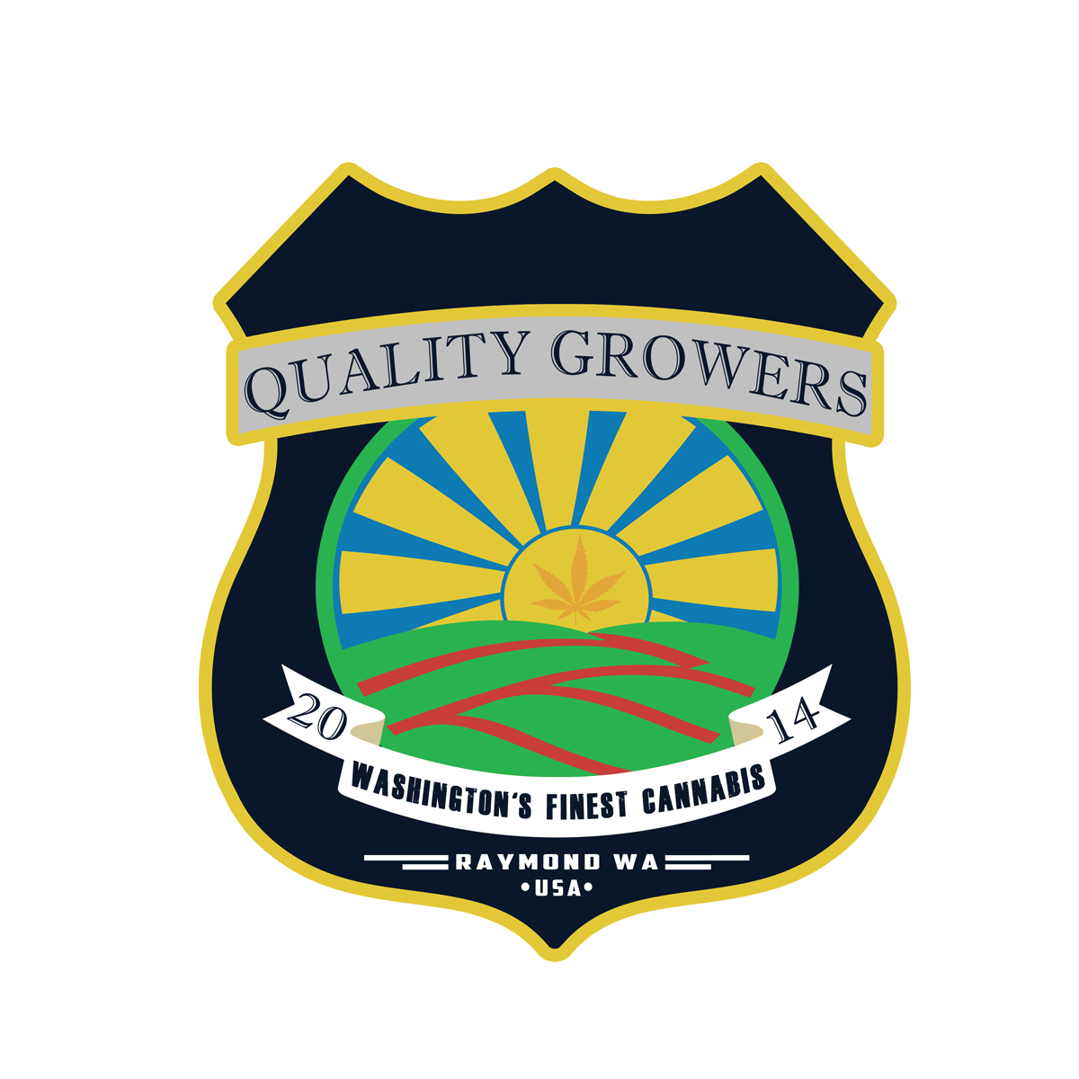
I am a Washington state, legal, marijuana grower, I want for a logo looks like a field growing in the foreground, the sun rising above it, a marijuana leaf inside the sunshine that makes the rays of the sun. (or something like this) green and red rows for the field, blue and gold for the sunshine. I want the marijuana leaf to be subtle, not in your face, yet obvious upon closer look at logo. nothing cutsie or cartoonish. I am open to artist interpretation. Please read carefully at my must haves as far as what I want for the shape of my design.
Zielmarkt/( -märkte)
Adults age 21 and above, nothing that would be mistakenly appealing to kids
Industrie/Einheitstyp
It Company
Logo Text
Qualtiy Growers Raymond WA (large print) Washingtons Finest Cannibas (small print)
Logo Stile, die Sie interessieren können
Emblem-Logo
Logo eingeschlossen in einer Form
Farben
Vom Kunden ausgewählte Farben für das Logo Design:
Sehen und fühlen
Jeder Schieber zeichnet eine der Charakteristiken der Marke des Kunden aus sowie den Stil, den euer Logo widerspiegeln sollte.
Elegant
Fett
Spielerisch
Ernst
Traditionel
Modern
Sympatisch
Professionell
Feminin
Männlich
Bunt
Konservativ
Wirtschaftlich
Gehobenes
Anforderungen
Muss haben
- I enjoy logos that look like a shield, the shape and style. similar to NFL logo, Harley Davidson, UPS, Ferrari, Firestone Tires, Warner Bros, Porsche, Lamborghini, Phillips 66. Almost badge like, a large Police Shield.
Schön zu haben
- a feeling that this logo has been around for a very long time. I love the influence of 1940s print advertising. I prefer basic colors, Navy blue is my favorite blue.
Sollte nicht haben
- cartoonish or cutsie, nothing that appears to target people under 21 years old.