Cosmetic Jar (Lid Only) Packaging Design Project
Wollen Sie auch einen Job wie diesen gewinnen?
Dieser Kunde bekam 60 Verpackungs-Designs von 10 Designern. Dabei wurde dieses Verpackungs-Design Design von Donn Marlou Ramirez als Gewinner ausgewählt.
Kostenlos anmelden Design Jobs finden- Garantiert
-
 US$240
-
 60 Designs
-
 10 Designer
Verpackungs-Design Kurzbeschreibung
UPDATE: I realize that the links I provided show products w/ packaging v. unlike my own, and that does limit you a lot design wise, so here are some links of logos/lid designs I like for v. similar jars:
I like how this one tells the brand and the product: http://www.dermstore.com/product_Loose+Powder+-+Dune_34162.htm
http://www.sephora.com/skin-foundation-mineral-makeup-spf-15-P296207?skuId=1353192
http://www.sephora.com/wild-rose-mineral-foundation-P277218?skuId=1440957
http://www.sheercover.com/
http://www.alimapure.com/assets/2012/11/07/eyes-banner-1.jpg
Also, black and white are fine for the colors, as the bright pink may look less professional.
*I've added two pics w/o the labels on the jar lids in case that helps!
*I'm hoping to see something that maybe has a graphic design that covers much of the lid, or is a bit abstract. I want people to think pretty and luxury when they see it. Please keep the submissions coming and I'll do my best to provide helpful feedback. Thank you all!
I need a package design for a heat-stamp (so for a die to be made and used for stamping the makeup jar's lid) for the plastic makeup jars of a natural, luxury makeup line. The jars will not have individual boxes, they will likely be placed in an organza or other fabric bag with the other products to reduce packaging.
I am currently launching intuitive COLOR on Indiegogo, so for more images and info. please check it out here: www.indiegogo.com/intuitivecolor
Name: intuitive COLOR
The line’s core product is a three part makeup process (the three products being smooth, color and set) and all together the three part set is called the trifecta. All products use only natural and cosmetic-grade mineral ingredients. The packaging design is for the jar lids of the two products: color and set.
Key Distinctions:
-intuitive COLOR’s products are free from Titanium Dioxide, Zinc Oxide and Micas. Titanium Dioxide and Micas have been linked to cancer, Zinc Oxide has been linked to respiratory and reproductive toxicity, but it is nearly impossible to find a department store, natural or mineral makeup that is free of all three of these ingredients.
-intuitive COLOR’s three part process, our trifecta, begins with the product called smooth, it is like a primer in that it smooths and evens the skin’s surface for color makeup application, but different in that it contains only beneficial ingredients (nearly all other makeup primers contain a base of silicone, glycerin or polyethylene). smooth is made with only three key ingredients: mango butter, sea buckthorn oil, jojoba esters, and then also contains essential oils and vitamin e oil to prevent oxidation.
-intuitive COLOR’s color and set products are lightweight, blendable, buildable, and contain copious amounts of pearl powder **so the products are not vegan** the pearl powder is rich in calcium and protein, making it beneficial to the skin, as protein and calcium loss contribute to aging.
Mission:
To do to the makeup industry in 2013 what BareMinerals did in 1995 via QVC: to make and educate people about safer cosmetics. Before then foundations were not powder, they were cream or liquid. BareMinerals stripped it down to just the powders, ditching the petro-chems, parabens and phthalates. intuitive COLOR adds in only essential, nourishing oils and butters like mango and prized sea buckthorn, but then strips down the mineral components (color and set) to only the most essential and safest powdered mineral makeup ingredients, adding in only high quality ingredients like pearl powder and arrowroot starch (a rice powder alternative, since rice is found to be contaminated with arsenic). Mineral makeup made cosmetics safer, now it’s time to make natural and mineral makeups safer.
Packaging:
I would like to keep the same jars for color and set that are currently used, a 25g clear jar and a 20g clear jar with a black shiny lid. If I had to change the smaller jar with the black shiny lid, it could match the clear jar, but the clear jar with the wider lid is necessary for at least the color product, though it could also be used for set.
Dimensions:
-Clear 25g color jar: 2.75" Diameter; 5/8" tall, 70 mm Diameter x 15 mm tall
-Black Lidded 20g set jar: 2" Diameter; 3/4" tall, 50 mm Diameter x 19 mm tall
Some Designs I Like:
I actually prefer the gold and silver in this case, but am not sure it would translate for my brand http://plentyofcolour.com/2011/10/11/topshop-cosmetic-packaging/
I probably won't have boxes for the products, but the graphics of this are lovely http://pinterest.com/pin/23925441740262945/
Again, not planning to have boxes for each indiv. product, but I like that Alima Pure uses the bird to represent their line, the idea of a symbol that can be identified as a brand http://www.thedieline.com/blog/2010/9/8/alima-pure.html
Absolutely beautiful, but I don't have the option of square packaging http://thingsorganizedneatly.tumblr.com/post/5975797800/submission-aschen-and-voss-make-up-packaging-by
A random one, but love the look and feel http://pinterest.com/pin/267190190363659062/
Aktualisierungen
I've changed the project to Payment Guaranteed, please check it out, it's for the jar lid design only, so could be an easy $220 for most of you based on what I've seen! There is a lot, lot, lot of talent out there, please help me make natural, safer, healthier makeup the norm by submitting your awesome designs for the makeup jar lids! Thanks so much!!
Added Wednesday, December 26, 2012
I realize that the links I provided show products w/ packaging v. unlike my own, and that does limit you a lot design wise, so here are some links of logos/lid designs I like for v. similar jars:
http://www.sephora.com/skin-foundation-mineral-makeup-spf-15-P296207?skuId=1353192
http://www.sephora.com/wild-rose-mineral-foundation-P277218?skuId=1440957
http://www.sheercover.com/
http://www.alimapure.com/assets/2012/11/07/eyes-banner-1.jpg
Also, black and white are fine for the colors, as the bright pink may look less professional.
Added Friday, December 28, 2012
I like that this one identifies the brand and the product, in this case the products would be "color" and "set"
http://www.dermstore.com/product_Loose+Powder+-+Dune_34162.htm
Added Friday, December 28, 2012
Thank you all so much for your beautiful designs!
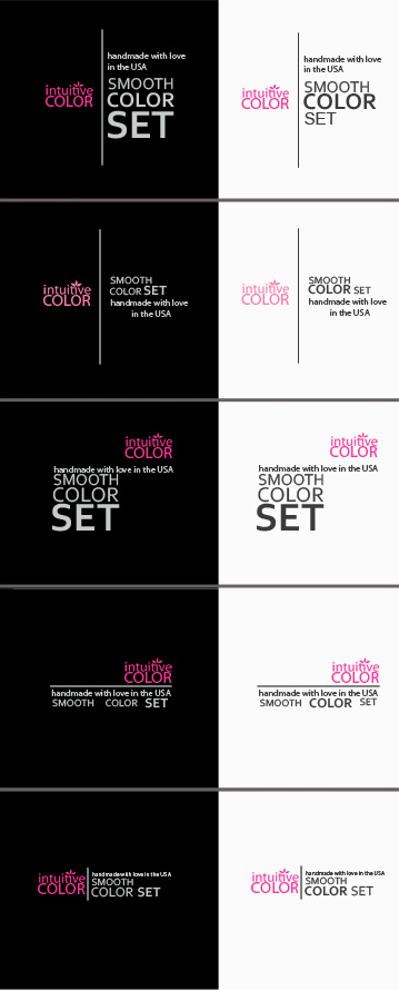
After much thought and seeing a lot of variance, I think that what will go best w/ the existing website (www.intuitivecolor.co) and logo is something similar to this:
http://3.bp.blogspot.com/-VQrHTZdUVyA/T58YzVNofBI/AAAAAAAADsA/rQtBatrU5Tg/s1600/Korres+Wild+Rose+Mineral+Setting+Powder.JPG
I would love to see your take on this, the Korres part could be the intuitive COLOR logo (with the flower, but without smooth.color.set.)
The part that says: "wild rose setting powder, rose sauvage . . ." could say "handmade with love in the USA"
And the part that says: "mineral . . . fixatrice" could say smooth color set (on two or three lines) and the words color and set could be bolded on their own lids
And I think that the font would be great in white on the black lid and in black or white on the clear lid.
Thank you all so much!!
Kristen
Added Monday, December 31, 2012
Zielmarkt/( -märkte)
women ages 18-65
Industrie/Einheitstyp
Graphic Design
Sehen und fühlen
Jeder Schieber zeichnet eine der Charakteristiken der Marke des Kunden aus sowie den Stil, den euer Logo widerspiegeln sollte.
Elegant
Fett
Spielerisch
Ernst
Traditionel
Modern
Sympatisch
Professionell
Feminin
Männlich
Bunt
Konservativ
Wirtschaftlich
Gehobenes
Anforderungen
Muss haben
- A one color design that can be (heat/foil) stamped onto the plastic makeup jar lids, that will show up on both the clear and black plastic lids.
It MUST say the brand name, or otherwise indicate it, but does not need to say the product (color or set) or anything else, but can if that helps.
I have an existing logo, but am open to alterations of it (i.e. am open to changes to the logo if they are necessary for the packaging aesthetic to be just right). I like the black with bright pink (fd33ab) for the brand, but am open to other suggestions.
I currently use waterproof, polyester laser printed labels for the jar tops, but don’t think those will look professional enough for the major beauty magazines. If you feel that you have a design that will only work with a label, I may consider it, but am leaning towards a design that can be printed/stamped directly onto the plastic jars. I am planning to have the lids foil/heat stamped though I prefer the matte colors to the metallics.