Tri-S Ag
Wollen Sie auch einen Job wie diesen gewinnen?
Dieser Kunde bekam 74 Logo-Designs von 31 Designern. Dabei wurde dieses Logo-Design Design von royalroosterdesign als Gewinner ausgewählt.
Kostenlos anmelden Design Jobs finden-
 US$400
-
 74 Designs
-
 31 Designer
Logo-Design Kurzbeschreibung
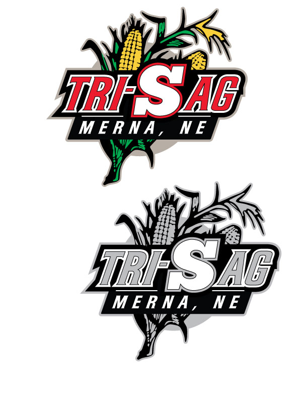
We are a farming operation in the center of Nebraska. The partnership consists of my dad, Jerry Safranek; my brother, Kevin Safranek; and myself, Craig Safranek.
We would like a logo to use on hats, business cards, website, and who knows that portrays a modern logo that could possibly incorporate a corn stalk or an ear of corn in the logo possibly.
Something mixing the S and a symbol that implies 3 people.
Aktualisierungen
Project Deadline Extended
Reason: We would like to extend the deadline as we feel the design is coming around, just have not came up with the design that fits both as a whole design and symbol within the design that will eventually be "the logo" all by itself.
Added Friday, February 15, 2013
Project Deadline Extended
Added Monday, March 18, 2013
Project Deadline Extended
Added Monday, April 01, 2013
Project Deadline Extended
Added Monday, April 01, 2013
Project Deadline Extended
Added Tuesday, April 09, 2013
Industrie/Einheitstyp
Farming
Logo Text
Tri-S Ag
Logo Stile, die Sie interessieren können
Emblem-Logo
Logo eingeschlossen in einer Form
Abstraktes Logo
Begrifflich / symbolisch (Text optional)
Lettermark-Logo
Kurzwort oder Buchstaben-Logo (nur Text)
Sehen und fühlen
Jeder Schieber zeichnet eine der Charakteristiken der Marke des Kunden aus sowie den Stil, den euer Logo widerspiegeln sollte.
Elegant
Fett
Spielerisch
Ernst
Traditionel
Modern
Sympatisch
Professionell
Feminin
Männlich
Bunt
Konservativ
Wirtschaftlich
Gehobenes
Anforderungen
Muss haben
- traditionally would like more of a logo to go with red and black
a green corn stalk could be an added feature or incorporated in the logo too.
I would like a main logo, but also a simple logo that can be pulled out for almost a symbol look to it.